In the Dashboards and Low-Code Apps modules, managing stateful flows and transitions has always been a challenge. With the introduction of the stepper component in DataMiner 10.3.10, the newest addition to our visualization toolkit, this problem now belongs to the past. This versatile component offers the ability to visualize the progression of states in both DOM definitions and instances.
DOM definitions and the happy path
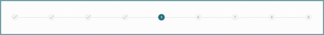
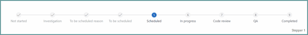
When you work with a DOM definition, the stepper component highlights the ideal sequence of states that constitute the “happy path“. This path illustrates the stages an instance of that definition would usually undergo as part of the standard workflow. By visualizing this sequence using numbered or labeled steps, creators gain a better understanding of the typical behavior exhibited by instances of a certain DOM definition.
For example, let’s take a definition that pertains to a work item. The happy path might involve states like “Not started”, “Scheduled”, “In progress”, and “Completed”. By using the stepper component, you can visually outline this path, gaining a clearer understanding of the intended advancement of the instances.
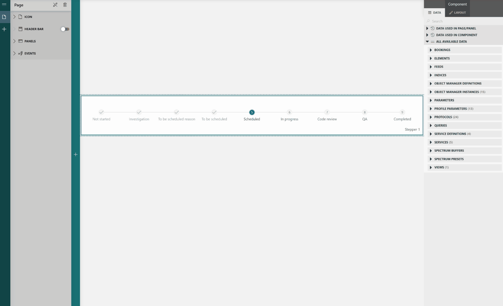
DOM instances and history tracking
In reality, instances rarely follow the ideal path at all times. That is precisely why, when dealing with a DOM instance, the component shows a record of all previous states, leading up to the present state. With this added perspective, you can identify any deviations from the happy path and gain insight into the journey that led the instance to its current state.
Based on the past states, the current state, and the expected happy path, the component calculates and displays the logical future states. Let’s revisit the previous example: a work item with a history of states leading to the current state, “In progress”. In this case, the component not only shows the historical sequence but augments it with the remaining stages from the happy path based on the current state, such as “To be reviewed”, “Reviewed”, and “Completed”.
Customize the look
Each stepper component starts with the same default template, depicting each state as a circle bearing the state index, while state name resides below.
You can choose from a diverse range of templates to customize the look and feel of the component. These templates can be configured in the appearance settings located in the layout tab of your dashboard or low-code app. Additionally, each template automatically adapts to match the background color! So if you prefer dark mode for your dashboards or low-code apps, we’ve got you covered.
Create your own path
At the moment, the stepper component can only be used within the context of stateful DOM data. Nonetheless, creators familiar with low-code apps will recognize that an app itself can sometimes also follow certain flows and that visualizing these through the stepper component would be more than nice. That’s why the natural next step for this component involves empowering it to configure steps and transitions independent of a data feed. This would allow you to configure states through a dedicated setting and transition between these states via app actions.
What could the future bring?
With the successful completion of the first milestone in this project, it is time to release the first version of this component into your DataMiner System (the feature will be available from DataMiner 10.3.10 onwards). However, there’s a wealth of valuable enhancements that can be implemented to make this component even better in the future.
Here’s a glimpse into some possible future advancements:
- Expanded range of templates: At the moment, you can choose from a list of 13 different templates to visualize the stages in your stepper component. In an updated version, the scope of this list could be expanded, encompassing a wide range of new templates to choose from.
- Creating your own templates: Going one step further, another exciting possibility is making your own templates. Right now, this is only possible with the Grid, Timeline, and Maps soft-launch components. Extending this capability to the stepper component would grant you the ultimate freedom to visualize your steps precisely as you want.
- Choosing how to visualize your history: Right now, the entire history of each instance is shown by default. Considering specific instance types frequently switch between different states before reaching their final state, this can quickly result in an extensive list of steps, often containing repetitive loops between the same states. As you may not always want this, introducing collapsible loops could be the solution. To once again revisit our work item example, if a work item switches back and forth between “In progress” and “To be reviewed”, you could choose to hide these loops, displaying the “In progress > To be reviewed” transition just once.
Get excited!
The stepper component is a game-changer when it comes to understanding how DOM definitions and instances move between different stages. It helps you see the ideal sequence, track past changes, and predict future steps. By adding the stepper component to your toolbox, tracking the workflow of your DOM definitions, instances, and – in the future – your entire app will become easier than ever.
Want to start using the stepper documentation in DataMiner 10.3.10? Check out our documentation!