For everyone using the new DataMiner 10.1.5 Feature Release, the node edge dashboard component is now generally available (GA). This component is a new addition to the catalog of out-of-the box data visualizations included in the DataMiner Dashboards module. It can be used in all sorts of applications that visualize objects and the relationships between them.
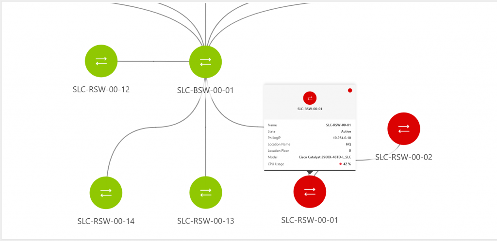
In many DataMiner Systems, there can be a need to visualize certain objects and how they are interconnected. Think for example of network devices and their physical connectivity, or the logical connections between the nodes, pods and containers of a Kubernetes cluster, or even the video flows between media nodes in an IP network. To tackle these use cases, you can now use this new generic HTML dashboard component and visualize any type of “nodes” (objects) and their “edges” (connections between them). The component is designed in such a way that all types of DataMiner objects can be visualized as either nodes or edges, be it elements, rows in a parameter table, services, views, etc.
However, the node edge component is much more than just a static visualization. It is in fact a full-blown analytics environment. To enable all kinds of analytical use cases, the node edge component makes it possible to link parameters and properties as KPIs to nodes and edges. These KPIs can then be shown in a tooltip on a node or edge, for example to quickly give an overview of the status or health of a node.
On top of that, the node edge component allows you to dynamically filter out, highlight or color nodes and connections based on their KPIs. This will allow users to quickly identify problems among a large set of nodes and see how these problems might be distributed throughout the displayed topology. A visualization like this allows operators to quickly visually correlate large amounts of data, which helps them to faster analyze service degradations and incidents. This makes this component a very valuable addition to our range of dashboard visuals.
The data input for the node edge component works with our Generic Query Language, which can query any DataMiner object, like elements, parameters, services, DCF connections, etc. This gives dashboard creators maximum flexibility to build node edge visualizations on top of any data they have available in their DataMiner System.
The video below illustrates the use of the node edge component to analyze a network of switches:
In this video, you can see how you can use the component to analyze performance of a Kubernetes cluster:
The first release of this component brings a lot of value and creates a ton of possibilities already, but we’re planning to add even more features and capabilities in the future. While the first version is already well suited to display a limited number of nodes and connections, we want to expand its capabilities to easily visualize large sets of nodes on a single screen as well. The filtering and highlighting behavior when dealing with different types of nodes in one topology will be optimized, and we will add additional positioning modes to the component, expanding the “automatic” and “layered” ones that are available now. Think for example of circular or even geographical positioning. This component opens an endless range of possibilities for us to explore!
For an overview of all features released in the DataMiner 10.1.5 feature release, have a look at our Highlights in DataMiner 10.1.5 blog post. To be the first to learn about other new features we have in the pipeline, keep an eye on the DataMiner Roadmap and the Coming Soon section of our blog.
It’s official. Using DataMiner can no longer be considered work, it’s too much fun. All jokes aside, this is really opening up so many use cases. Taking any data, irrespective where it comes from across your entire operation, and being able to easily combine it and transform that into a unified live updated node edge diagram is a very powerful proposition in a data-driven future. I’m very keen to see what else everybody will do with this.
We have now added a lesson on the node edge component to our DataMiner Dashboards course on Dojo! Watch the video’s here to learn how to build up a node edge visualization from scratch: https://community.dataminer.services/courses/dashboard/