Hi Dashboard guru’s
After your fantastic Empower sessions, I have been trying to get my Dashboard to look like your solutions. One of the things we were stuck on was trying to get the tables in the dashboards to look the same as yours.
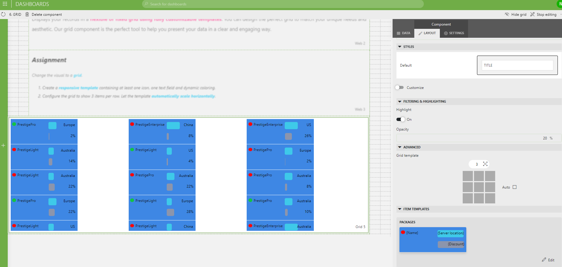
Here is a screenshot of Mine. (don’t Laugh too much).

And here is a screenshot of your Solution with the exact screen resolution.

Notice how the columns align with no white space and the rows are smaller.
Is this just how I created the individual Packages in the Packages editor or is there more to it?
Also, the advanced section on the Layout for the Grid template didn’t seem to make much of a difference.
Great work indeed! Looks like you are well on your way to becoming a data visualization wizard. And the guys from the development team here at Skyline have some more very exciting capabilities coming up. Looking forward to seeing what you will be doing in your own operation with those skills.
Hi Nathan
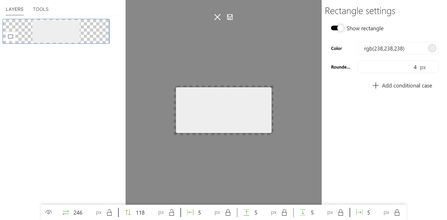
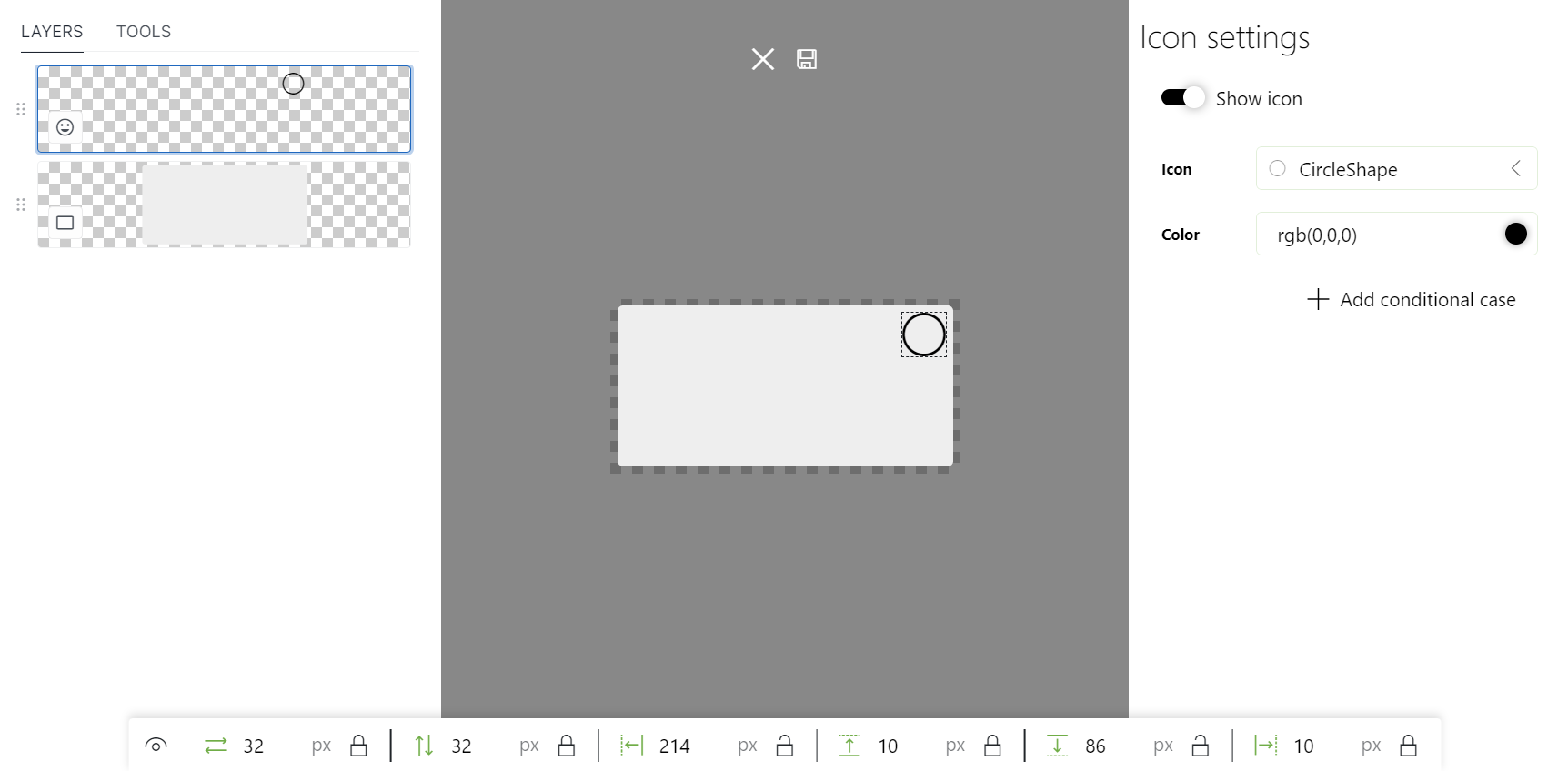
To make sure that the grid templates take the available width, you have to create your template so that it can handle that. This means that you should not lock the width of your background shape to a specific size, but lock the position offsets to specific distances from the edge of your template. These offsets can also be configured for all shapes of your template.
Example:
This background shape will take the full width & height and will be 5px from the edge of my template.

This icon will always be 32×32 and will be 10px from the right & top edges of my template.

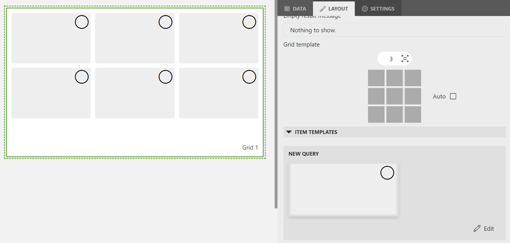
The configuration will look like this on the grid when the advanced settings are set to 3 rows with an automatic width.

Does this help you out?
Hi Wout. That answers one of my questions, but I was also referring to the white space between the 3 Columns. Is this adjusted using the method provided by you earlier?
I suspect that the whitespace in your setup is caused by the template width being greater then the width of your background shape. Does your background shape have a width that is locked? If you unlock it, it can scale with the template itself.
This is actually looking great! Congrats