

I would like to create a dashboard that displays the minimum and maximum values of a parameter from a protocol table. Standard I get for 1 hour.
The table contains values for each RPD name, and I can retrieve all values per time interval (approximately every hour). I would like to analyze this data for the last 30 days.
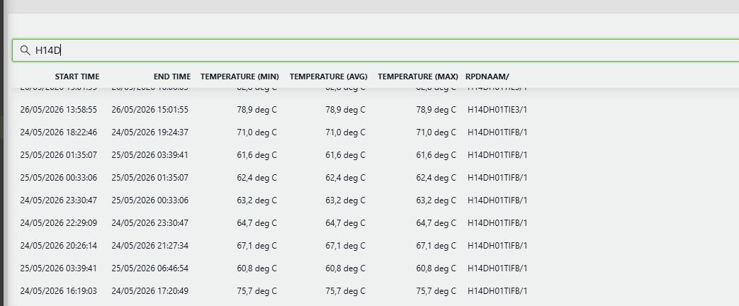
For example of this picture:
H14DH01TIFB/1: min= 60,8 and max= 75,7 and so further for another RPD's

Hi Tim,
For this type of use case, I believe the best option is to use the DataAggregator DxM. This DxM allows you to execute queries at scheduled times and store the results in a CSV file.
Assuming that the retention period for real-time trend data is 1 day, you could proceed as follows:
- Configure the DataAggregator to execute a daily GQI query that calculates the min/max for the desired parameter over the previous day. This GQI query could be built based on the 'Get Trend Data' data source or an ad-hoc data source.
From here there are two possible approaches:## Option 1: Using a connector
- Develop a connector that will process the daily CSV file generated by the DataAggregator. Store the aggregated values in a structure similar to the original table. The columns containing the aggregated values should be trended.
- Using a dashboard/LCA, you could then use one of the default data sources to display the aggregated values. Using a line chart, you could visualize the evolution of the aggregated values along the time.
## Option 2: Using a automation script (or an ad-hoc data source)
- Develop an automation script that process the daildy CSV file and generates a second CSV file containing the aggregates daily values.
- In a dashboard/LCA, using the ad-hoc data source SLC-GQIDS-DataFormats, you could process the result of the aggregated CSV file so it can be displayed in a table or line chart.
Hope it helps.