Hello
Is it possible in the new Dashboard app to show a chart with a trendline that represents the sum of multiple interfaces In (or Out) Bit Rate parameter, for example? How do you advise this to be done?
Thank you.
Best regards
Bruno Sousa
From feature release 10.1.6 on it will be possible to stack trend lines in the Dashboard app.
2 new options were added for the chart component in Layout > Styling & Information that are relevant to your usecase:
- Stack trend lines:
Each additional trend line is added on top of the previous one to represent the sum. - Fill graph:
The area beneath each trend line is colored in, to better indicate that the trend lines are summed together.
Hi Bruno,
Another option I’ve seen is through a custom driver that could allow you to create a new element and inside of it you could select the source elements/interfaces, define the parameter to be aggreagated and generate the trending graphs to be included in the dashboards. As I said is more like a custom solution that needs to be designed but possible.
Thanks.
Hi Bruno, At his moment, we have stacked charts functionality in Visio. We have an example on our ‘https://dcpdma.skyline.be‘ DataMiner.
Users with a older type of DCP account can already access ‘dcpdma.skyline.be’ and we are working on giving access to the newer type of (B2C) accounts as well. Please let us know if you would like to have an account to access dcpdma.skyline.be now. ‘dcpdma.skyline.be’ is the reference platform for many (Visio) use-cases.
Anyway, here’s a screenshot already:
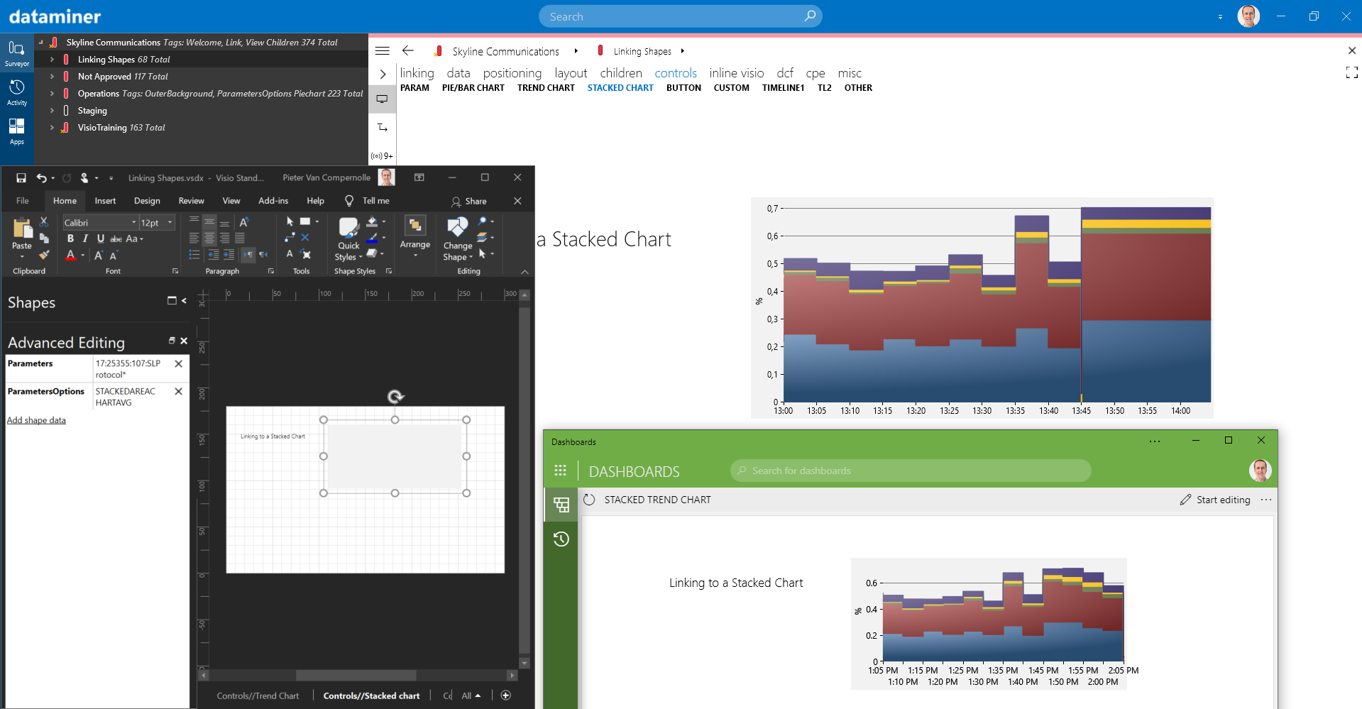
In the screenshot, you can also see the chart in Dashboards. That’s because we have a component in our dashboards to embed Visio snapshots. This is not an interactive chart, but it could help for the time being.
We have an internal task in our backlog to support stacked trend lines in dashboards via the trend component. This task just got some extra ‘business value’ (one of the metrics to sort our tasks), so hopefully we can integrate this in one of our upcoming releases.
Hi Bruno,
There is no commitment yet on a specific release, but I expect it to be included in one of the 10.1.x feature releases. Feel free to ask for updates on this or to create a duplicate task for this in your own maintenance project, so you can follow the progress on this. You can refer to our internal task with this ID: DCP116400.
Hello Peter,
Since this is a major requirement for a project now, I followed your advice and asked to open a task in my maintenance project so I can stay tuned and sync regarding this implementation.
Regarding the “Stack Chart” in Visio:
1- Do you know if it possible to have the element name and Min, Max, Average Values for the parameters in the chart Legend?
Thank you.
Best regards
Bruno Sousa
Hi Bruno,
For the charts in Visio, you can enable a legend (more info on how to do this in our user guide: https://help.dataminer.services/dataminer/#t=DataMinerUserGuidepart_2visioCreating_a_parameter_chart.htm)
The format of the legend labels is determined based on what data you bind to your chart. If you bind to parameters from the same element, you’ll see the ‘parameter name’ as legend label. If you bind to one parameter from different elements, then you’ll see the ‘element name’ as label, …
For trend statistics, we have a component in our dashboards, which shows the min, max & average for a certain parameter over a specific time range.
Hello Pieter,
I also trying to do the traffic aggregation using an aggregation rule.
I have to aggregate by “Interface Description” but I don’t see an operator other than “Equals” to deal with strings.
Any way to do this?
Thank you.
Best regards
Bruno Sousa
Might be difficult. To my knowledge:
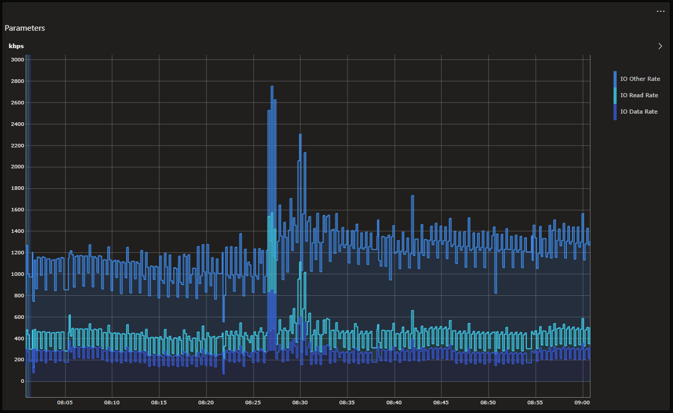
The current trend graph in Dashboards allows you to display multiple metrics like bit rates from multiple interfaces in overlay, but does not support a stacked presentation yet.
You can build an aggregation rule on the view level and define a new metric there. This has the advantage that the sum would be calculated server-side continuously, and you can alarm and perform trending on that. But I believe you then will not be able to easily access that new metric in the Dashboards to display it there in a graph.
The GQI definitely also allows you already to aggregate on multiple interfaces and do things like sum, average, min, max, percentiles, etc. But that will show you the current aggregated value on your dashboard, and not a trend graph showing that value over time.
Other people might have some further perspectives on this. Because it is a common use case and we should ensure that we can support this easily.
Hi Ben,
Thank you for your thoughts on this.
I would like to hear more about it from the Community, to know how is this kind of subject being addressed using Dataminer in the present, since it is a major requirement for me nowadays. (for example, show stacked graphs with data from multiple interfaces from different sources / elements sometimes)
Besides Dashboards app, is there any advice on how to address this challenge and present this kind of information in Dataminer? What is the best way to present to a user a stacked graph with the required interfaces bit rate information? (from multiple sources / elements)
Can we do it using “Trend Groups”, for example?
Thank you.
Best regards
Bruno Sousa
Most definitely, and could not agree more. And to just confirm: for your use cases, you are mostly focused on the graphical presentation (i.e. to stack the data graphically). For your use cases it is not required to aggregate the data continuously and to be able to alarm and store the aggregated value as a separate time series in the database. Correct?
Hello Peter.
I’m trying the Visio aproach.
Do you if there is any target date for this component to be available in Dataminer Dashboards?
Thank you.
Best regards
Bruno Sousa