Hi Dojo,
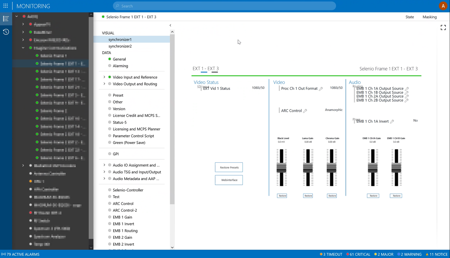
When using the mobile monitoring app, we noticed certain Visual overview shapes are getting rendered in different ways comparing different browsers.
- Firefox - text misalignment
- Chrome and Edge - toggle between Frames results in blank page
- Cube - working fine
The visual overview doesn't have the Grid layout options yet.
(reference: Positioning shapes in a grid layout | DataMiner Docs)
Are we on the correct track with going for the Grid layout in order to resolve these problems?
Do we have a sample visual available to boost and understand how Grid layout is used?
Thanks.
UPDATE: Adding a screenshot of the text misalignment:

Correct - some of the more advanced features of Visual Overview are not fully supported in the mobile version. But note that there is also an option to render an alternative version of your Visual Overview graphics for mobile (which is sometimes also desirable in the sense that you want to display it on a phone with a smaller screen real estate- in that case you do not want to show a complex and very detailed graphic designed for desktop). The way it works is that you make a new tab page in Visio, and a simplified version of your graphic, and label that to render for the mobile apps (monitoring app, dashboards, no-code apps, etc.).
Forgot the link: https://docs.dataminer.services/user-guide/Basic_Functionality/Visio/miscellaneous/Conditionally_showing_or_hiding_a_page_of_a_Visio_drawing.html?q=visiomobile (at the bottom of this page)
Thanks Ben. Before we try the “mobile”-option to simplify that visual overview page for mobile clients, we’ll give it a try with the Grid layout to see if that improves the consistency of the presented visual.
Added a screenshot of the text alignment issue. It seems the parameter controls are placed above some of the titles. We will try the grid layout to see if it resolves that part.