Hi,
Could you advice on how the average value per day is calculated for trending? and how it is plotted for 1 month?

Marieke Goethals [SLC] [DevOps Catalyst] Selected answer as best
Hi Ashwiny,
You can find this information in DataMiner Docs (Trending Techniques).
Something I noticed in your screenshot is that there is no max/min values displayed for the averages values. For the timespan selected (last month trending data) you should visualize the average trending.
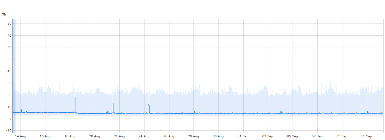
Below an example of one month trending for the CPU load (using the Microsoft Platform connector):

- The dark blue line represents the average value for the 5-minute time slot
- The light blue lines represents the min/max value for the 5-minute time slot
Could it be the case that the TTL for real-time trending was modified in the DMS?
Marieke Goethals [SLC] [DevOps Catalyst] Selected answer as best