

How can I color the bars in this chart based on the severity of the label?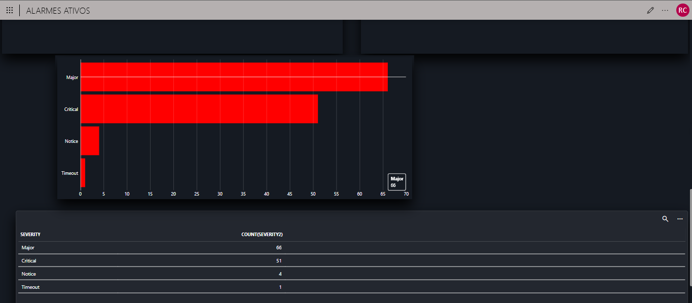
Rodrigo Cerqueira [DevOps Member] Answered question

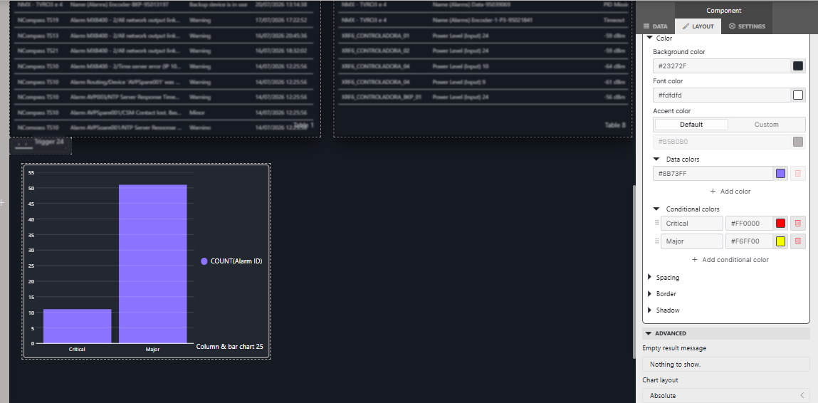
And how do I choose a specific color for each label index?
I already tried doing exactly what you showed in your screenshot, but it didn't work. In my case, I only have one column. How can I create a query with a separate column for each severity level?
Miguel Obregon [SLC] [DevOps Catalyst] Edited comment
Hi Rodrigo,
As mentioned in my previous answer, you need a column per severity. In your screenshot, there is one single column that represents the count of alarms per severity. There is an example in the catalog that you can deploy and use it as reference:
https://catalog.dataminer.services/details/8d26cb0b-ba75-4bfc-8f52-fc721fac4b1d
Hi Rodrigo,
I am not sure if it is possible to have different colors in a bar chart. Have you tried using a pie chart?