

How can I color the bars in this chart based on the severity of the label?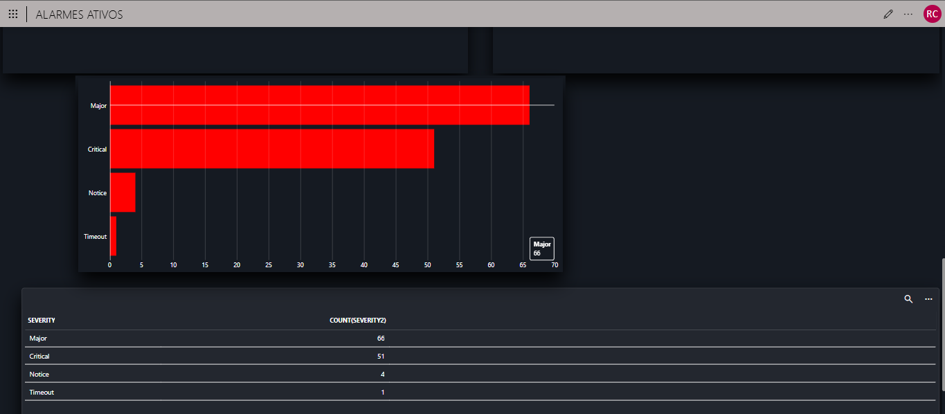

And how do I choose a specific color for each label index?

Hi Rodrigo,
I investigated a bit further and wanted to correct my previous message: It is possible to change the bar colors based on their value. You can customize the component layout and define conditional colors based on values. Below an example:
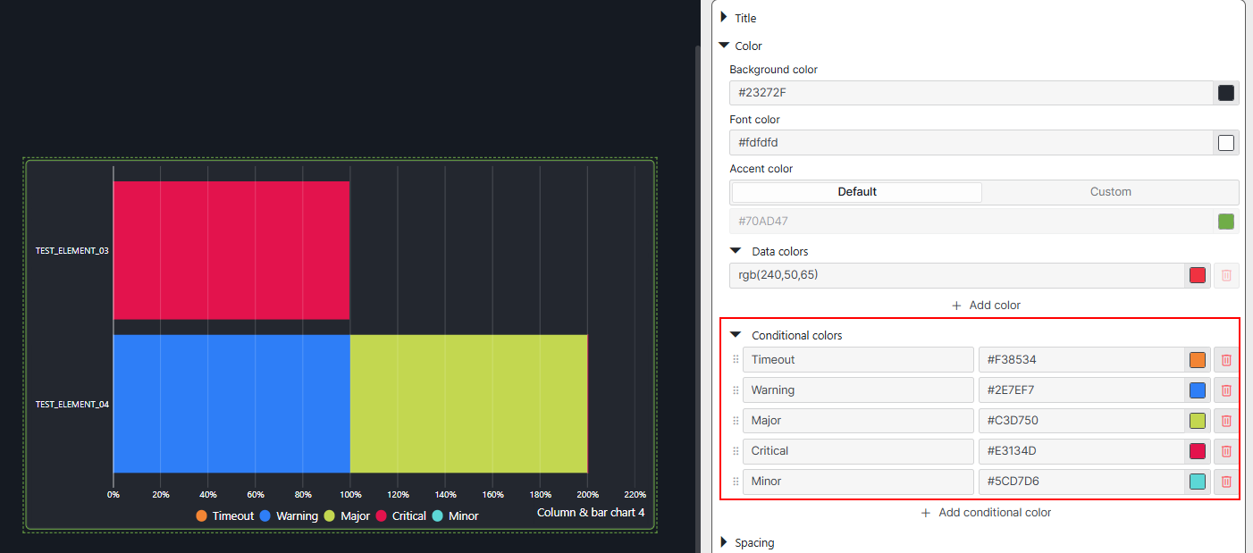 For your use case, to set a color per severity, the GQI query result needs a dedicated column for each severity level.
You can find an example about this query in the dashboard Alarm Report.
Hope it helps.
I managed to figure out how this GQI works and even made some adjustments to suit my needs. The problem is that it was built entirely around historical alarms, whereas I wanted to use it for a dashboard that deals specifically with active alarms. Do you happen to have another package designed for active alarms?
Hi Rodrigo,
I had a look at the available ad-hoc data sources and couldn't find one that deals with active alarms in the same way as the ones available in the alarm history report. You could use the ad-hoc data sources available in the alarm report as a reference to build a custom ad-hoc data source that deals with active alarms.
Having a look at other visualizations, is it not an option to use the alarm table component? This visualization already provides you the active alarms. You can group by severity and have the desired alarm count per severity.
Hope it helps.
Hi Rodrigo,
I am not sure if it is possible to have different colors in a bar chart. Have you tried using a pie chart?