Hello!
My goal is to display information from the top row of a table and put it in a diagram. This top row changes every 3 hours. The table shows historic weather forecasts. And I would like to put the information from the most recent forecast into my diagram.
Currently, my diagram has a scroll bar and when used you can see all the data from all the rows in the table. Which I just want one row that correlates to the most recent Time Stamp.
Also, the Time is wrong - it's showing information from 19/12/2023 when it should be showing information from 05/02/2024.
This is the table it's taking the information from:
You can also see that the Display Key keeps changing and is never the same.
This is my Visio diagram:
Any help with this would be amazing!
As this question has now been open for a long time and there has been no further reaction from you, I will now close it. If you do wish to investigate this further, could you post a new question?
An alternative solution would be using Dashboards and GQI.
This will give you more flexibility in filtering, sorting and selecting Top X in the table. You could then embed the dashboard in your visual overview.
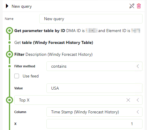
The GQI query could look like this as an example.

In addition to Wale’s suggestion, you can embed this dashboard in a Visio overview.
Hi Amber,
I see that this question has been inactive for some time. Have you found a solution for this yet? If yes, could you select the best answer? Or if not, could you provide some extra info, as Michiel asked below?