Hello, I have a question regarding the coloured alarm status icons within the Dataminer tree GUI. I am partially Red / Green colour blind and can sometimes struggle differentiating the small alarm status icons in the V10.x Dataminer surveyor tree. I did not find reading the status an issue in previous Dataminer versions where the status colour icon was larger, rather than the current small shape to the side of each element. Is it possible to offer an option to increase the size of the small colour status icons and / or to have that status colour populate the entire square element shape in the Dataminer GUI please? I am aware that it is possible to change Dataminer’s default colour palette, however I would prefer not to change that as all Dataminer users are used to the default colours and the associated status that they represent.
Hi Paul, if you would still struggle with accessibility of DataMiner, a feature suggestion could be created at: https://community.dataminer.services/feature-suggestions
Hi Paul, great to see that you found a solution that works for you by disabling the “Use Modern Icons” setting.
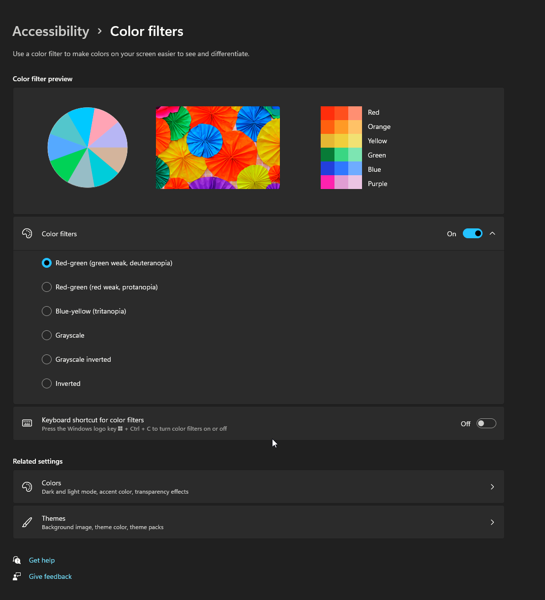
In addition, if you enable the “color filters” in the windows accessibility settings, the adjusted colors will also be applied in DataMiner Cube, also on the alarm and surveyor icons. This could be an alternative if you like the modern icons better. As this setting is stored with your windows user settings, it allows you to change the colors for you without affecting other DataMiner users.

I believe that I have found the solution to my own enquiry after some further Dataminer ‘Help’ searching!
Go to ‘settings’ and then de-select ‘Use Modern Icons’