Hi,
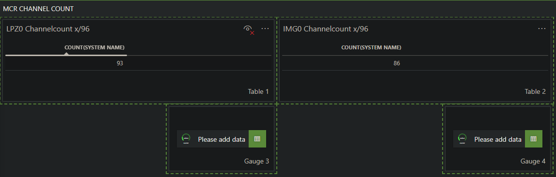
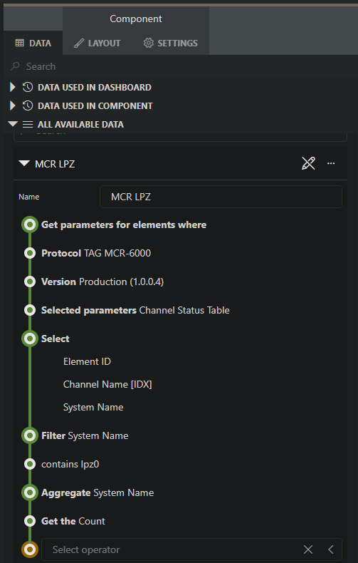
i used a query (see below, query for LPZ0) to count Channels per MCR Device (LPZ0 / IMG0) and visualized it in a table (table 1 for LPZ0).
For a better visualization i want to display a Gauge with the counted Channels and show the maximum Channels (for example LPZ0: Count is 93 and the maximum number of channels is 96).
I didnt see a way to create a Gauge adding the count as data and I didnt see a way to set a maximum to a Gauge.
Is there a way to visualize it with a Gauge?
Hi Thomas,
The current version of the Gauge component can only visualize parameters. Showing the count from your query is not supported.
We currently have no task to implement this. If you want us to consider this, you can create a feature suggestion (https://community.dataminer.services/feature-suggestions/).
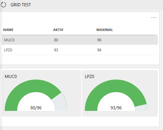
Queries can already be used in the state component and grid component. State components have a basic visualization of the rows in your query result while the grid component could already be used to create a visual similar to a progress bar. For this you would need a column value that represents the percentage of the total and not the absolute value. This column can then be linked to the width of the shape in the template.
Hi Thomas,
as Wout mentioned, you could customize e.g. the grid component with your own code.
Even it is not optimized, here an example using the grid component:
Cheers,
Felix
Hi,
is this planned to implement?
Is there an other visualization, that support Counts?