Hi there,
We’re back with a new DataMiner Feature Release! Just like for the previous Feature Release, this blog will give you an overview of what you can find in the new DataMiner 10.0.12 Feature Release.

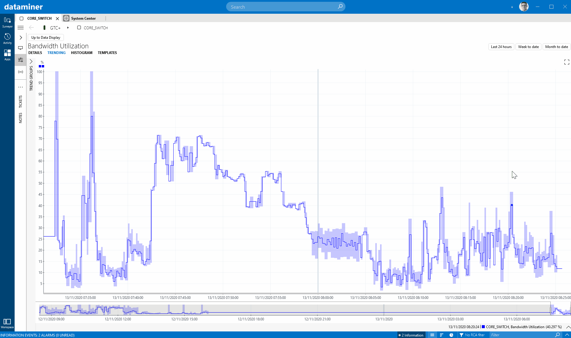
In this release, we have improved several things in the area of performance data (a.k.a. time series). A first nice extension on trend graphs is a new right-click option in DataMiner Cube to show an integrated and configurable percentile line. If you really like this option, you can even use a new user setting to activate the percentile line by default on all the trend graphs in your system.
We have also improved the mobile Visual Overview, i.e. the HMTL5 component that allows you to display Visual Overview graphics from DataMiner Cube. Where previously, trend graphs embedded in Visual Overview in DataMiner Cube were not shown in the mobile Visual Overview, now the trend component is perfectly integrated in the rendered graphic. In DataMiner 10.0.12, this enhancement is only available for DataMiner Dashboards, but the Monitoring app will follow in the next iteration.
A last improvement related to performance data has to do with “gaps” in the time series (e.g. when the data source went into timeout and no data was collected). For quite some time (since 9.5.13), it has been possible to configure a trend component in DataMiner Dashboards so that gaps in a trend line are not shown as gaps (i.e. the line graph is shown as a continuous line). We have now also added an option to the CSV export in DataMiner Cube, so that you can also exclude the gaps in the output data there.
Next, there have been several improvements related to readability. In the Monitoring app, the configured view properties can now be displayed in the Surveyor just like in DataMiner Cube. We have also implemented a small improvement to the dynamic units feature, so that metrics that initially had one or no digits now have better formatting. Another readability improvement is that we now automatically detect columns that have MAC addresses listed, which allows better sorting. And another small addition, but useful if you have multiple DataMiner clusters managing your ecosystem, is the fact that you can now show the cluster name in the header of DataMiner Cube.
While we are on the subject of DataMiner clusters, this release also introduces a change in DataMiner Cube as to how elements are visualized when the DataMiner node hosting them is not available. To make it clear that elements are in this so-called disconnected state, they are displayed with a different icon, and the actions you can perform on them are limited.
This version also introduces extra functionality in the protocol engine. If you have an integration that needs to send HTTP requests in bulk, you can now add a message body to your HTTP request.
And one last thing: in the Tools folder of your DataMiner nodes, there is now a new tool that can be used to reset a DataMiner node to the state it was in just after the installation of DataMiner. It basically allows you to clean your entire configuration and reset the node again. The tool comes with a load of options, so read the documentation carefully.
To dive deeper into all the changes, check out the detailed release notes here.
That’s it for 10.0.12! See you in four weeks for the next feature release DataMiner 10.0.13. In that one, as the top of the bill, we will officially introduce Cassandra Cluster support.
Cheers, and stay safe!
What I also like is how you can set the percentile line for whatever percentile you choose, and it sets it based on the data in the current time window. You can then zoom out and look at the time series in a broader time window and compare to that percentile line that you have set (it shows a dashed line then to indicate that this is data that was not taken into account to define that percentile). This way you can take the percentile for a certain time span and then compare earlier data to that. Nice implementation, easy to use and intuitive, versatile and well thought-through.