Hello
My client is requesting a report by email which shows a graphic for multiple servers for a single KPI (for example: CPU).
In the present, what is the best approach to achieve that in your opinion?
Thank you.
Best regards
Bruno Sousa
Marieke Goethals [SLC] [DevOps Catalyst] Selected answer as best
Hi Bruno,
I believe that the best way to generate this report is using the Dashboard app. Please find below the steps that should cover your use case:
- Create a dashboard that contains the component Line Chart. See DataMiner Help (Line & area chart) for additional information about charts
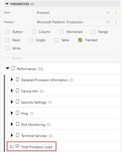
- In the new dashboard, as data source, select Parameters. In the filter options select:
- From: Protocol
- Protocol: The name of the protocol
In the example below, I added the parameter Total Processor Load from the connector Microsoft Platform:
- Add this selection to the line chart component
- For filtering select Elements. In this case add to the line chart component the elements that will be included in your report
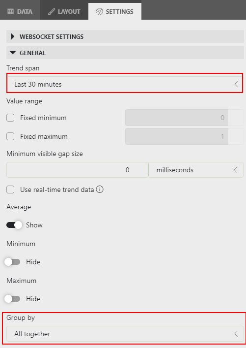
- Select the component and go to Settings:
- If required, change the timespan according to your requirements
- In the option 'Group by', select the option 'All together'. This will display all the lines in the same chart:

- Finally, generate the report based on the dashboard. You can find in DataMiner Help - Generating a report based on a dashboard additional information about how to generate this report
Bruno Sousa [DevOps Member] Posted new comment
It worked!
Thank you for the help, Miguel!
Best regards
Bruno Sousa