Skip to content
DataMiner DoJo

More results...

Generic selectors
Exact matches only
Search in title
Search in content
Post Type Selectors
Search in posts
Search in pages
Search in posts
Search in pages
Log in
Menu
  • Blog
  • Questions
  • Learning
    • E-learning Courses
    • Open Classroom Training
    • Certification
      • DataMiner Fundamentals
      • DataMiner Configurator
      • DataMiner Automation
      • Scripts & Connectors Developer: HTTP Basics
      • Scripts & Connectors Developer: SNMP Basics
      • Visual Overview – Level 1
      • Verify a certificate
    • Tutorials
    • Video Library
    • Books We Like
    • >> Go to DataMiner Docs
  • Expert Center
    • Solutions & Use Cases
      • Solutions
      • Use Case Library
    • Markets & Industries
      • Media production
      • Government & defense
      • Content distribution
      • Service providers
      • Partners
      • OSS/BSS
    • DataMiner Insights
      • Security
      • Integration Studio
      • System Architecture
      • DataMiner Releases & Updates
      • DataMiner Apps
    • Agile
      • Agile Webspace
      • Everything Agile
        • The Agile Manifesto
        • Best Practices
        • Retro Recipes
      • Methodologies
        • The Scrum Framework
        • Kanban
        • Extreme Programming
      • Roles
        • The Product Owner
        • The Agile Coach
        • The Quality & UX Coach (QX)
    • DataMiner DevOps Professional Program
  • Downloads
  • More
    • Feature Suggestions
    • Climb the leaderboard!
    • Swag Shop
    • Contact
      • General Inquiries
      • DataMiner DevOps Support
      • Commercial Requests
    • Global Feedback Survey
  • PARTNERS
    • All Partners
    • Technology Partners
    • Strategic Partner Program
    • Deal Registration
  • >> Go to dataminer.services

Visual overview rendering in mobile monitoring app – results differ per browsers

Solved1.46K views19th January 2023Monitoring app rendering Visual Overview
12
Thijs Vanovenacker [SLC] [DevOps Advocate]2.08K 18th January 2023 1 Comment

Hi Dojo,
When using the mobile monitoring app, we noticed certain Visual overview shapes are getting rendered in different ways comparing different browsers.

  1. Firefox - text misalignment
  2. Chrome and Edge - toggle between Frames results in blank page
  3. Cube - working fine

The visual overview doesn't have the Grid layout options yet.
(reference: Positioning shapes in a grid layout | DataMiner Docs)

Are we on the correct track with going for the Grid layout in order to resolve these problems?
Do we have a sample visual available to boost and understand how Grid layout is used?

Thanks.

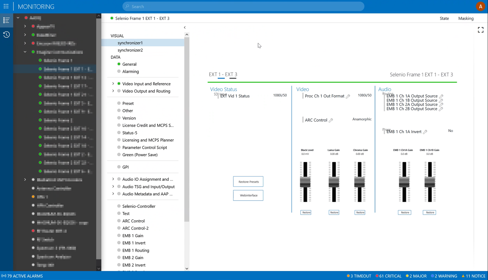
UPDATE: Adding a screenshot of the text misalignment:

Thijs Vanovenacker [SLC] [DevOps Advocate] Selected answer as best 19th January 2023
Thijs Vanovenacker [SLC] [DevOps Advocate] commented 19th January 2023

Added a screenshot of the text alignment issue. It seems the parameter controls are placed above some of the titles. We will try the grid layout to see if it resolves that part.

2 Answers

  • Active
  • Voted
  • Newest
  • Oldest
5
Bert Vandenberghe [SLC] [DevOps Enabler]8.11K Posted 19th January 2023 3 Comments

Hi Thijs,

This is how I believe it works: When using the monitoring app in a web browser, any browser of your choice, then the Visual Overviews are being rendered on the server and transferred to your web browser as an image. And the rendering engine on the server, is essentially the same one as the one in Cube. So, I don't really understand why you would have different results, positioning should be the same. And between different browsers it should be the exact same image (with clickable regions on top of it), unless the images are not shown anymore under certain conditions... But maybe somebody from the dev team can confirm this...

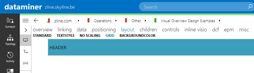
We do have an example with grid layout, that's included in the 'Linking Shapes' Visio which can be found on dcpdma.skyline.be in is in the process of being transferred to ziine.skyline.be, I believe. I'll double check this with Jens.

UPDATE: I checked with Jens and here you can find the demo Visio including an example of most of the Visio features, also the grid control:

Bert

Thijs Vanovenacker [SLC] [DevOps Advocate] Selected answer as best 19th January 2023
Thijs Vanovenacker [SLC] [DevOps Advocate] commented 19th January 2023

Thanks Bert for the reference of an example on the Grid control. I have updated the original question adding a screenshot of the text alignment problem. Are the parameter control shapes also rendered on the server itself? or would this be an overlay in the monitoring app itself? Once we have a version with the grid control, I’ll also provide an update to confirm if it helped.

Pieter Van Compernolle [SLC] [DevOps Enabler] commented 19th January 2023

The Web apps indeed use server-rendered images with on top regions that can serve as ‘zones’ in the image that are clickable or that can host other (scrollable) images or can host controls. I believe the offset you experience is indeed a control (web parameter control) that is placed on such a region, but that is actually bigger than the region that is preserved in the image. This could be related to the screen and resolution that is being used. Did you try to open this on a bigger screen (or screen that has a higher resolution)?

Bert Vandenberghe [SLC] [DevOps Enabler] commented 19th January 2023

The parameter controls are indeed an overlay added by Cube or the Monitoring app on top of the Visio drawing, same like you would add a web browser control.

In this case it might indeed be best to look at using the grid control or NoScaling. When using the grid control or NoScaling, your Visio remains at 100% and you know how much space you will have for your parameter controls. If the Visio scales along with the available size, then you might have a small Visio with large parameter controls on top of it, which won’t fit anymore, or the other way around because the parameter controls never scale. You can simulate this in Cube by making your surveyor wider and smaller and forcing your Visual Overview to become small and big, then you will notice that the Visio and the parameter controls scale differently, and that might cause problems on certain resolutions. So NoScaling or a grid control might indeed be the solution for your problem.

You are viewing 1 out of 2 answers, click here to view all answers.
Please login to be able to comment or post an answer.

My DevOps rank

DevOps Members get more insights on their profile page.

My user earnings

0 Dojo credits

Spend your credits in our swag shop.

0 Reputation points

Boost your reputation, climb the leaderboard.

Promo banner DataMiner DevOps Professiona Program
DataMiner Integration Studio (DIS)
Empower Katas

Recent questions

Multiple Set on Table parameters for DVE’s 0 Answers | 1 Vote
DOM Definition relations returned in Definition query 0 Answers | 1 Vote
Alarm Dashboard PDF/CSV Export 1 Answer | 0 Votes

Question Tags

adl2099 (115) alarm (62) Alarm Console (82) alarms (100) alarm template (83) Automation (223) automation scipt (111) Automation script (167) backup (71) Cassandra (180) Connector (108) Correlation (68) Cube (150) Dashboard (194) Dashboards (188) database (83) DataMiner Cube (57) DIS (81) DMS (71) DOM (140) driver (65) DVE (56) Elastic (83) Elasticsearch (115) elements (80) Failover (104) GQI (159) HTTP (76) IDP (74) LCA (152) low code app (166) low code apps (93) lowcodeapps (75) MySQL (53) protocol (203) QAction (83) security (88) services (51) SNMP (86) SRM (337) table (54) trending (87) upgrade (62) Visio (539) Visual Overview (345)
Privacy Policy • Terms & Conditions • Contact

© 2025 Skyline Communications. All rights reserved.

DOJO Q&A widget

Can't find what you need?

? Explore the Q&A DataMiner Docs

[ Placeholder content for popup link ] WordPress Download Manager - Best Download Management Plugin