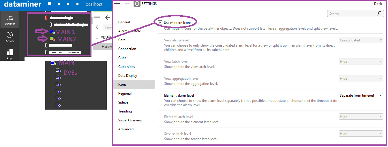
Hello Dojo,
I understand the “modern” icons have a slightly different behaviour from the traditional ones,
as some features like latch and aggregation are not supported:
https://community.dataminer.services/video/surveyor-using-latched-and-special-icons/
When using the newer icons in CUBE, is it correct to expect that the “Main/Parent” element always shows in the little “square” the cumulative highest severity of the related DVEs, while the little “circle” is a led indicator just for the parameters of the parent that are not transferred to any DVE?

Thanks
As this question has now been inactive for a very long time, I will close it. If you still want more information about this, could you post a new question?
Hi Alberto,
That’s correct.
Of course, you will only see this being applied after having enabled the setting ‘Sidebar/Surveyor/Collapse DVE elements beneath their main element’.
By default, the setting is off and you not have this behavior. And their is also the condition that the DVE elements need to be in the same view.
I hope this answers your question and the feature is valuable for you.
I see that this question has been inactive for some time. Did Pieter's answer provide the information you were looking for? If yes, could you select the answer to indicate that this question is resolved?