Hi Dojo / Support,
We would like to know how the data from Dashboard Trending graph was produced
Below is the example of data from trend graph dashboard that we set trend points as real time from 4:00 PM to 5:00 PM when we export to CSV:

Kindly advise :
- What formula is being used to calculate the data?
- Based on the example given, the outcome of the calculation will be recorded at either 4:00 PM or 5:00 PM?

Thank You.
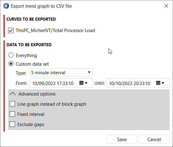
Hi Muhamad, the average of the values between 4:00PM and 5:00PM will be calculated at 5:00PM and in DataMiner Cube this will be displayed as a flat line between 4:00PM and 5:00PM, together with a lighter colored block that indicates the minimum and maximum values in that timeslot. When you do an export to CSV, you in the advanced options you can use between a line graph, which will put the points at the end of the interval and create a continuous looking graph, or the default block graph, which will export a point at the start and end of the timeslot so a plot based on the export will produce a similar graph to the one in DataMiner Cube.

Well noted, Thank You !