Hi Dojo
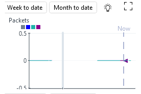
I would like to display a small trend graph in View.
Is there any way to hide the date range buttons?
Also, this parameter starts at 0 and only accumulates.
So no negative value is needed, but can I omit it and make 0 the starting point of the graph?
min=0 did not work.

Hello Yuki,
My understating is below, Dojo Community please correct me if I’m wrong here.
From DataMiner 10.3.3/10.4.0 onwards, the Show average, Show minimum, and Show maximum settings are also taken into account when you export a chart to CSV. In addition, if the Show min/max shading option is enabled, minimum and maximum values will always be taken into account in the export. I think you have to write c# code while ingesting data in to graph. you need to set value 0 if it’s negative value.
Regarding Date Filter, I think you can create a dashboard and add trend graph for your element & parameter. Please follow the steps mentioned below.
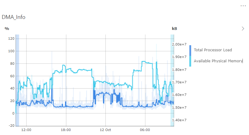
To add a component to a dashboard to show a basic trend graph with several DMA KPIs:
- In edit mode, drag the Line & area chart visualization to the dashboard.
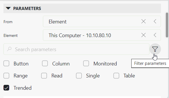
- Click the
 icon to filter the available data in the data pane.
 - Expand the Parameters section in the data pane and specify the element representing the DMA in the Element box.
- Select a parameter you want to display in the graph, and drag it to the graph. Repeat this for each parameter that should be displayed in the graph.TIP
Select the Trended checkbox at the top of the Parameters section to only view parameters for which trending is enabled. Depending on your DataMiner version, you may need to select the filter icon first.
Parameters section with filter in DataMiner 10.3.11 - In the Settings tab, in the Group by box, select Element. This way all KPIs will be shown in the same graph.

https://docs.dataminer.services/user-guide/Advanced_Modules/Dashboards_and_Low_Code_Apps/Visualizations/Available_visualizations/Charts/Line_and_area_chart.html
Note that you can embed dashboards in the Visual Overview using https://docs.dataminer.services/user-guide/Advanced_Modules/Dashboards_and_Low_Code_Apps/Dashboards_app/Creating_and_configuring_dashboards/Embedding_a_dashboard_component_in_a_webpage_or_Visio_drawing.html?q=embeddashboard
Vikas’ alternatives can be helpful tools.
To answer your questions specifically:
- The range buttons cannot be hidden. What most users do is put another non-transparent shape on top of it in the same color as the background. That way you can’t see the buttons (but they are still there).
- If a parameter value is static and you use auto scaling, some padding is given to the top and bottom of the graph, making the graph “1” high in total. If we were to place the “0” value at the bottom of the y-axis, it would literally overlap with the x-axis, which we personally find worse to look at. There is no option to set the y axis range from the shape data as the y axis range is controlled by a user setting. You can modify this user setting to use auto range or fixed. If you choose fixed, the trend graph will determine the range at the start based on the parameter range as described in the protocol. If there is no such thing, it will take the outer bounds of your data. Again though, some padding will always be added if your value is static.
Yes, I too know that using the dashboard is the solution to the problem.
But I also know that access using a web browser does not allow all Dataminer operations.
Assume an actual monitoring operation.
Operators do not switch between Cube and browser every times.
They will not open a browser just to monitor the accumulation in a graph.
I hope that the dashboard graphs will also be available in Cube.