Hello,
What is the most efficient way to implement in a HTML5 Dashboard the following:
- A trend line graph for a single parameter that is found in one SNMP table “row / column” value?
- A trend line graph that is the result of the sum of multiple values for the same parameter across one SNMP table column?
Thank you.
Best regards,
Bruno Sousa
Hi Bruno,
Regarding your first question, this one can be implemented using the existing data sources:
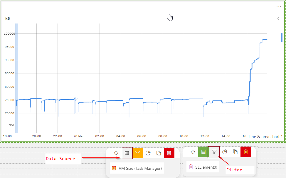
- Data Source: Parameters
Note: If you select ‘Protocol’, you will need to add an extra filter that will contain the element where the column parameter (that you would like to display in the trend line graph) is locatedOnce you select the data source, you will get the list of parameters. From the list of parameters select the column parameter that you would like to display in the trend line graph.
- Filter: Indices
Select the index from the table where the column parameter is located
Below an example using the connector ‘Microsoft Platform’:
Regarding the second question, a first approach will be to use the aggregation rules available on views. Once you create the aggregation rule, you can see as data source in dashboard:
- Data Source: Parameters
In this case, select ‘Views’. Once you select the view you can select the aggregation rule that you would like to display - Filter: Not required
The main drawback for this approach is that you will need to create a view that contain a single element.
Another approach is more complex and requires the DxM module DataAggregator:
- Create a query that will contain the aggregated value(s).
- Using the DataAggregator, execute the query at the desired frequency. The DataAggregator will generate a session record (e.g. CSV file) that contain the result of the query created in the previous step
- For data retention, these session records can be offloaded to an external database (e.g. Elasticsearch). This can be done for example through a connector that implements a logger table. The connector should take care of offloading the session records in the logger table at a specific frequency. The logger table should contain at least the following columns:
- Timestamp: This column will be used in the X Axis in the trend chart
- Aggregated value: This column will be used in the Y axis in the trend chart
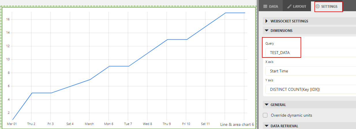
- From the dashboard you can use the logger table as data source (via GQI query). Currently trend charts supports GQI queries as data source:
Hope it helps!
Hi Bruno,
For both scenarios you can use Parameters feed. I would recommend you watch this video and follow the dashboard course: Charts – DataMiner Dojo
Particularly, for the second case, you need to first create an aggregation (see example here: Rui’s Rapid Recap – Aggregation – DataMiner Dojo), then when created you can refer to it in the Parameters feed by filtering from View.