Is it possible in the dashboard to store a value every x minutes in a table/graph and see the history to see how that value changes over time ?
I couldn't figure out how to do this
Hi Thomas,
With the current capabilities you would only be able to see a trend graph in a dashboard to visualize a metric over time in case that the trending is enabled on that metric. This has the advantage of course that you can see the metric its value from before when you opened the dashboard. But again, that requires the trending to be enabled already for that metric.
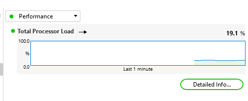
I guess what you are looking for is to have a capability to trace a metric over time starting from the point that you choose to do that in the dashboard. This would be the same as in the Data Display in an element card in DataMiner Cube, where you can click on a metric and change the LED bar to a trace graph (also for metrics that do not have trending enabled). Like shown below. Is that correct?

Hey Thomas,
Thank you for the feedback, that’s much appreciated. So this is like an uptime counter or something like that (expressed in hours, minutes, seconds) which once in while resets (which would happen if there was a reboot if it would be an uptime counter) and you would like to get the overall uptime in a month (factoring out the resets that occurred for example due to a reboot). Did I get that correct?
Hi Ben,
Thank you for your reply
But my value is in hours, minutes and seconds and sometimes it is reset, I wanted to have the possibility to have the history to calculate the total time over a month despite the reset