
Skip to content
DataMiner Dojo

More results...

Generic selectors
Exact matches only
Search in title
Search in content
Post Type Selectors
Search in posts
Search in pages
Search in posts
Search in pages
Log in
Menu
  • Updates & Insights
  • Questions
  • Learning
    • E-learning Courses
    • Tutorials
    • Open Classroom Training
    • Certification
      • DataMiner Fundamentals
      • DataMiner Configurator
      • DataMiner Automation
      • Scripts & Connectors Developer: HTTP Basics
      • Scripts & Connectors Developer: SNMP Basics
      • Visual Overview – Level 1
      • Verify a certificate
    • YouTube Videos
    • Solutions & Use Cases
      • Solutions
      • Use Case Library
    • Agility
      • Learn more about Agile
        • Agile Webspace
        • Everything Agile
          • The Agile Manifesto
          • Best Practices
          • Retro Recipes
        • Methodologies
          • The Scrum Framework
          • Kanban
          • Extreme Programming
        • Roles
          • The Product Owner
          • The Agile Coach
          • The Quality & UX Coach (QX)
      • Book your Agile Fundamentals training
      • Book your Kanban workshop
    • >> Go to DataMiner Docs
  • DevOps
    • About the DevOps Program
    • Sign up for the DevOps Program
    • DataMiner DevOps Support
    • Feature Suggestions
  • Downloads
  • Swag Shop
  • PARTNERS
    • Business Partners
    • Technology Partners
  • Contact
    • Sales, Training & Certification
    • DataMiner Support
    • Global Feedback Survey
  • >> Go to dataminer.services

Separate Colors for Trend Lines in the Same Dashboard Chart Component

42 views17 hours ago
1
Nur Aliah Nasution Mohd Asri431 18 hours ago 0 Comments

Hi Support,

I am using a Line & Area Chart component in a Dashboard.

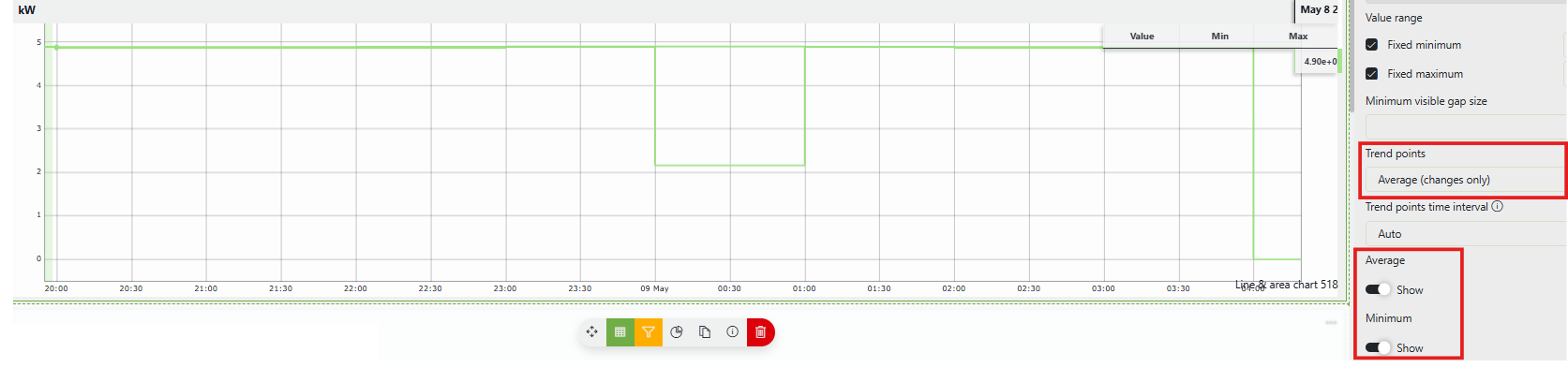
For the trend graph, I selected:

  • Trend points: Average (changes only)
  • Show Average
  • Show Minimum

The graph correctly displays both the Average and Minimum trend lines.

However, both lines are shown using the same color, making it difficult to distinguish between them.

Is there a way to configure different colors for:

  • Average line
  • Minimum line

within the same chart component?

Attached a screenshot for reference.
Thank you.

Wout Mahieu [SLC] [DevOps Catalyst] Answered question 17 hours ago

1 Answer

  • Active
  • Voted
  • Newest
  • Oldest
0
Wout Mahieu [SLC] [DevOps Catalyst]11.84K Posted 17 hours ago 0 Comments

Hi Nur,

This is unfortunately currently not possible. The average, min & max lines all take the same color. If you want us to create a feature to be able to customize this, I sugges you create a feature suggestion.

Wout Mahieu [SLC] [DevOps Catalyst] Answered question 17 hours ago
Please login to be able to comment or post an answer.

My DevOps rank

DevOps Members get more insights on their profile page.

My user earnings

0 Dojo credits

Spend your credits in our swag shop.

0 Reputation points

Boost your reputation, climb the leaderboard.

Promo banner DataMiner DevOps Professiona Program
DataMiner Integration Studio (DIS)
Empower Katas
Privacy Policy • Terms & Conditions • Contact

© 2026 Skyline Communications. All rights reserved.

DOJO Q&A widget

Can't find what you need?

? Explore the Q&A DataMiner Docs

[ Placeholder content for popup link ] WordPress Download Manager - Best Download Management Plugin