Skip to content
DataMiner DoJo

More results...

Generic selectors
Exact matches only
Search in title
Search in content
Post Type Selectors
Search in posts
Search in pages
Search in posts
Search in pages
Log in
Menu
  • Updates & Insights
  • Questions
  • Learning
    • E-learning Courses
    • Empower Replay: Limited Edition
    • Tutorials
    • Open Classroom Training
    • Certification
      • DataMiner Fundamentals
      • DataMiner Configurator
      • DataMiner Automation
      • Scripts & Connectors Developer: HTTP Basics
      • Scripts & Connectors Developer: SNMP Basics
      • Visual Overview – Level 1
      • Verify a certificate
    • Video Library
    • Books We Like
    • >> Go to DataMiner Docs
  • Expert Center
    • Solutions & Use Cases
      • Solutions
      • Use Case Library
    • Markets & Industries
      • Media production
      • Government & defense
      • Content distribution
      • Service providers
      • Partners
      • OSS/BSS
    • Agile
      • Agile Webspace
      • Everything Agile
        • The Agile Manifesto
        • Best Practices
        • Retro Recipes
      • Methodologies
        • The Scrum Framework
        • Kanban
        • Extreme Programming
      • Roles
        • The Product Owner
        • The Agile Coach
        • The Quality & UX Coach (QX)
    • DataMiner DevOps Professional Program
      • About the DevOps Program
      • DataMiner DevOps Support
  • Downloads
  • More
    • DataMiner Releases & Updates
    • Feature Suggestions
    • Climb the leaderboard!
    • Swag Shop
    • Contact
    • Global Feedback Survey
  • PARTNERS
    • All Partners
    • Technology Partners
    • Strategic Partner Program
    • Deal Registration
  • >> Go to dataminer.services

Is there a way to display trend data for multiple elements customizing X/Y axis?

Solved1.01K views1st August 2023chart Dashboard Visio
3
Steve Purcell [SLC] [DevOps Advocate]1.71K 26th July 2023 0 Comments

Is there a way to display trend data for multiple elements, grouping measurements by time and setting the X and Y axis as desired?

For our scenario, we have a rotator controller setup to an antenna which is collecting readings for the current angle of direction.

Then we have different elements making power and interference readings from the antenna which we would like to correlate to the antenna angle as the rotator is activated.

Today, we can show the trend lines for the readings from the Antenna Controller and measurement equipment, however, the X-Axis is always the timeline.

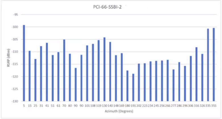
What we would like to do is set the X Axis to the angle, then have the associated readings (from the other element(s)) displayed as the value based on the associated timeline reference created a bar chart showing the reading levels based on antenna direction.

To complicate a little further, this is a single Windows server implementation (DataMiner and Cassandra on a single server), so there is no Elastic database available today.  If there is a possible solution using DOM or LCA we can discuss adding an Elastic server.

At the moment I believe the solution is to create a custom table driver which records (time, angle, readings 1 - x) then we can use Visio or Dashboards as the data is already correlated.  I am just checking to see if there is another way.

Steve Purcell [SLC] [DevOps Advocate] Selected answer as best 1st August 2023

2 Answers

  • Active
  • Voted
  • Newest
  • Oldest
1
Steve Purcell [SLC] [DevOps Advocate]1.71K Posted 1st August 2023 0 Comments

Final solution thanks to Ronalds's input...

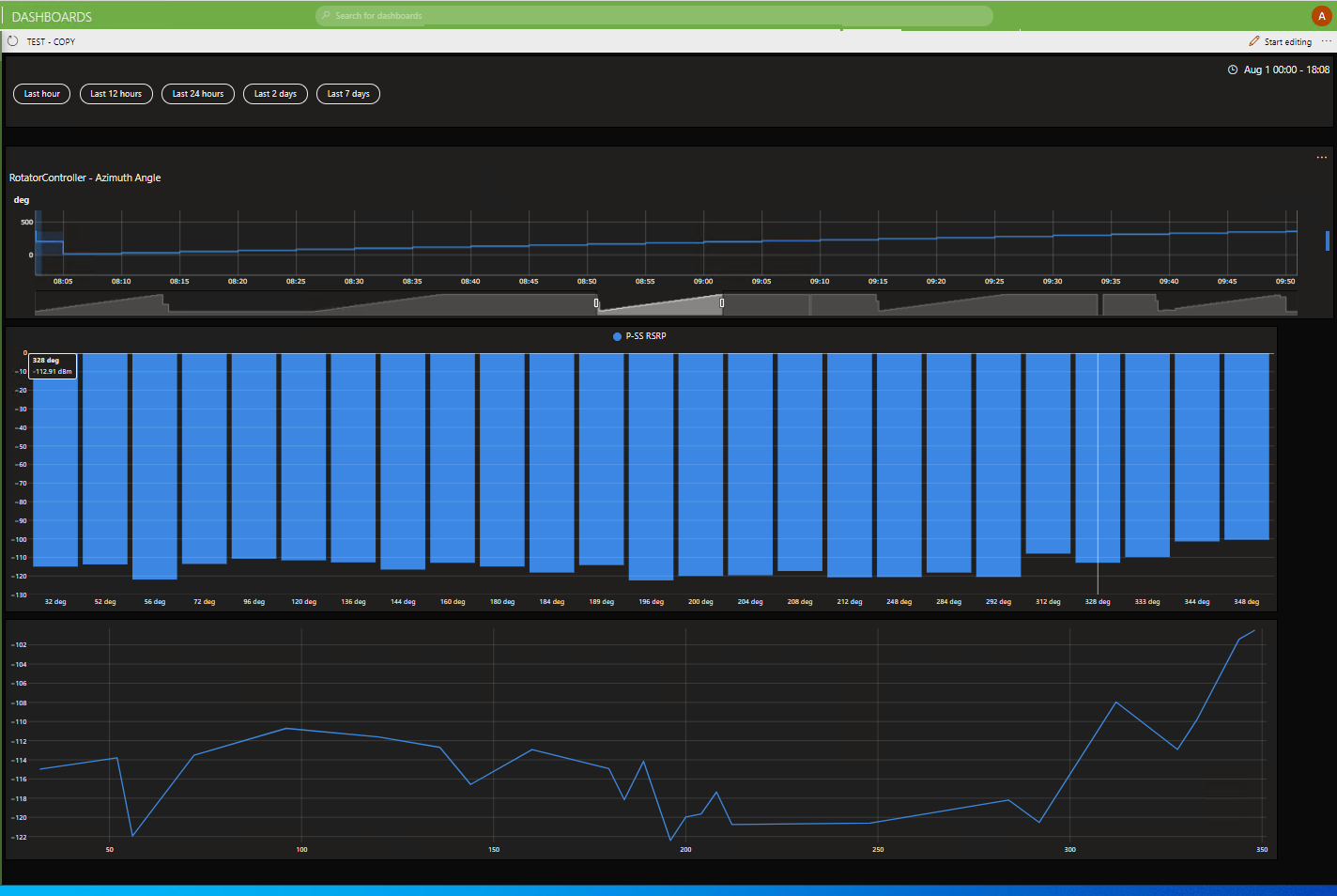
User selects initial timeframe from time control buttons at top of page, then zooms in on desired full rotation from top trend line.  This selection then gets applied (via GQI) to the bar and line charts below with the custom axis.

To build we used 3 GQI queries, probably not necessary, but kept the solution clean for initial deployment.

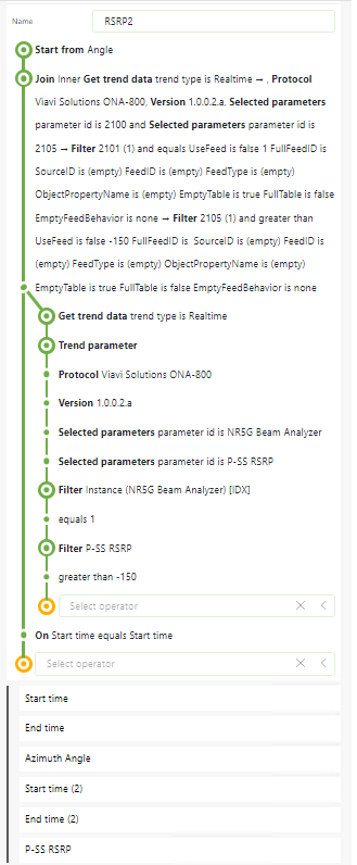
Query 1 Collected Trend Data from the Rotator Element:

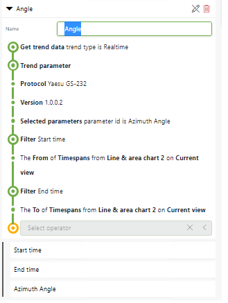
Query 2 Started from above query, then joined in the RSRP reading element:

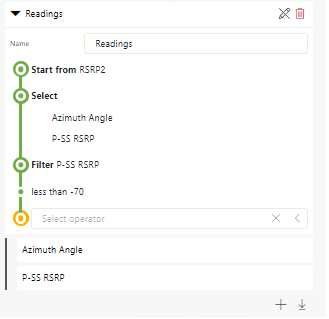
Query3 Was used so I could collect just the readings I was interested in from Query2 above to use on the Line and Bar Charts, allowing me to select the X and Y axis values.

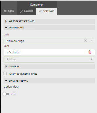
The final step was selecting the Chart shape from the Dashboard and using the settings page to set the 'Dimension' to set the Axis data.

Steve Purcell [SLC] [DevOps Advocate] Answered question 1st August 2023
You are viewing 1 out of 2 answers, click here to view all answers.
Please login to be able to comment or post an answer.

My DevOps rank

DevOps Members get more insights on their profile page.

My user earnings

0 Dojo credits

Spend your credits in our swag shop.

0 Reputation points

Boost your reputation, climb the leaderboard.

Promo banner DataMiner DevOps Professiona Program
DataMiner Integration Studio (DIS)
Empower Katas
Privacy Policy • Terms & Conditions • Contact

© 2025 Skyline Communications. All rights reserved.

DOJO Q&A widget

Can't find what you need?

? Explore the Q&A DataMiner Docs

[ Placeholder content for popup link ] WordPress Download Manager - Best Download Management Plugin