Is there a way to display trend data for multiple elements, grouping measurements by time and setting the X and Y axis as desired?
For our scenario, we have a rotator controller setup to an antenna which is collecting readings for the current angle of direction.
Then we have different elements making power and interference readings from the antenna which we would like to correlate to the antenna angle as the rotator is activated.
Today, we can show the trend lines for the readings from the Antenna Controller and measurement equipment, however, the X-Axis is always the timeline.
What we would like to do is set the X Axis to the angle, then have the associated readings (from the other element(s)) displayed as the value based on the associated timeline reference created a bar chart showing the reading levels based on antenna direction.
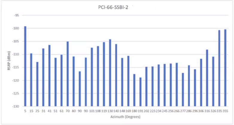
To complicate a little further, this is a single Windows server implementation (DataMiner and Cassandra on a single server), so there is no Elastic database available today. If there is a possible solution using DOM or LCA we can discuss adding an Elastic server.
At the moment I believe the solution is to create a custom table driver which records (time, angle, readings 1 – x) then we can use Visio or Dashboards as the data is already correlated. I am just checking to see if there is another way.
Hi Steve,
I believe this should be possible using our Generic Query Interface (GQI).
There we have built-in data sources for trend data and operators to join, aggregate, group and transform that data.
If the built-in data sources and operators are not capable of handling your use-case, it allows you to write a custom ad-hoc data source.
This is a C# script where you expose and manipulate any external data or data from DataMiner.
Once you have such a query, you can visualize it in a dashboard using the bar chart or line chart component.
These components allow you to choose what is shown on the X/Y axes.
It is possible that they still lack some customization to visualize them exactly like in your screenshot, but you can get close already:
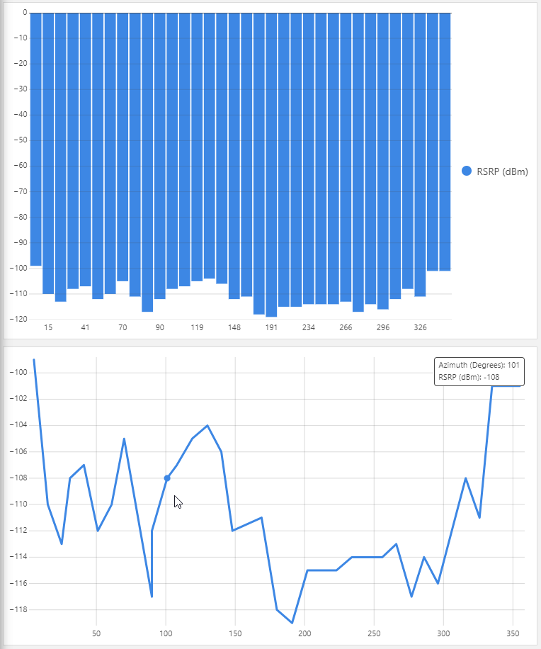
For my screenshots I injected some dummy data from a CSV file with an ad-hoc data source into a GQI query. I recreated the setup on ziinedev: https://ziinedev.skyline.be/dashboard/#/db/Stagingarea/RGE/AntennaController.dmadb
For the actual query, you can try using the built-in Trend data source first (available from 10.3.2: https://intranet.skyline.be/DataMiner/Lists/ReleaseNotes/DispForm2.aspx?ID=35151 under softlaunch flag “GenericInterface”).
Hi Ronald, thanks for the idea. This ended up working great. I used GQI to collect the Trend Data for the Angle from the Azimuth Controller element, then did an (inner) join to the RSRP test element. I then tied together as a feed for the timeframe and top trend based on angle, so when the user selects a single full rotation, the bottom charts display with the custom axis as desired.
Final solution thanks to Ronalds’s input…
User selects initial timeframe from time control buttons at top of page, then zooms in on desired full rotation from top trend line. This selection then gets applied (via GQI) to the bar and line charts below with the custom axis.
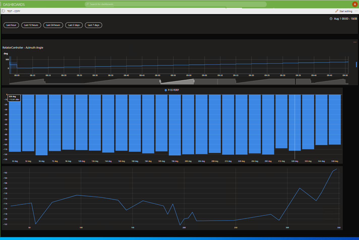
To build we used 3 GQI queries, probably not necessary, but kept the solution clean for initial deployment.
Query 1 Collected Trend Data from the Rotator Element:
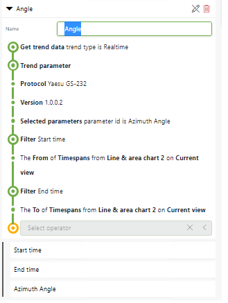
Query 2 Started from above query, then joined in the RSRP reading element:
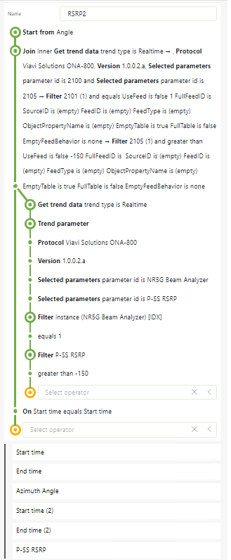
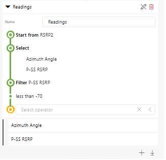
Query3 Was used so I could collect just the readings I was interested in from Query2 above to use on the Line and Bar Charts, allowing me to select the X and Y axis values.
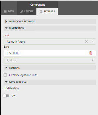
The final step was selecting the Chart shape from the Dashboard and using the settings page to set the ‘Dimension’ to set the Axis data.
Hi Ronald, Thanks for the information. From your screenshots I believe this will work. Were your screenshots from GQI or Ad Hoc Data? Can you show me what your solution looked like or move it to ZiineDev so I can look at how the solution was setup.