Hi,
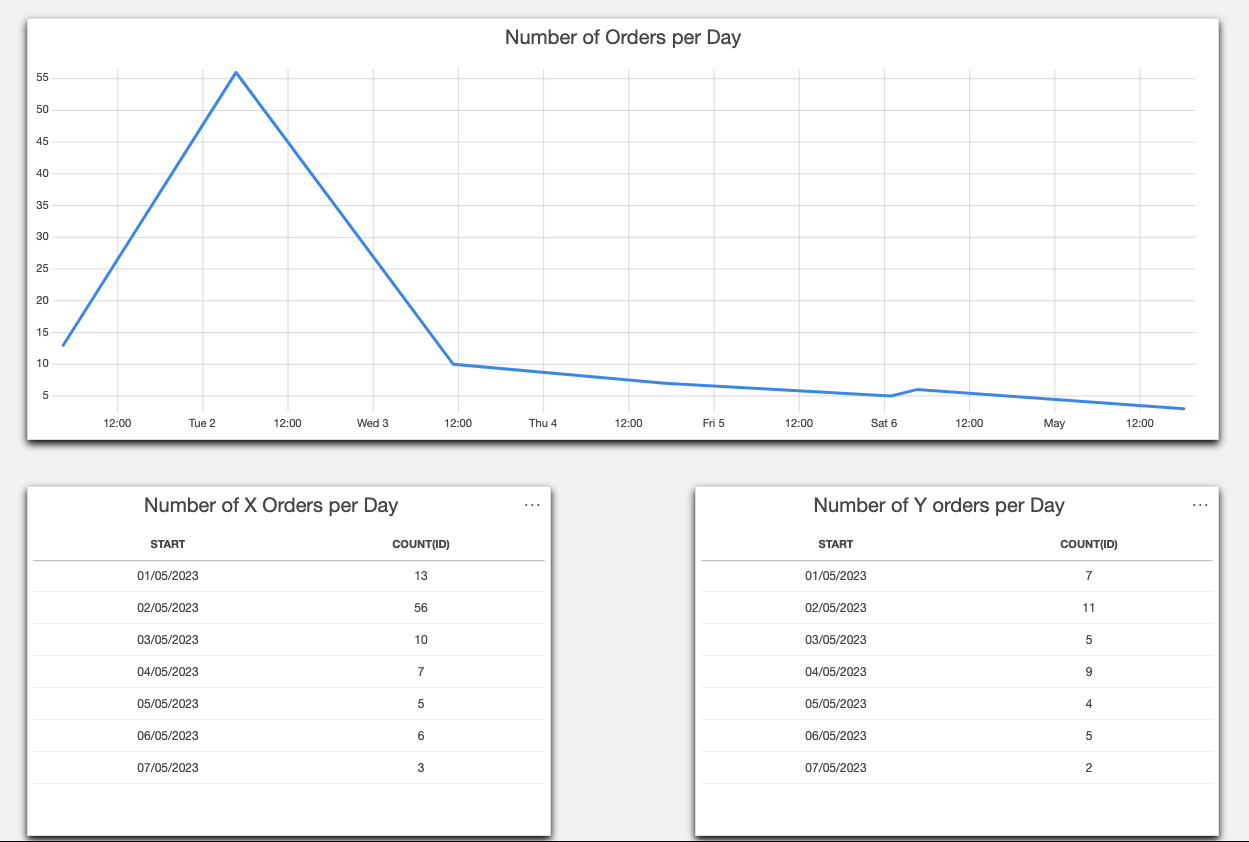
I have a question related to the Dashboards app. Do you know if it is possible to display data from multiple queries in a single line chart? The business need would be to see several trend curves at a glance. I can add multiple queries in one line chart but only one data set can be displayed at once. Any ideas or workarounds?

Hi Jari,
Great question, unfortunately this is something that is still on our backlog. There are no workarounds for this as far as I know.
Edit:
You should be able to track the progress using DCP188381.
Hi Paul, using trend groups is currently not on the roadmap. To gauge interest in this feature from the community, I suggest raising this as a new feature suggestion (https://community.dataminer.services/feature-suggestions).
Displaying multiple trend lines based on GQI data is available as of 10.4.6.
I guess the answer for including saved “Trend Groups” into a Dashboard is the same? Is this on the roadmap too?