Hello,
I am wanting to add a trending graph to a visio drawing. The only issue is when I set up trending on the parameter in a table, it sets up individual trending graphs for every single item. Is it possible to make dataminer do an overall trending for the parameter Network Delay shown in the screenshot?

Hey Ben, that is correct. Instead of an individual trending graph for every single file transfer, I want to see an overall trending total if possible.
Just one more follow-up question: would you want to alarm also on that aggregate value or just be able to see the graph over time of the aggregate value?
Alarming would be a great option as operations may want it but not an absolute requirement.
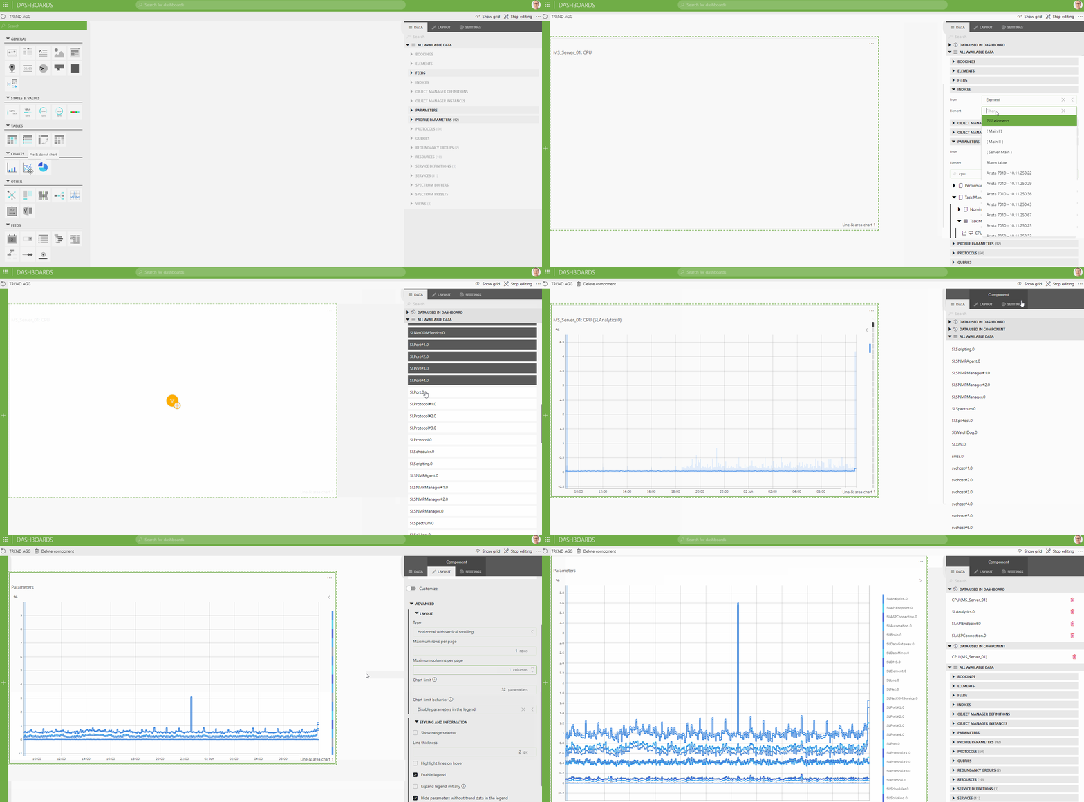
In addition to item 2 from Ben, you can also have stacked line charts in dashboards. Here is a quick gif on how you can do that for example on the task manager table of a Windows server:

see also: Line & area chart | DataMiner Docs
Dashboards can also be embedded in Visio: see Embedding dashboards - DataMiner Dojo
Hey Peter, this is wonderful information and great to know. So, I am running into one issue. The parameter I want to monitor and see trending data is for Network Delay under sessions on the IBM Aspera driver. These sessions are constantly changing and being added/removed. When I go to indicies, they are all greyed out. Is it possible to have the dashboard just look at Network Delay as a whole?
Ok, so I do see the indicies now. But like I said, they are always changing so I just need it to monitor any that appears under Sessions for Network Delay.
Linking to all rows from a table is not possible right away at this moment, but there is a workaround you can apply via a ‘parameter feed’ component in your dashboard.
So here’s is what you can do:
1. Add a parameter feed component to your dashboard. Link it to your element and column parameter.
2. Select the component and in the Component Settings at the right hand side enable [x] Auto Select all and ensure the default grouping is ‘All together’.
3. Add a trend line component and link it to the ‘Parameters’ feed from your Parameter feed (so in ‘Data’ in the right panel again, expand ‘feeds’ and expand ‘Parameter selector’ and drag ‘Parameters’ to your trend chart.
4. Refresh your dashboard and you should have all rows loaded initially. You can enable or disable lines by using the selection boxes from the parameter feed component.
If you don’t find your way, just let me know, then I can make a new gif that illustrates this visually.
Good luck!
Hey Peter, this worked. Thank you so much! This was very helpful and a good learning experience!
Great! Thx for reporting back that it was helpful.
Hi David, do you mean that you would like to see the trending of the aggregate value of all the individual metrics?