We want to show the trend graph of a parameter cell in a dashboard. As we don’t want to provide access to the mobile app, we don’t want to use the parameter table with the trend icons in the table. That is why we are using a table filled with a GQI query. Now we want to show the trend graph of a specific column/row based on a row selection of the table filled with GQI.
Any ideas on how to achieve this?
Michiel Saelen [SLC] [DevOps Advocate] Selected answer as best
Hi Michiel,
That should be possible. In the line chart component your could configure it as follows:
- Data source: Select the parameter that you would like to display in the line chart component. For this purpose you could use the data source Parameters -> From Protocol
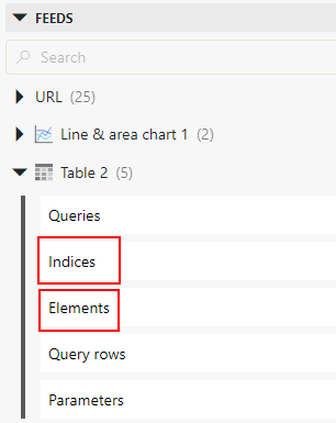
- Filter: Select the feeds from table that contains data from your GQI query. In this case you will need two feeds:
- Elements: To know from which element the trend graph should be displayed
- Indices: To know which index should be used to display the trend graph
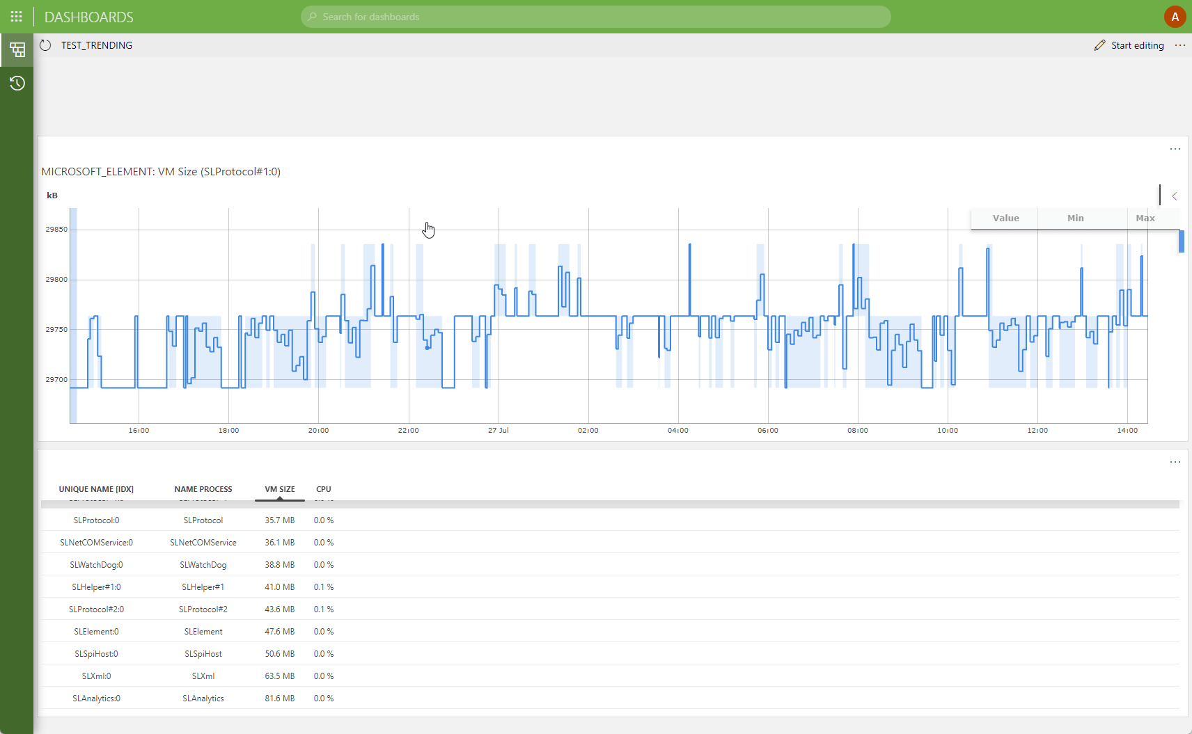
After this configuration, you should be able to display the trend graph of the selected row:
Michiel Saelen [SLC] [DevOps Advocate] Selected answer as best
Hi Miguel,
Indeed this works.
For other people, if you select parameter from ‘Element’ instead of ‘Prrotocol’ it will not work. If you do not have a row selected in your table, then you will not see the indices as feed.