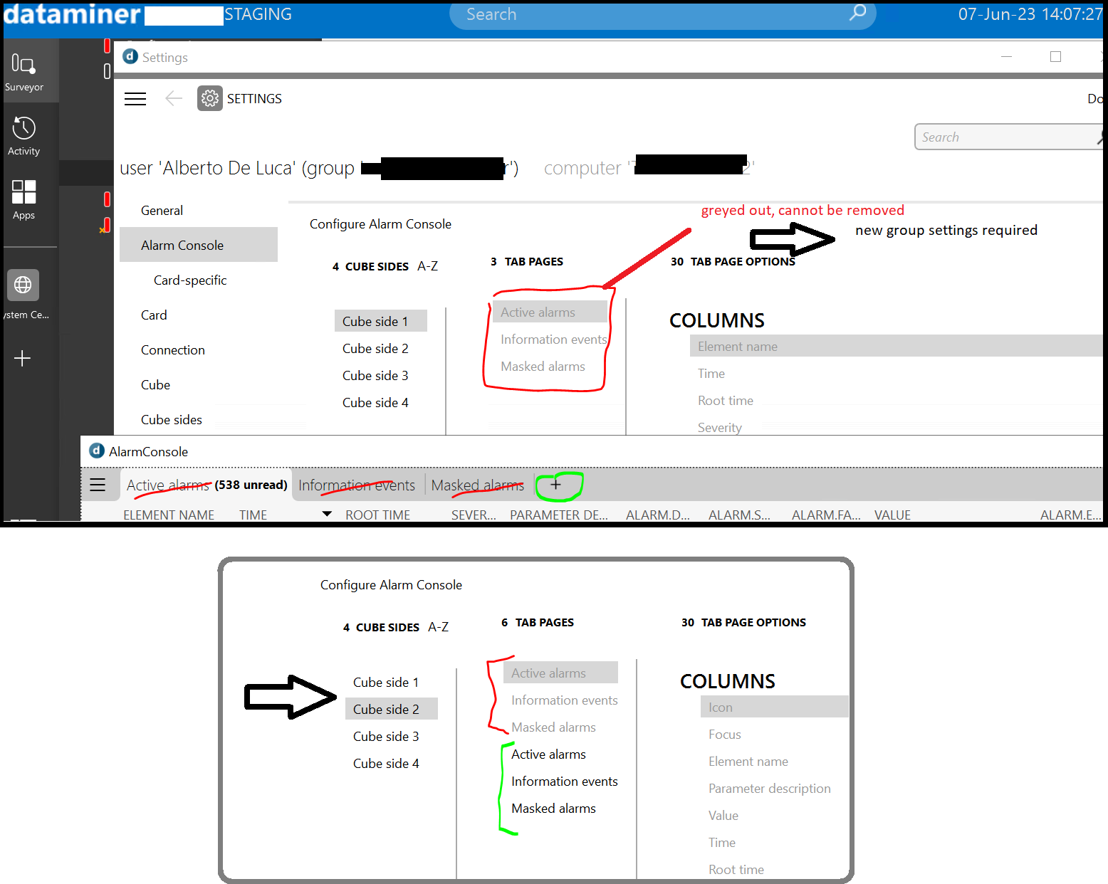
Please, Dojo – as per title – wondering if there is a quick option to change the default Cube settings (so not necessarily at group level) that allows to land on a page without any “Alarm Tabs” open at the bottom of the client – if not, am I correct the only possibility is to define a new group with no Alarm Tabs defined on any of the Cube sides?

The use case would be to rely on Cube Desktop App also for users that are mainly browsing dashboard & visuals, with only occasional interest on alarms, so they always land on the minimized alarm console – ideally with just the plus sign (no “new tab” default if this can be an option):
Nothing like this is possible. The only thing that comes close is the Security Right to disable the Alarm Console, which would entirely remove it for the select user group. Not sure actually if that also removes the Alarm option in the element and service card, or if those users could still use it there.
I’m not sure what kind of data and information you want those users to be able to consult. But typically, from a more general conceptual perspective, we are looking at user-definable apps to broaden the audience for DataMiner within an organization (and consider Cube more for the professionals that actually do this full-time, such as NOC operators). In such an app you can already build quite some nice experiences, that could serve the purpose of browsing some of the data.
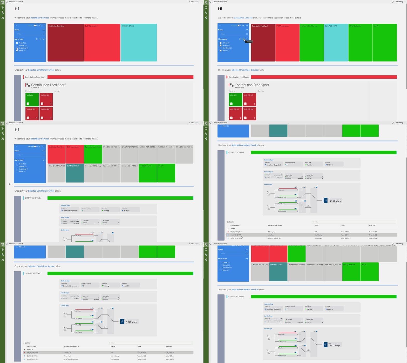
We are trying to make time to create more out of the box dashboards, acting upon elements, services, and alarms. There’s many different generic perspectives that can be made on the data. There’s a blog coming up with a generic service management dashboard. I’ll post a separate response with a screen cap. If you have a cloud connected DataMiner System, you can get it here with just a click. https://catalog.dataminer.services/catalog/4636
And then I forget to make the actual point that I wanted to make: if you have specifics on your use case, would could try to make such generic dashboard to browse elements and see basic information about it.
Sample referenced in earlier comments, available from the Catalog on Catalog (dataminer.services)

These screens look just amazing!
Thanks for sharing, indeed with the newer apps the possibilities are virtually limitless.
PS: Any chance I can refresh my vote for this old suggestion?
https://community.dataminer.services/new-feature-suggestions/add-image-in-comments/
We have many more users posting comments on dojo now – inline images would improve readability of the threads when we refer to them later on
Thanks for your feedback, Ben (and this time I’m referring to the right BV)
(;
Indeed the Dashboards are also being evaluated, with the possibility to launch quick lists of alarms ad-hoc, such as “critical in the last 24h”.
That might be the approach we’ll follow for now – marking this as solved.