Skip to content
DataMiner DoJo

More results...

Generic selectors
Exact matches only
Search in title
Search in content
Post Type Selectors
Search in posts
Search in pages
Search in posts
Search in pages
Log in
Menu
  • Updates & Insights
  • Questions
  • Learning
    • E-learning Courses
    • Empower Replay: Limited Edition
    • Tutorials
    • Open Classroom Training
    • Certification
      • DataMiner Fundamentals
      • DataMiner Configurator
      • DataMiner Automation
      • Scripts & Connectors Developer: HTTP Basics
      • Scripts & Connectors Developer: SNMP Basics
      • Visual Overview – Level 1
      • Verify a certificate
    • Video Library
    • Books We Like
    • >> Go to DataMiner Docs
  • Expert Center
    • Solutions & Use Cases
      • Solutions
      • Use Case Library
    • Markets & Industries
      • Media production
      • Government & defense
      • Content distribution
      • Service providers
      • Partners
      • OSS/BSS
    • Agile
      • Agile Webspace
      • Everything Agile
        • The Agile Manifesto
        • Best Practices
        • Retro Recipes
      • Methodologies
        • The Scrum Framework
        • Kanban
        • Extreme Programming
      • Roles
        • The Product Owner
        • The Agile Coach
        • The Quality & UX Coach (QX)
    • DataMiner DevOps Professional Program
      • About the DevOps Program
      • DataMiner DevOps Support
  • Downloads
  • More
    • DataMiner Releases & Updates
    • Feature Suggestions
    • Climb the leaderboard!
    • Swag Shop
    • Contact
    • Global Feedback Survey
  • PARTNERS
    • All Partners
    • Technology Partners
    • Strategic Partner Program
    • Deal Registration
  • >> Go to dataminer.services

Column & Bar charts with axis lines

224 views19th February 2025charts low code app
1
Robbe De Ghein [SLC] [DevOps Advocate]785 19th February 2025 0 Comments

Hi Dojo,

In a low code app I have a Column & Bar chart that shows a count of something.
On the axis, there are helper lines to quickly identify the shown values.
It works great for higher values, but gets confusing when the values are small.

eg

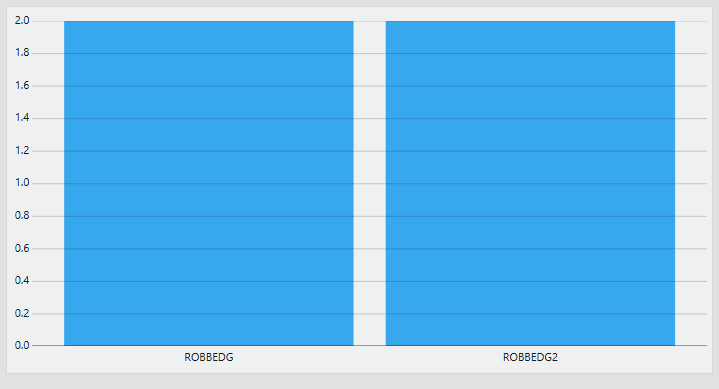
I was wondering if its possible to only show the axis helper lines for integer values, as in this specific use case you cannot have for example 1.2 count.

It would remove some of the clutter for low counts.
It would also help as a visual indicator how many items there are: if there are a low number of axis lines, you are in the small count ranges.

Toon Casteele [SLC] [DevOps Enabler] Answered question 19th February 2025

1 Answer

  • Active
  • Voted
  • Newest
  • Oldest
0
Toon Casteele [SLC] [DevOps Enabler]7.01K Posted 19th February 2025 0 Comments

In general, changing the distribution of ticks or even the range of the y axis is not something you can currently do in web apps. I would suggest adding your suggestion onto Dashboards – fixed y-axis on trending or making a new one.

Toon Casteele [SLC] [DevOps Enabler] Answered question 19th February 2025
Please login to be able to comment or post an answer.

My DevOps rank

DevOps Members get more insights on their profile page.

My user earnings

0 Dojo credits

Spend your credits in our swag shop.

0 Reputation points

Boost your reputation, climb the leaderboard.

Promo banner DataMiner DevOps Professiona Program
DataMiner Integration Studio (DIS)
Empower Katas
Privacy Policy • Terms & Conditions • Contact

© 2025 Skyline Communications. All rights reserved.

DOJO Q&A widget

Can't find what you need?

? Explore the Q&A DataMiner Docs