Hello all
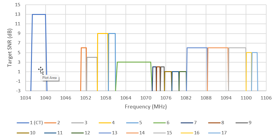
We have a table with 3 values, carriers center frequency, bandwidth, and Target SNR, and we would like to have this represented in DataMiner in the following way:

I've been looking at several possibilities (Visual Overview/Dashboards) but no luck... any idea ?
Thanks a lot for your help
Marieke Goethals [SLC] [DevOps Catalyst] Selected answer as best
I have seen an implementation like that somewhere, and they used the drawing capability with Path Markup. Making a shape display a custom drawing using Path markup | DataMiner Docs
I believe this was a capture of the result:

Marieke Goethals [SLC] [DevOps Catalyst] Selected answer as best
Thanks a lot Ben that looks like a solution !