Skip to content
DataMiner DoJo

More results...

Generic selectors
Exact matches only
Search in title
Search in content
Post Type Selectors
Search in posts
Search in pages
Search in posts
Search in pages
Log in
Menu
  • Updates & Insights
  • Questions
  • Learning
    • E-learning Courses
    • Empower Replay: Limited Edition
    • Tutorials
    • Open Classroom Training
    • Certification
      • DataMiner Fundamentals
      • DataMiner Configurator
      • DataMiner Automation
      • Scripts & Connectors Developer: HTTP Basics
      • Scripts & Connectors Developer: SNMP Basics
      • Visual Overview – Level 1
      • Verify a certificate
    • Video Library
    • Books We Like
    • >> Go to DataMiner Docs
  • Expert Center
    • Solutions & Use Cases
      • Solutions
      • Use Case Library
    • Markets & Industries
      • Media production
      • Government & defense
      • Content distribution
      • Service providers
      • Partners
      • OSS/BSS
    • Agile
      • Agile Webspace
      • Everything Agile
        • The Agile Manifesto
        • Best Practices
        • Retro Recipes
      • Methodologies
        • The Scrum Framework
        • Kanban
        • Extreme Programming
      • Roles
        • The Product Owner
        • The Agile Coach
        • The Quality & UX Coach (QX)
    • DataMiner DevOps Professional Program
      • About the DevOps Program
      • DataMiner DevOps Support
  • Downloads
  • More
    • DataMiner Releases & Updates
    • Feature Suggestions
    • Climb the leaderboard!
    • Swag Shop
    • Contact
    • Global Feedback Survey
  • PARTNERS
    • All Partners
    • Technology Partners
    • Strategic Partner Program
    • Deal Registration
  • >> Go to dataminer.services

Alarm Distribution Graph in Dashboards

Solved968 views5th June 2024Alarm Distribution Dashboards Visulisation
4
Alex Barnett [DevOps Member]222 26th March 2024 1 Comment

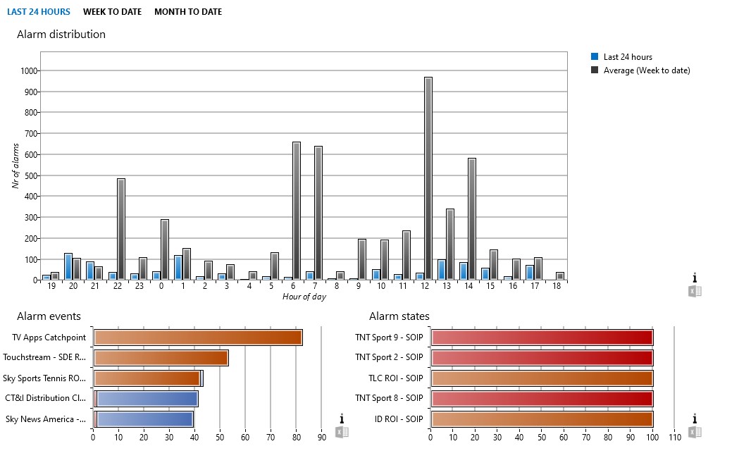
Hi, what is the best way to display an Alarm Distribution graph against a given timespan in the new Dashboards module please? Something like the Alarm distribution graph in the old Reporter module (see image)?

Alex Barnett [DevOps Member] Selected answer as best 5th June 2024
Ronald Gerard [SLC] [DevOps Advocate] commented 28th March 2024

Hi Alex, the best way to achieve this with the new dashboards would be using an Ad Hoc data source in a GQI query. We should have something like this available in the DataMiner Catalog, but at the moment of writing this is not the case yet.
We’ll add something you can use and post it as an answer here when ready.

2 Answers

  • Active
  • Voted
  • Newest
  • Oldest
4
Ronald Gerard [SLC] [DevOps Advocate]1.74K Posted 29th March 2024 0 Comments

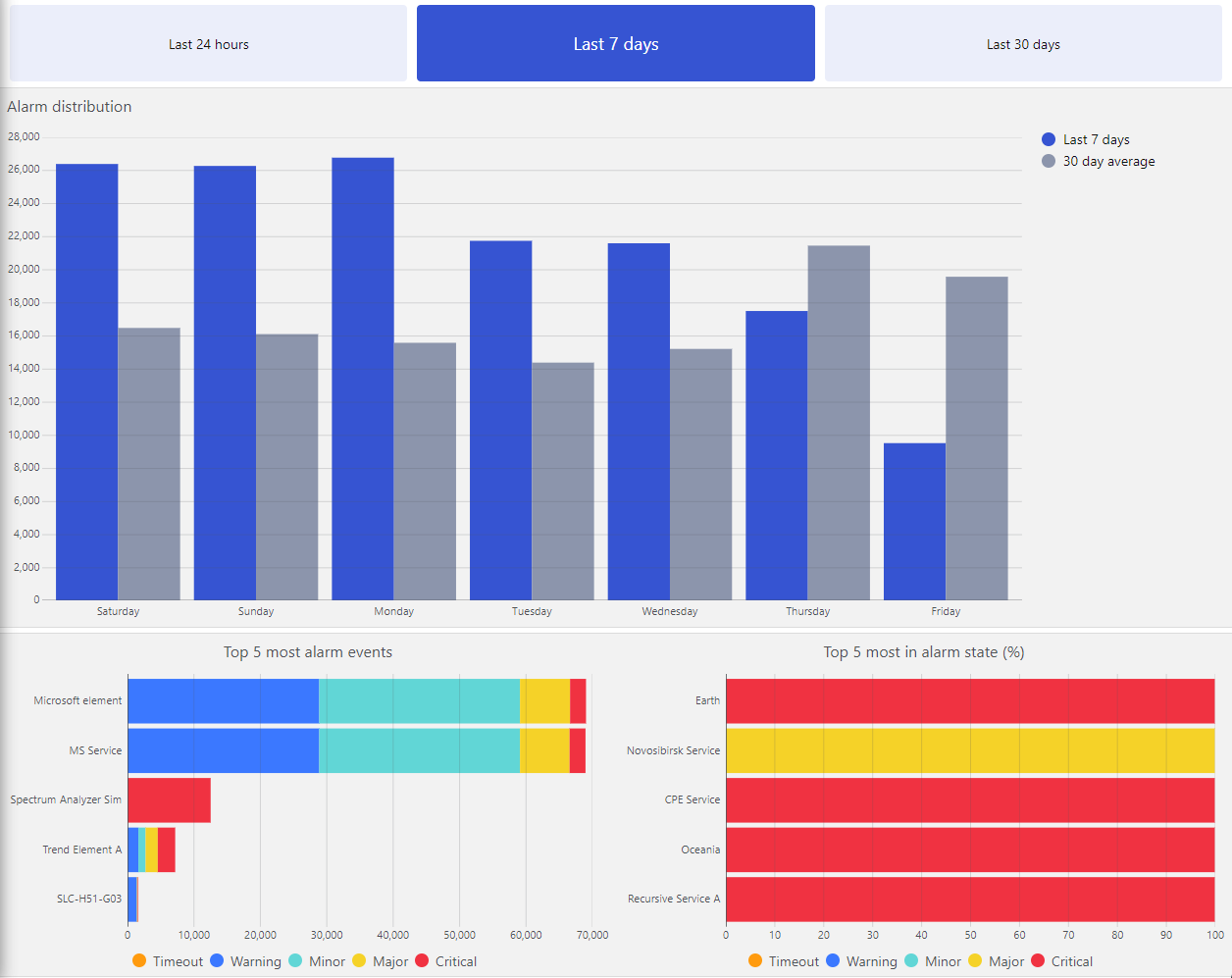
We have added a package on the catalog, compatible from DataMiner 10.4.0 onwards: Alarm Report | Catalog (dataminer.services)

This package contains the following:

  • Ad hoc data source to retrieve the alarm distribution
  • Ad hoc data source to retrieve the top most alarm events
  • Ad hoc data source to retrieve the top most time in alarm state
  • An Alarm Report dashboard, using these data source in bar charts

All can be customized further for more specific needs.

As Tobe shows, you can also almost get there using the built-in Alarms data source. But be aware that this approach will require GQI to pull all the alarm event data in memory every time.
In contrast, the ad hoc data sources in the catalog package reuse the existing specialized report messages to get the best performance.

Ideally, in the future, these type of data sources will come available out of the box.

Alex Barnett [DevOps Member] Selected answer as best 5th June 2024
0
Tobe Deprez [SLC] [DevOps Advocate]894 Posted 28th March 2024 0 Comments

I wasn’t able to recreate the full graph (yet), but you can create part of it using the existing ‘Get alarms’ data source with the following query.

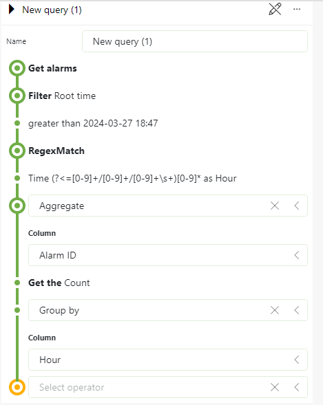
This query first fetches all alarms since yesterday (at the time of writing). Then, I perform a regex match which extracts the hour of each alarm from the ‘Time’ column, and I save it in the ‘Hour’ column.

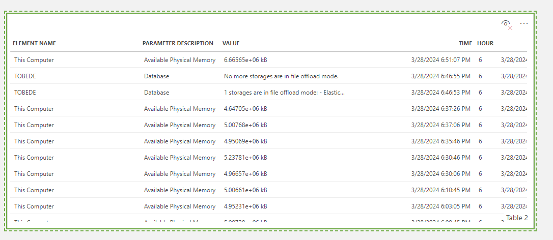
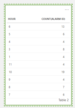
Once you have that, you can count the number of alarms per hour using the ‘Aggregate’ and the ‘Group by’ operators. This will yield something like this

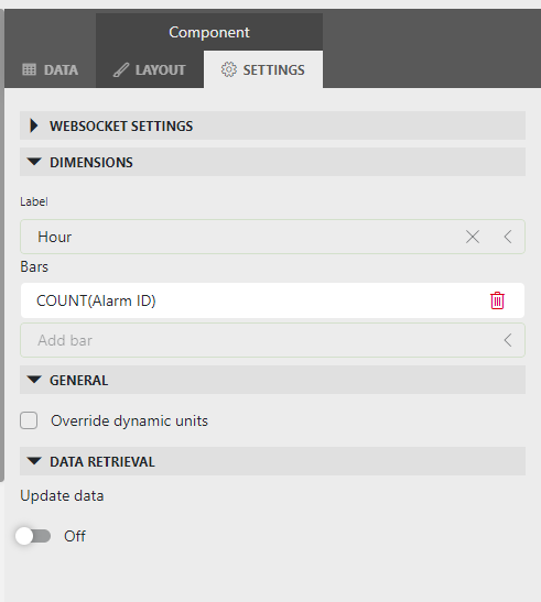
Now, you can visualize this data as a bar chart by selecting the ‘Column & Bar chart’ visualization, and setting the correct axis as below.

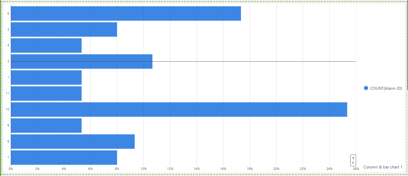
Finally, you will have an overview of the number of alarms per hour of the day.

Similarly, by aggregating on the element name (or service, view, …) you can get the number of alarms per element (resp. service, view, …) over the last 24h.

Tobe Deprez [SLC] [DevOps Advocate] Answered question 28th March 2024
Please login to be able to comment or post an answer.

My DevOps rank

DevOps Members get more insights on their profile page.

My user earnings

0 Dojo credits

Spend your credits in our swag shop.

0 Reputation points

Boost your reputation, climb the leaderboard.

Promo banner DataMiner DevOps Professiona Program
DataMiner Integration Studio (DIS)
Empower Katas
Privacy Policy • Terms & Conditions • Contact

© 2025 Skyline Communications. All rights reserved.

DOJO Q&A widget

Can't find what you need?

? Explore the Q&A DataMiner Docs