In today's digital world, user experience (UX) plays a pivotal role in determining the success of any software application. Developers and designers alike are constantly striving to create visually appealing and user-friendly interfaces. And among all the design elements, the choice of color schemes stands out the most.
That's why the majority of today's platforms and applications allow users to easily switch between light backgrounds (light mode) and dark backgrounds (dark mode). Including DataMiner!
- Why do black themes matter?
- Improve UX on your DataMiner UI
- How to get started: dark theme visual overviews in DataMiner Cube
Why do black themes matter?
Did you know that black themes consume less power on devices, especially devices with OLED screens, because the pixels can turn off entirely when displaying pure black? Better yet, did you know that dark mode reduces the amount of light emitted by your screens, reducing eye fatigue in low-light conditions?
However, when all is said and done, it's the aesthetics of the dark theme that have really jacked up its popularity.
Dark themes have a unique elegance. They look sleek, modern, and professional. A dark background also allows important elements to stand out, ensuring clarity and ease of navigation. Whether it's a website, a mobile app, or a software interface, dark themes have the ability to enhance the overall aesthetic appeal and the user experience.
"If once you start down the dark path, forever will it dominate your destiny."
Yoda, Star Wars: Episode V
Improve UX on your DataMiner UI
DataMiner is all about empowering people to transform their data into actionable insights they can build upon. Creating visually appealing user interfaces is one of the ways to get information across easily and clearly. Besides, no one gets happy from looking at dashboards that look cluttered.
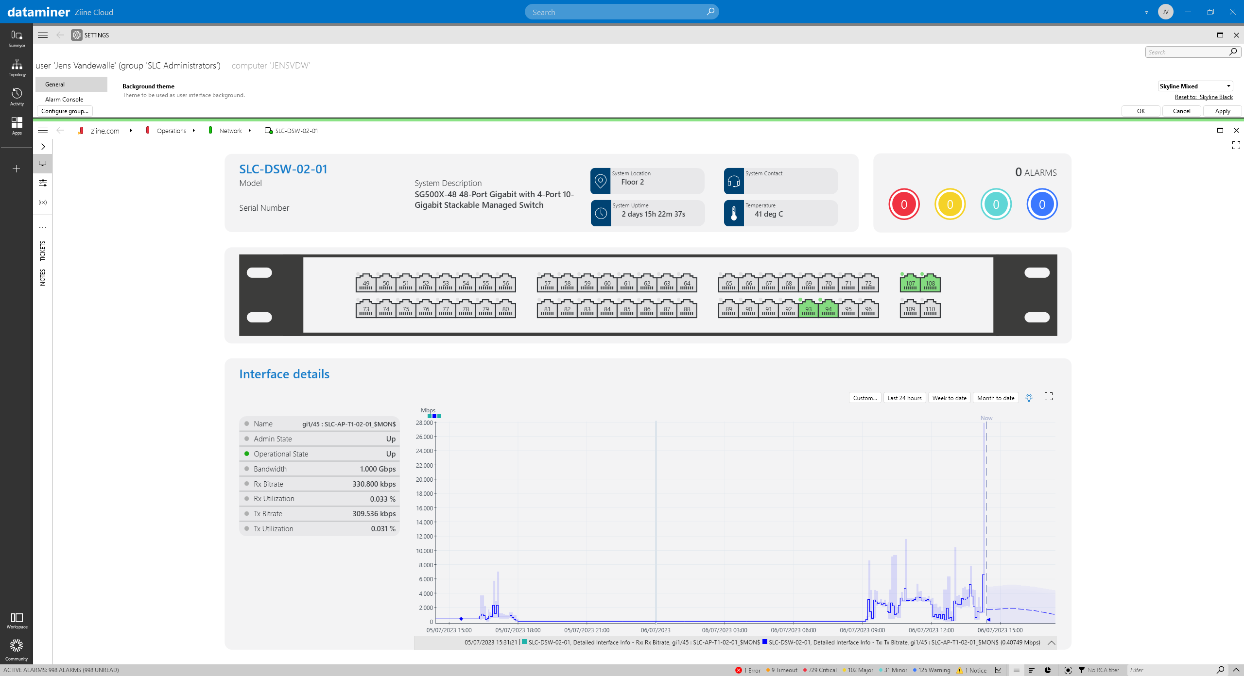
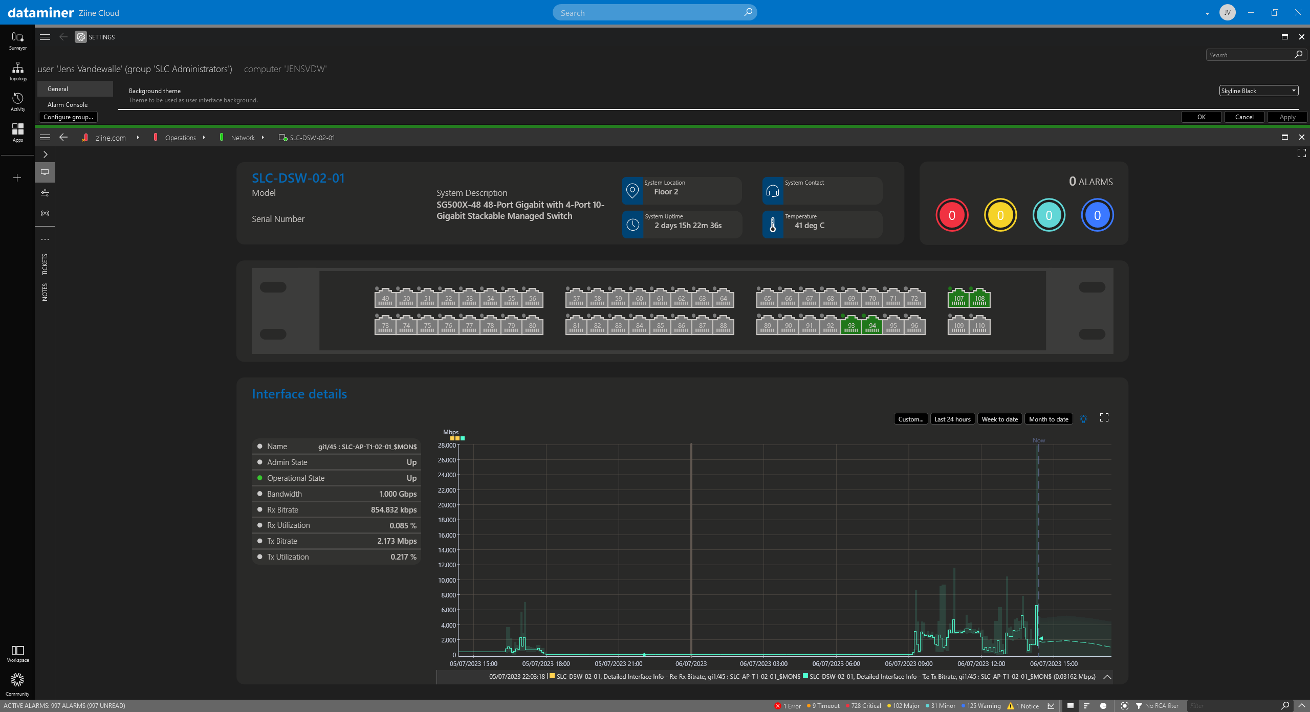
Fortunately, choosing the right color scheme can often make a UI instantly more appealing, especially in combination with dark mode, which already looks sleeker. Go on, try out the slider below to see the difference! Click and drag the center of the image to reveal the power of the dark side:
See what a difference a black theme makes?
How to get started: dark theme visual overviews in DataMiner Cube
To make your Visio drawings compatible with both dark and light themes in DataMiner Cube, you need to specify three colors on page level: the foreground color, the background color, and the accent color.
Consider the following color specifications: #000000=ThemeForeground|#FF0000=ThemeAccentColor|#FFFFFF=ThemeBackground
If you specify the value above, in a theme with a light background, black text and shapes will be displayed on a white background, while in a theme with a dark background, the colors will be reversed. In other words, all items in the drawing that use the colors specified in the option will be assigned the theme color.
Take a look at the following Visio diagram where these values are used: ThemeForeground for text and shapes; ThemeAccentColor for titles, and ThemeBackground for the diagram background.
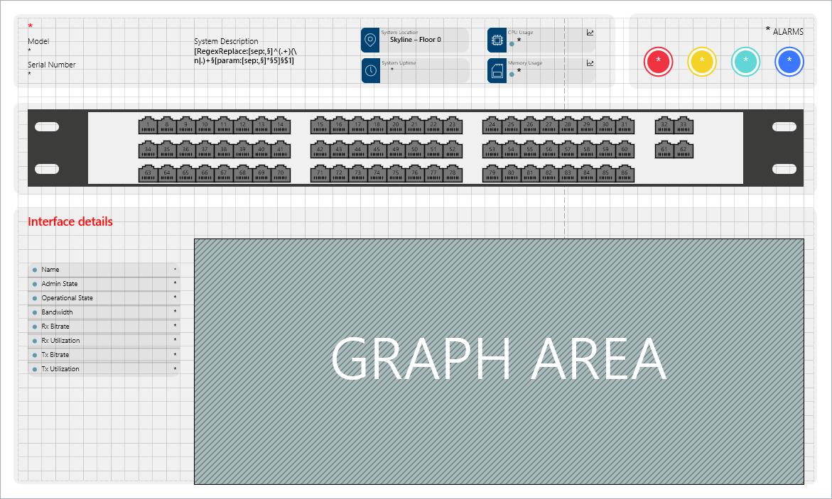
- You can play around with the opacity of shapes to create grey shapes in your Visual Overview.
- Other colors can be hard-coded into your Visio diagram. But keep in mind that the colors should work well with both the light and dark themes.
This is how your Visio drawing will look in DataMiner Cube if you toggle between dark and light mode: