Over the past couple of months, we have extended the DataMiner Generic Query Interface (GQI) with some powerful time dimension querying capabilities. These allow users to retrieve historical parameter data from an element, filter out specific time ranges and aggregate the resulting data in many different ways. In this blog post, we’ll take a deep dive into a practical example to show how you can leverage these functionalities and gain insights into your trend data.
In this example, we’ll analyze the historical bandwidth utilization of an optical fiber link.
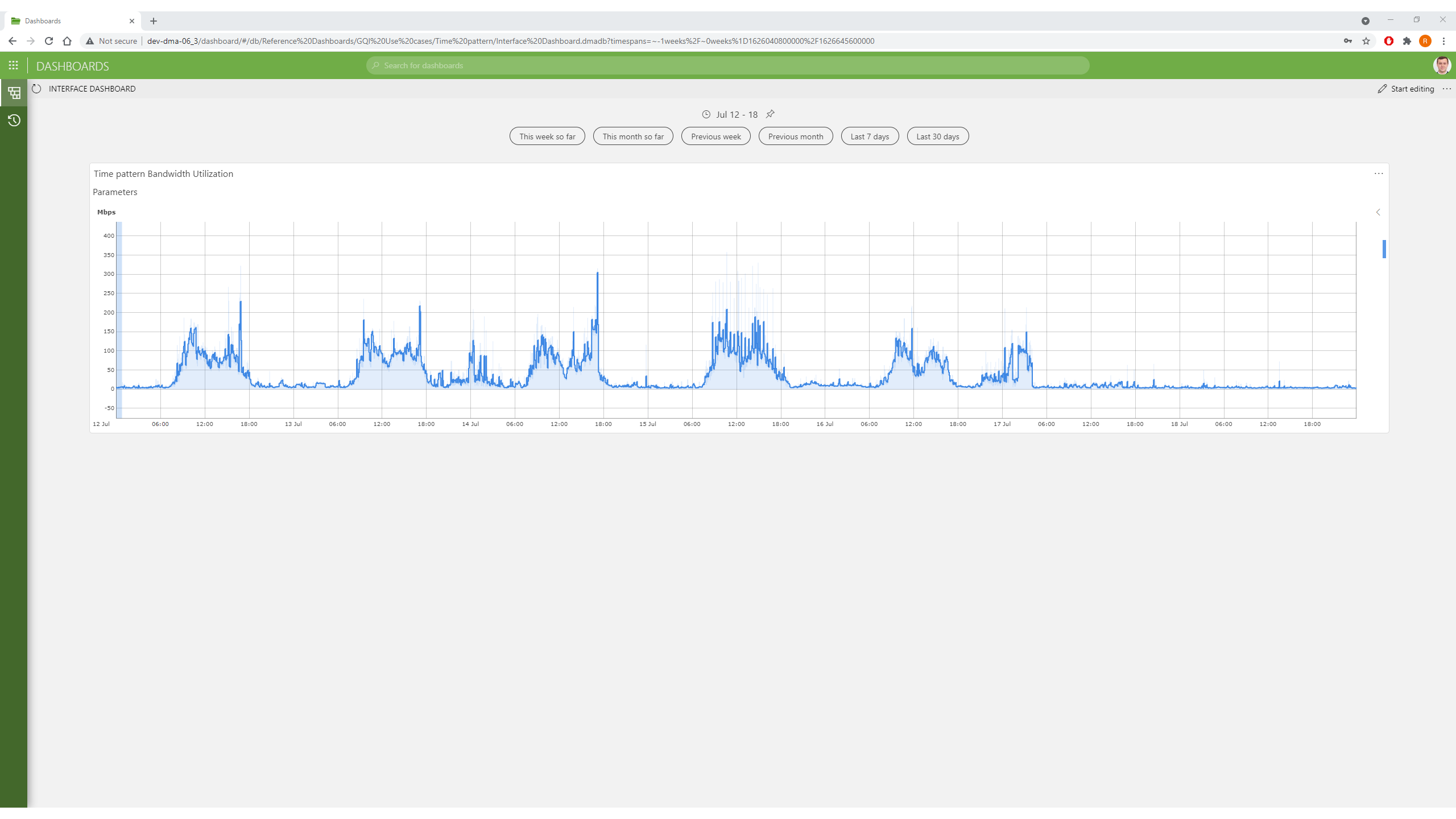
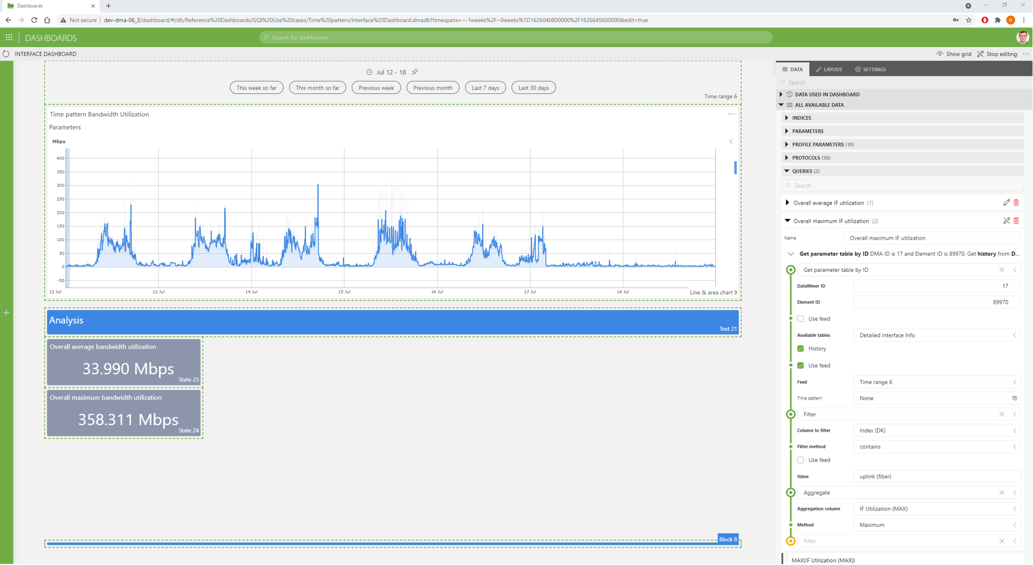
In the dashboard screenshot below, you can see a trend chart of the bandwidth utilization over the course of a week (July 12 – July 18). Even though the chart gives a detailed picture of the bandwidth utilization over time, it’s quite difficult to draw conclusions from such a large data set.
However, there’s one thing that’s very clear to see: on weekdays, there’s a pattern where the traffic volume starts going up after 06:00 and drops again after 18:00, while it remains negligible throughout the weekend.
Let’s translate this trend data into actionable insights using the GQI!
We’ll translate the trend data in 3 steps:
- Overall average/maximum: We’ll start off by calculating the overall average and maximum bandwidth utilization over the entire selected time range.
- Average/maximum during business hours: Since it’s clear from the trend graph that bitrates are much higher during business hours, we will then calculate the average and the maximum bandwidth utilization separately for business hours.
- Daily average/maximum: Finally, there also seem to be day-to-day variations in traffic volume. So we’ll differentiate the calculation of the average and maximum bandwidth utilization even further, to get a different value for each day in the selected time range.
Step 1: Calculating the overall average and maximum values
The GQI allows us to build advanced queries that can retrieve any kind of information from a DataMiner System, transform it and visualize it in the Dashboards module. For a high-level introduction to the GQI and its powerful features, have a look at this blog post: Your next step towards a data-driven operation: the brand-new DataMiner Generic Query Interface (GQI).
In our example, we’ll start with a basic query of the overall average and maximum bandwidth utilization over the time range shown in the graph.
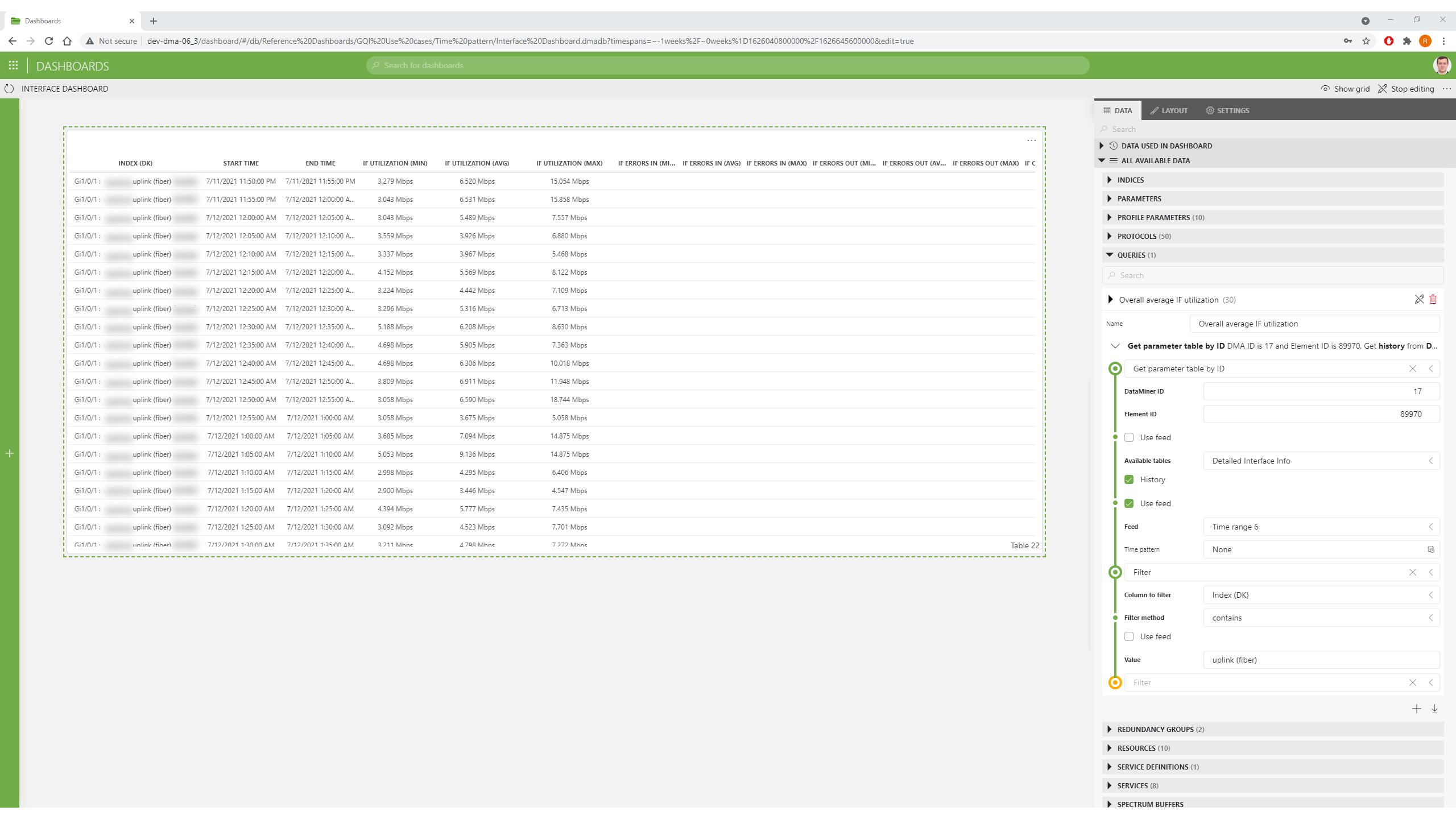
The first step in this query is to fetch the data we need from the DataMiner System. We will use the interface table parameter of a switch element in the DataMiner System for this, so we’ll use the “get parameter table by ID” query option. For this query type, you need to provide the element ID and name of an interface parameter table.
Next, we select the “History” box to retrieve the historical data from all columns in the table. We also need to specify the time range for the trend data. In this case, we can use the time range feed on the dashboard (see top of the dashboard in the first image) to dynamically update the query based on the time range selected by the dashboard user.
The switch element has many interfaces. We should therefore also filter on the index column of the table, which contains the interface name in this case, and only include the interface that has “uplink (fiber)” in it.
You can find the intermediate result of this query in the table illustrated below. You can see that for the columns where trending is enabled (which is only the “IF Utilization” parameter in this case), DataMiner keeps an average, maximum and minimum value over five-minute intervals. These are shown as rows of the query result.
All we need to do now is add an “Aggregate” step to the query and select “Average” as the aggregation method on the “raw” five-minute average. This query then returns the average interface utilization over the period selected in the time range feed as a single value result; this is shown in the next screen.
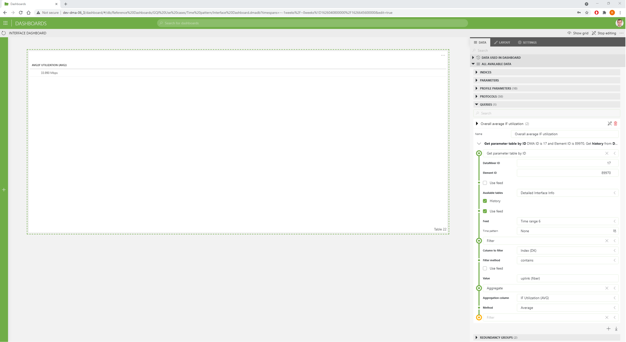
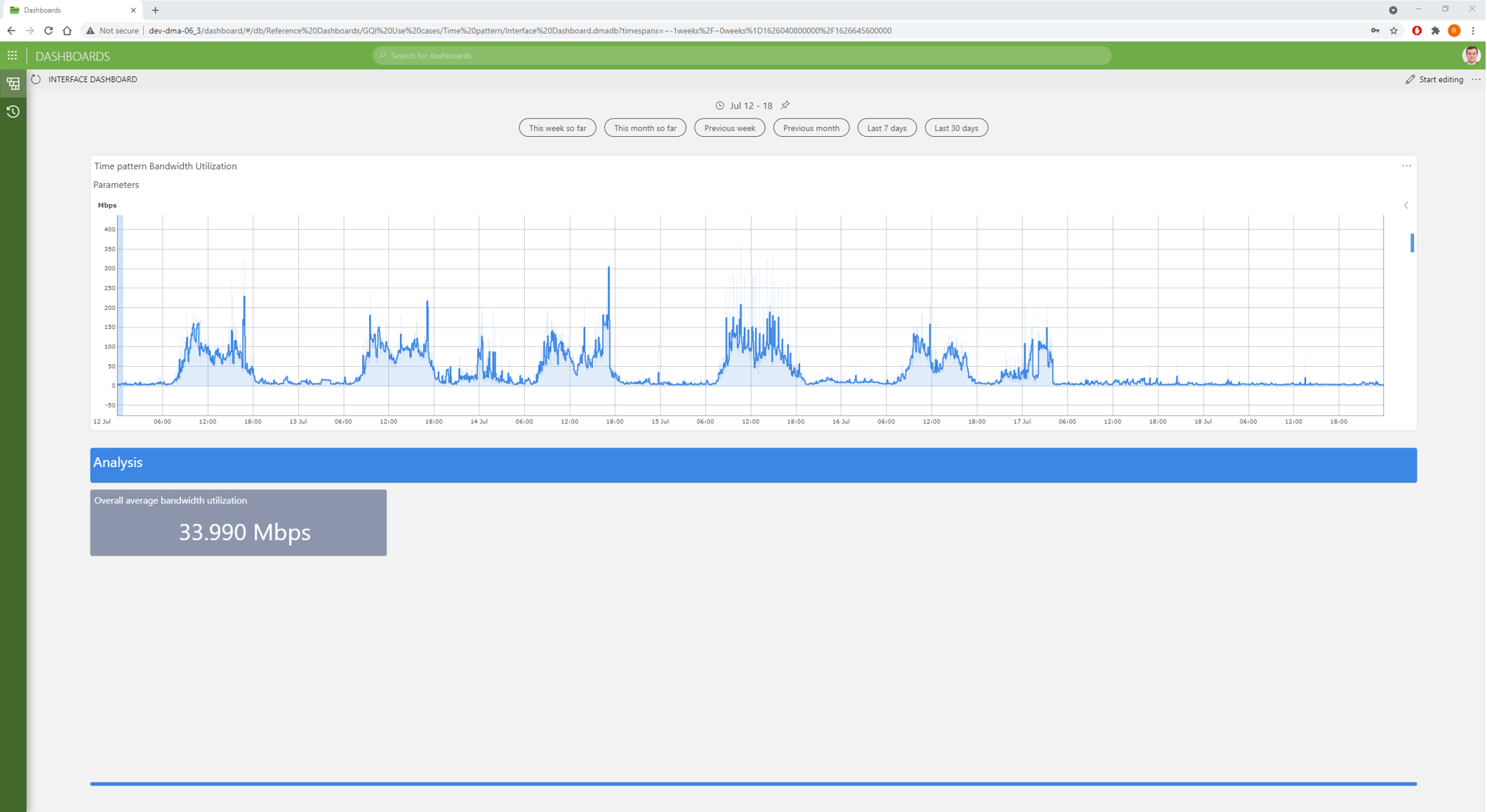
We can then place the result on the dashboard as a KPI, as you can see here:
Similarly, we can create the exact same query again, but change the aggregation method in the final step to “Maximum” instead of “Average”, and apply it to the five-minute maximum column to get the overall maximum bitrate over the specified period:
Step 2: Specifying a time pattern
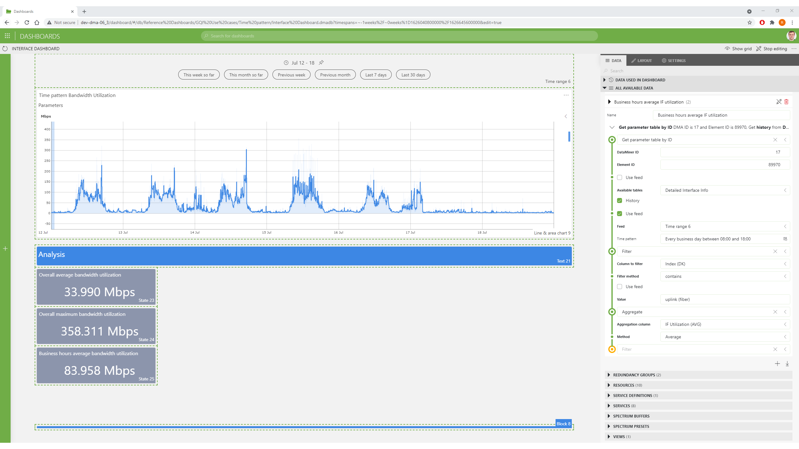
As we noted in the beginning of our analysis, the volume of traffic is significantly higher during business hours compared to off-business hours. Therefore, it’s important to differentiate between the two in our calculation to get a better picture of the actual bandwidth consumption.
To do this, we can use the “Time pattern” option on the query we built earlier. This option allows us to configure a subset of the time range to look at, based on a certain pattern. We can specify a daily pattern (every X days), a weekly pattern (every X weeks on Monday/Tuesday/Wednesday/…), a monthly pattern (every X months on the Nth day/Monday/Tuesday/…) or even a yearly pattern (every X years on the Nth day/Monday/Tuesday/… of Jan/Feb/Mar/…).
In our example, we will filter on all weekdays from 08:00 until 18:00. We can see that the resulting average bitrate is 2.5 times higher than the overall average, which is dragged down by the low utilization during off-peak hours.
Step 3: Zooming in on separate days
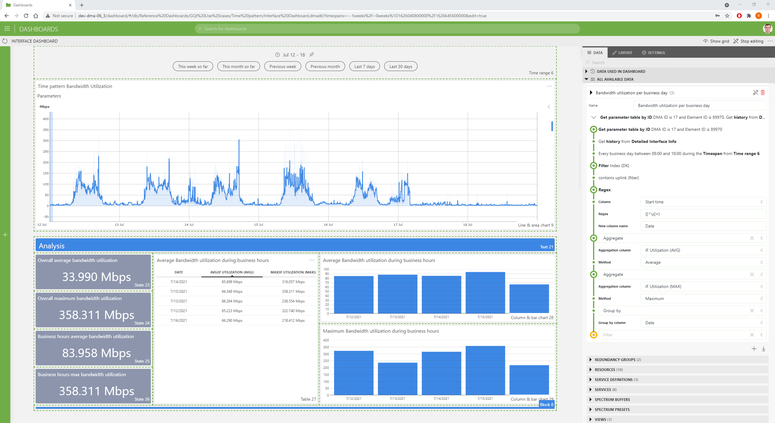
There can also be big differences between the utilization during the different days of the week. But in order to calculate a separate average/maximum for each day, we need to insert an extra step in the query before the aggregation.
We can use a column manipulation and use a regular expression on the “Start Time” column to extract only the date (in mm/dd/yyyy format) from that date/time column. In the future, more column manipulation methods will be added to transform date/time columns more easily, but for now, this regular expression can already be used as a workaround.
Then, we can aggregate the data again using the average on the raw five-minute average metric and the maximum on the raw five-minute maximum metric.
Finally, to obtain the result we want, we will group on the “date” column we added earlier. The results can then be visualized in a table with all the figures and in a bar chart for both the average and maximum bitrates per day.
The result teaches us that the busiest day was Thursday, with an average interface utilization of 93.4 Mbps, while Friday was the quietest with only 66.3 Mbps of traffic on average. You can see the entire query and the visualized results in the screenshot below:
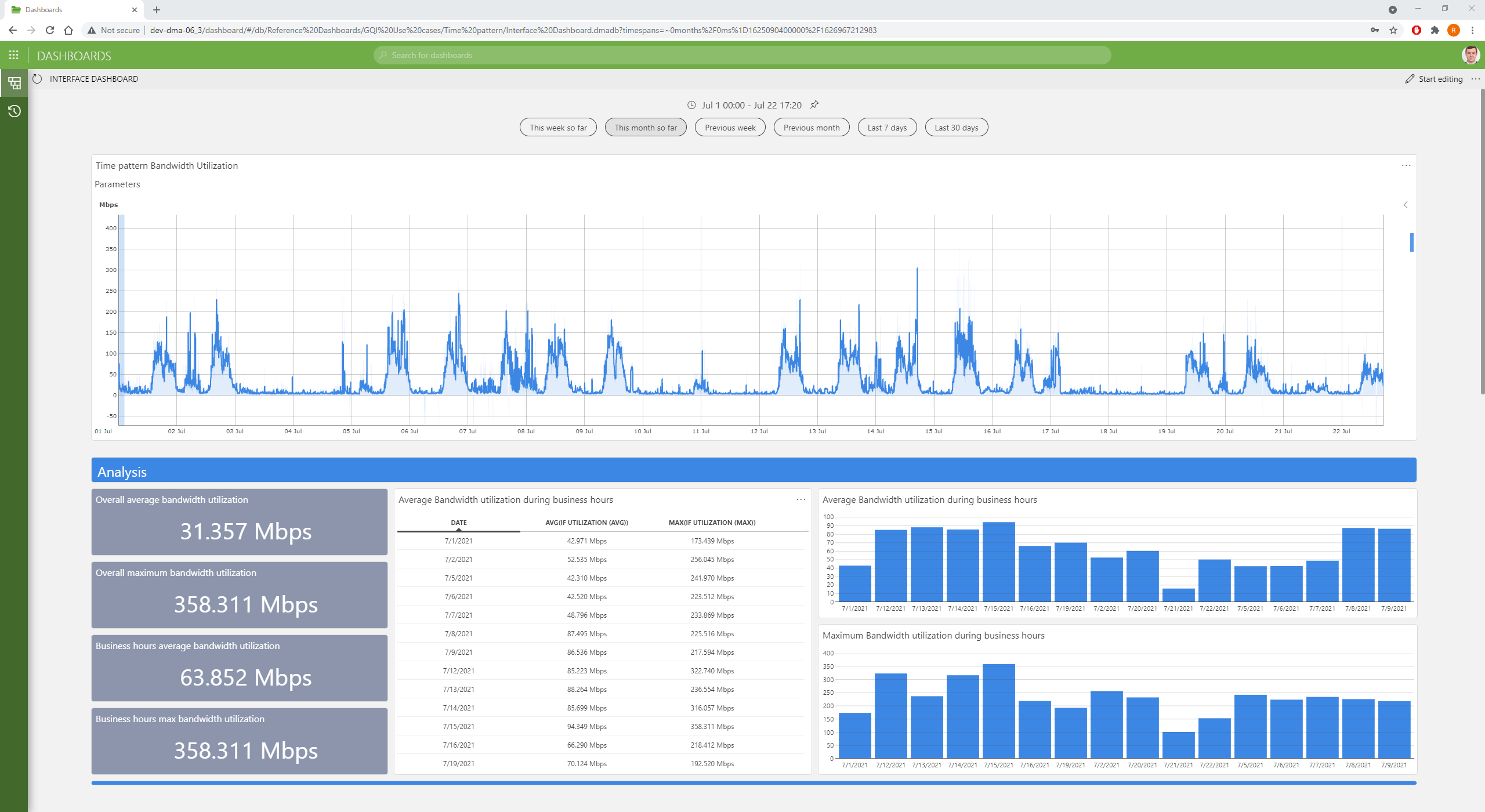
We can now use the time range feed at the top of the dashboard to select a different time window, and all queries will automatically be recalculated for the new time range. For example, if we select the time range “this month so far”, this is what we get:
This example has shown what you can achieve with the current GQI time querying capabilities. However, there are many more interesting applications that can already be built, and many more querying functionalities will be added in the coming months. Keep an eye on our blog to be the first to learn about new features, and check out our use case library to discover what other creative analyses our users are building.