

Hi Support,
I am using a Line & Area Chart component in a Dashboard.
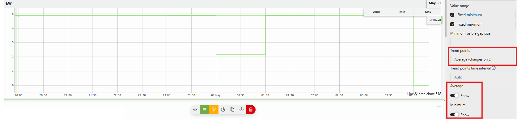
For the trend graph, I selected:
- Trend points: Average (changes only)
- Show Average
- Show Minimum
The graph correctly displays both the Average and Minimum trend lines.
However, both lines are shown using the same color, making it difficult to distinguish between them.
Is there a way to configure different colors for:
- Average line
- Minimum line
within the same chart component?
Attached a screenshot for reference.
Thank you.
Wout Mahieu [SLC] [DevOps Catalyst] Answered question

Hi Nur,
This is unfortunately currently not possible. The average, min & max lines all take the same color. If you want us to create a feature to be able to customize this, I sugges you create a feature suggestion.
Wout Mahieu [SLC] [DevOps Catalyst] Answered question