Are you looking for an easy way to control capabilities in your apps and dashboards? Look no further—the new toggle component has you covered! Available starting from DataMiner 10.5.3, this versatile feature can be used in both DataMiner Dashboards and Low-Code Apps.
The toggle component is a brand-new type of visualization that lets you enable or disable specific capabilities with ease. It accepts Boolean input (true/false), enabling it to both receive and output Boolean values, giving you control over other app elements.
When toggled, the component can be used to control other components in the dashboard or app—even other toggle components. This is especially useful when enabling one option also needs to enable another, but not necessarily the other way around. For example, in a resource management app, you might have toggles for “Meeting room” and “Video conferencing”. When a meeting room is reserved, video conferencing could be enabled by default. However, turning off video conferencing won’t cancel the room reservation.
The toggle switch also integrates with GQI queries. Toggling it can re-execute a query, helping to refresh data in your dashboard or app.
The toggle component is highly customizable. You can set its default state to either enabled or disabled through its component settings. Since it accepts Boolean input, its default value can also be overwritten by another component.
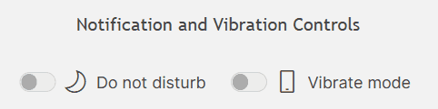
Additionally, you can customize the toggle’s label and icon to make it more visually intuitive. For even more personalization, the toggle component supports the new accent color feature—also set to be released in DataMiner 10.5.3. By default, the toggle switch matches the app or dashboard’s theme, but you can customize its color to make it stand out or better fit your design.
The toggle component is just one of the many new features and improvements coming in DataMiner 10.5.3. Be sure to install this upcoming Feature Release as soon as it’s available to take advantage of all the latest additions.
You might also like
BLOG
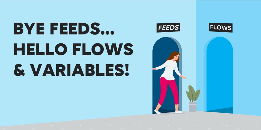
Say goodbye to feeds, say hello to flows and variables!
“Feeds” have officially left the building! We’ve updated some terms in Dashboards and Low-Code Apps to make both modules more intuitive and user-friendly, and the disappearance of the term “feeds” is part of that big update. We’re not just renaming features; we’re bringing entirely new features to the table. We’re excited to introduce flows and variables, two brand-new concepts that will help you get the most out of your dashboards and low-code apps.
BLOG
Introducing the Interactive Automation script component
We want to get all of you excited about a new component for the Low-Code Apps module: the Interactive Automation script component. This addition will greatly improve how you integrate and interact with scripts in your low-code apps, offering unprecedented flexibility and control.