Hello
My client is requesting a report by email which shows a graphic for multiple servers for a single KPI (for example: CPU).
In the present, what is the best approach to achieve that in your opinion?
Thank you.
Best regards
Bruno Sousa
Marieke Goethals [SLC] [DevOps Catalyst] Selected answer as best
Bruno,
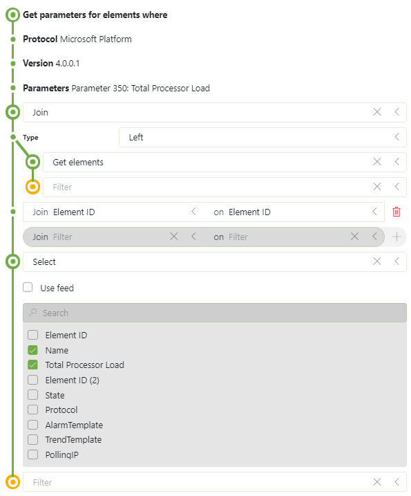
Here is an example of such a join in the query.
This is how you go from your initial query to this one:
- Add a join node
- specify the data source you want to join (optionally you can filter, ... this branch till you have a table ready-to-join). In this case I'm joining the full element table. I choose for a 'left' join as I only want rows from my initial (left) table.
- In the join node, you also need to configure the 'linking' between the two tables, so basically the columns in the left and right table that hold the same information. In this case this is the 'Element ID' column which we have in both tables.
- At the end of the query, I have added a 'Select' node to limit the number of columns in my result and I shifted the Name columns in front of the 'Total Processor Load' column.

Marieke Goethals [SLC] [DevOps Catalyst] Selected answer as best
Really nice!
Thank you for the help Pieter!
Best regards
Bruno Sousa