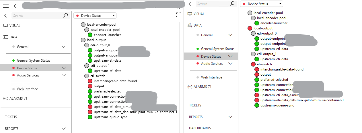
Context: These elements are duplicates of each other. The left was first created, the right side is a duplicate of the left. I find it difficult to understand that the grey nodes are still have alarms/Normal states below it. This makes it very difficult to understand from an users perspective.

https://docs.dataminer.services/develop/devguide/Connector/UIComponentsTreeControlAlarmBubbleUp.html The documentation describes that "There is no alarm for a parameter in "Normal" state, so there will be no bubble-up: parent levels will be displayed in gray/Undefined instead of green/Normal."

I fail to understand how this is possible and it makes no sense to have no alarm on the top level visible form the start. Because left and right should be the same, but they give a different vision on the user.
Could someone explain the vision after this flow?
As discussed with the product owner of Data-Insights, this can cause misconception in the mind of an user. Therefor documentation will be adjusted to incorporate the findings. This to make sure people will understand the reaction of Dataminer when this option is enabled/disabled.