Hi everything!
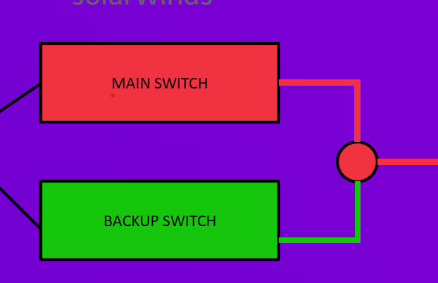
I've just created a Visio for a Switch connectivity as shown as below:

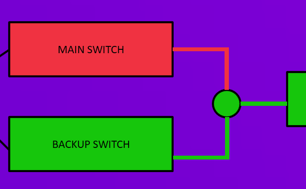
Basically, if one the the switch still has the lowest severity (in this case, the backup switch, which is in green), the circle color on the right should follow that lowest severity (it should be green also). However, for now that circle collects an alarm based on highest severity, so it becomes red.
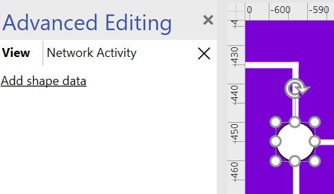
This is the details that i inputted on that circle for it to change color:

The details are based on this, which is from the surveyor.

I believe this is because is just take the value directly from the VIEW as we all know VIEW will shows the highest severity alarm. Hence, is there any other way for me to obtain a value that shows the lowest.
tldr:
How can I make my visio appears as the below image (do note that this below image is just fabricated, where that circle is just been colored green instead of showing an actual alarm):

Thank you very much for your assistance and have a nice day!
Hi,
Instead of using a view to group your elements, is it an option to use a DataMiner service? A DataMiner service allows you to manipulate the severity of the service based on the alarms of the child elements (in you case the main/backup switch). For example, you could:
- Include an element in the service based on a condition
- Once included, an element will influence the overall alarm severity of the service
More information in DataMiner Docs.
Once the service is created, you can assign a Visio file to this service. The shape can be linked to the severity of the service.
Hope it helps.