Dear community,
About visualizing resource capacity in DataMiner. I know it is possible to visualize resource capacity over time by using the Line & Area Chart component and linking it to a resource or resource feed.
What I am looking for is a way to create an overview (table) with all resources from a certain resource pool and show the maximum capacity as well as the current used capacity. No need for any time dimension, just the current status.
This would be ideal to quickly see which resources are used to the full capacity, which resource still have some capacity left, …. without having to select a resource upfront.
Any idea if this is possible with any dashboard component currently?
Thanks!
Hi Koen,
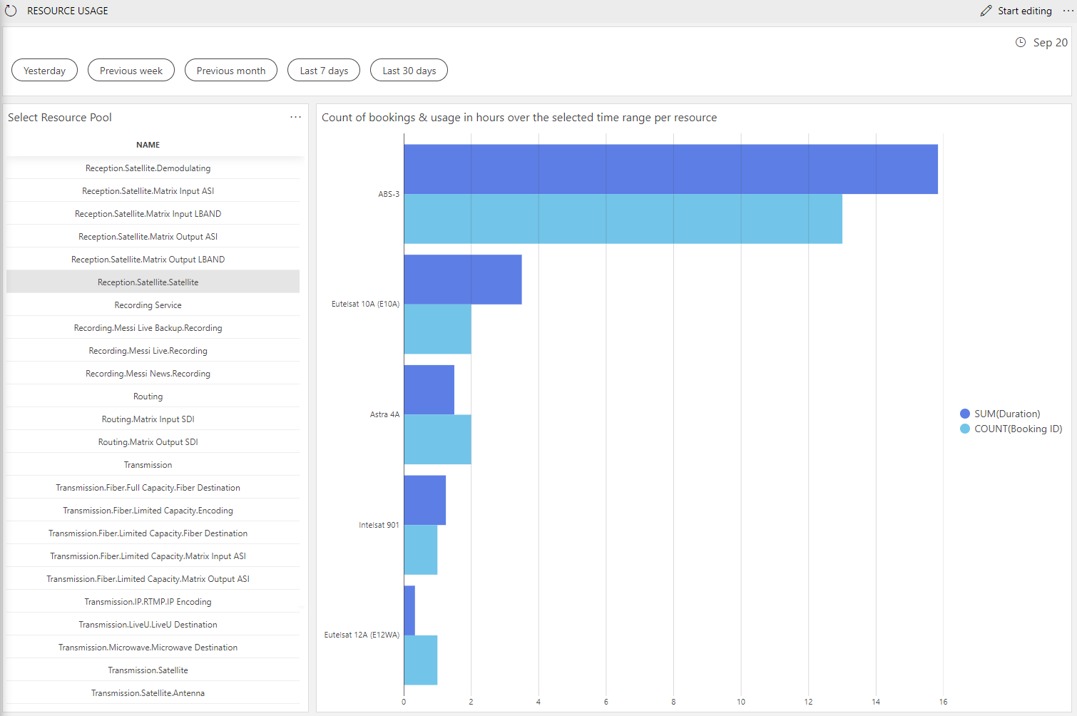
I made a dashboard that shows the usage (number of hours) of resources in a resource pool over the selected timerange.
It also shows the amount of bookings that the resource was used in:

The queries behind this are using the “Get Resource Usages” and “Get Resources” data sources. It is also using this custom operator to calculate the duration of each booking: https://github.com/SkylineCommunications/SLC-GQIOP-Duration
Hi Koen, not immediately, but I guess if you make the timespan very small (current minute) some calculations could be done to get the current usage of a pool.
Nice work. Thanks for sharing!
I take that the names in the left pane are your resource pools and when clicked, you see all resource in that pool with their usage?
You don’t know of any table components that could just show the current used capacity?