Hello, we have a number of elements that report their status, in a Visio-driven display on Dataminer, with a small colour block to the left side of the shape (representing the monitored state), followed by the parameter name and that parameter's monitoring status. (see example below)

- I would like to understand what prompts Dataminer to create such a display, rather that the usual overall single colour block?
- Is there a way to override this display do that Dataminer just provides a single colour that fills the shape and represents the monitoring status? (as would happen on other occasions)
- Where can I change the text size / colour that gets shown within the small status box in this monitoring scenario? (remembering that the Visio behind this is just a single shape with no '*' wild card where text size/colour would normally be defined)
- Can additional text be added?
Marieke Goethals [SLC] [DevOps Catalyst] Selected answer as best
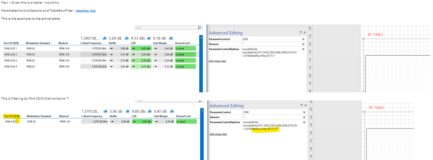
This seems to be parameters from a table - See example below
Roger Bijos [SLC] [DevOps Member] Answered question