Hello, we have a number of elements that report their status, in a Visio-driven display on Dataminer, with a small colour block to the left side of the shape (representing the monitored state), followed by the parameter name and that parameter's monitoring status. (see example below)

- I would like to understand what prompts Dataminer to create such a display, rather that the usual overall single colour block?
- Is there a way to override this display do that Dataminer just provides a single colour that fills the shape and represents the monitoring status? (as would happen on other occasions)
- Where can I change the text size / colour that gets shown within the small status box in this monitoring scenario? (remembering that the Visio behind this is just a single shape with no '*' wild card where text size/colour would normally be defined)
- Can additional text be added?
Hi Paul,
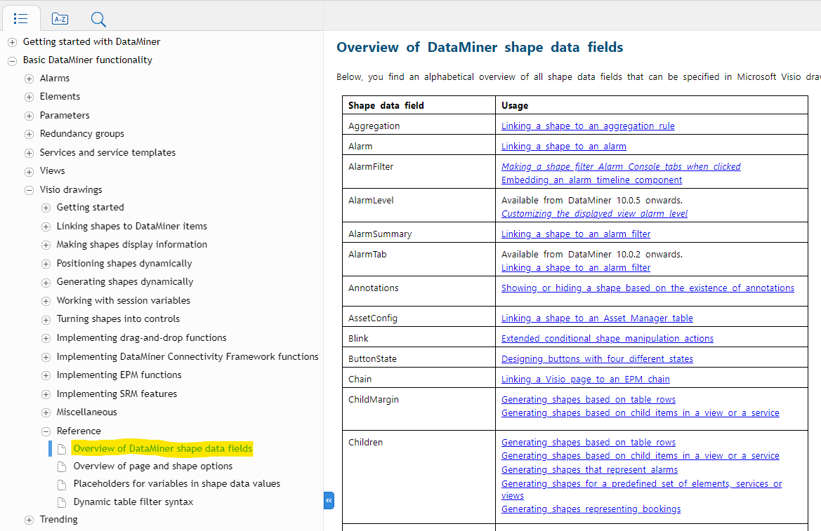
Your best reference is to go to the help and search for "Overview of DataMiner shape data fields" were you find a complete list of "Shape data", which in turn drives the display behavior.
I also recommend the following video library:
Visio Archives - DataMiner Dojo
and for specifics on DataMiner stencils
DataMiner Inspire - The New DataMiner Stencils & Style Guide - DataMiner Dojo

Hi Roger, thank you for your reply. I will review the info that you supplied.
One question, would it be the fact that a Visio shape is linked to a ‘paramiter’ or perhaps to a ‘Data Display Page’ that prompts Dataminer to change the standard colour-fill behaviour of a Visio shape to instead populate the shape with text?
The shape data from my example Vision is as below (the shape shown in my DOJO question) ;
Element : AWS Media Connect
DataDisplayPage : FLOWS
ParameterControl : 507:*text*
The Visio shape is blank, it contains no text.