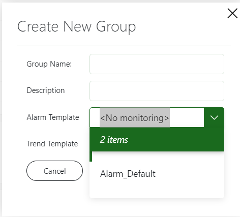
I am using a drop down to try to emulate that of Cube which shows you not only the list of available alarm/trend templates but also the option of no monitoring .

For some reason the no monitoring option seems to be hidden by the drop down UI. Anyhow, I can select it so I can see that the insertion I have made to the list is working properly.

With this in view, have I found a buggy behavior here or am I doing something wrong?
The dropdown will see these options as html tags and will try to display it accordingly (a safe sanitized html string). In this case this would result into an empty tag without any content, hence the white gaps. As the dropdown its html feature is mainly used for internal style enhancements (eg highlighting the parts that match a filter), this can be considered a bug. A workaround would be to avoid usage of < and >, or add spaces in between them (< No Monitoring >).
You can send it to the support mailbox of the data-exploration domain.
Hello Gilles,
That worked, thank you. Considering this might be a bug, I am wondering to which mail could I mail the bug to.
Thanks for your help!