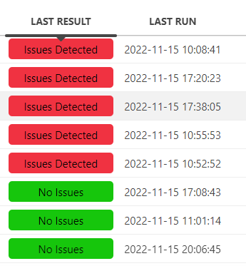
In a low-code app, I am using a GQI query to populate a table. Table contains few records in different states (Issues detected, No Issues, … ).
I would like to extend the App with a pie-chart showing the proportion of records in each state.
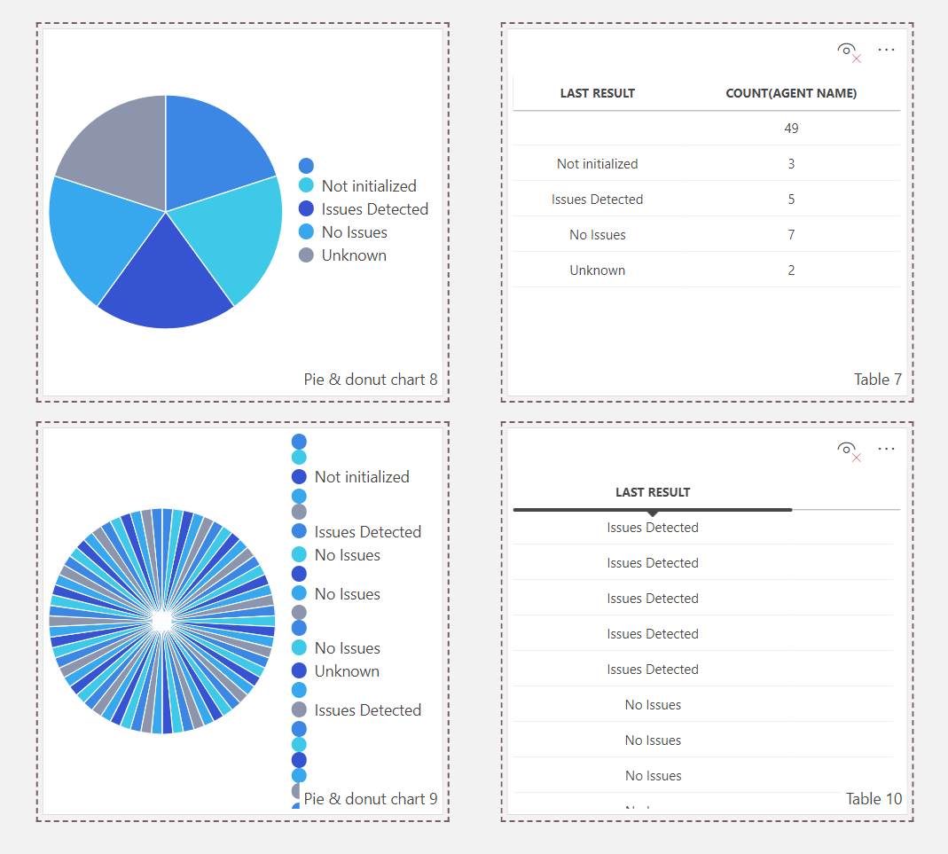
I’ve tried to adjust the query and feed it to the pie-chart component, without success (see below : on the same row, I am using the same query applied to different components). What am I missing?
Hi Emmanuel,
For your first table:
In the pie chart ‘Settings’ menu, you’ll need to assign a ‘Label’ and ‘Segment Size’ field, which should make the chart appear as expected.
For the second table:
I think you’ll need to first add a ‘Count’ aggregation in your GQI query and then group that by the ‘Last Result’ column. Then you’ll get the count of each ‘Last Result’ state.
Yes, that’s what I’m doing on the first example (using the Count). Second example was just a different attempt, as it was not fully clear to me what the component was expecting.
Configuring the ‘Label’ and ‘segment’ gave the expected result.
Thank you