Hi Dojo,
I have a question regarding the trend graph using MS Visio.
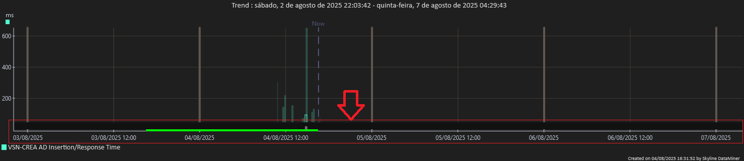
In the Ziine examples, the graph appears properly formatted — as shown in the attached image — with values clearly distributed along the Y-axis and the alarm/warning bars positioned outside the main data area.
However, when I try to replicate the setup in my environment, the alarm and warning bars end up overlapping the actual data in the graph. I noticed that adjusting the Y-axis range manually makes the values display correctly, but this seems to be a per-user setting rather than a default Visio behavior.
My question is:
Is there any way to configure this directly in the shape or data settings, so the graph scales properly by default — without the alarm bars overlapping the data — just like in the Ziine example?
Appreciate any guidance on this.
Hi Toon, Sorry for the late response. The issue seems to be resolved after I updated DataMiner — I’m now on version 10.5.11, and the problem no longer occurs. Thanks!
Hi Daniel,
I noticed that this question has been open for some time now. Do you still need help with this, or have you found the solution in the meantime? If you still need help, could you answer Toon’s question above? Or if you have found the solution, could you select this answer (using the ✓ icon) to indicate that no further follow-up is needed, or post an answer of your own for reference for other users?
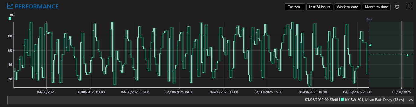
What is your y axis scaling setting? Is it set to auto in your example?