Skip to content
DataMiner DoJo

More results...

Generic selectors
Exact matches only
Search in title
Search in content
Post Type Selectors
Search in posts
Search in pages
Search in posts
Search in pages
Log in
Menu
  • Updates & Insights
  • Questions
  • Learning
    • E-learning Courses
    • Empower Replay: Limited Edition
    • Tutorials
    • Open Classroom Training
    • Certification
      • DataMiner Fundamentals
      • DataMiner Configurator
      • DataMiner Automation
      • Scripts & Connectors Developer: HTTP Basics
      • Scripts & Connectors Developer: SNMP Basics
      • Visual Overview – Level 1
      • Verify a certificate
    • Video Library
    • Books We Like
    • >> Go to DataMiner Docs
  • Expert Center
    • Solutions & Use Cases
      • Solutions
      • Use Case Library
    • Markets & Industries
      • Media production
      • Government & defense
      • Content distribution
      • Service providers
      • Partners
      • OSS/BSS
    • Agile
      • Agile Webspace
      • Everything Agile
        • The Agile Manifesto
        • Best Practices
        • Retro Recipes
      • Methodologies
        • The Scrum Framework
        • Kanban
        • Extreme Programming
      • Roles
        • The Product Owner
        • The Agile Coach
        • The Quality & UX Coach (QX)
    • DataMiner DevOps Professional Program
      • About the DevOps Program
      • DataMiner DevOps Support
  • Downloads
  • More
    • DataMiner Releases & Updates
    • Feature Suggestions
    • Climb the leaderboard!
    • Swag Shop
    • Contact
    • Global Feedback Survey
  • PARTNERS
    • All Partners
    • Technology Partners
    • Strategic Partner Program
    • Deal Registration
  • >> Go to dataminer.services

Dashboards – Group Line Charts generated from GQI

Solved1.62K views25th August 2023dsahboard GQI line-chart
1
Sebastian Ulloa [SLC] [DevOps Advocate]1.90K 24th August 2023 0 Comments

Hello community,

Is it possible to group line charts that are generated using GQI in a single component? Either by adding pagination to a component or displaying multiple lines in a single chart?

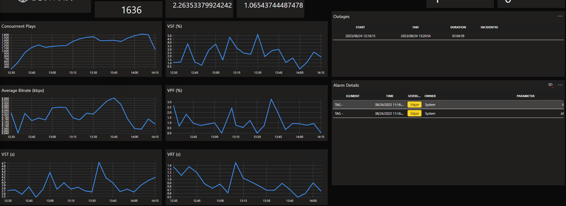
Currently I have the following view, and I would like to reduce the amount of space used by the charts in the dashboard:

Sebastian Ulloa [SLC] [DevOps Advocate] Selected answer as best 25th August 2023

2 Answers

  • Active
  • Voted
  • Newest
  • Oldest
1
Miguel Obregon [SLC] [DevOps Catalyst]18.89K Posted 24th August 2023 0 Comments

Hi Sebastian,

Currently this is a limitation of the trend chart component when the data source is a GQI query.

I believe that the only workaround at this moment is to use the Data Aggregator to offload the result of the GQI queries to a CSV file. Then the CSV file will need to be offloaded to an element. Using the 'Parameters' data source you can point to this element and include multiple graphs in the same line chart.

Sebastian Ulloa [SLC] [DevOps Advocate] Selected answer as best 25th August 2023
You are viewing 1 out of 2 answers, click here to view all answers.
Please login to be able to comment or post an answer.

My DevOps rank

DevOps Members get more insights on their profile page.

My user earnings

0 Dojo credits

Spend your credits in our swag shop.

0 Reputation points

Boost your reputation, climb the leaderboard.

Promo banner DataMiner DevOps Professiona Program
DataMiner Integration Studio (DIS)
Empower Katas
Privacy Policy • Terms & Conditions • Contact

© 2025 Skyline Communications. All rights reserved.

DOJO Q&A widget

Can't find what you need?

? Explore the Q&A DataMiner Docs

[ Placeholder content for popup link ] WordPress Download Manager - Best Download Management Plugin