Hey all,
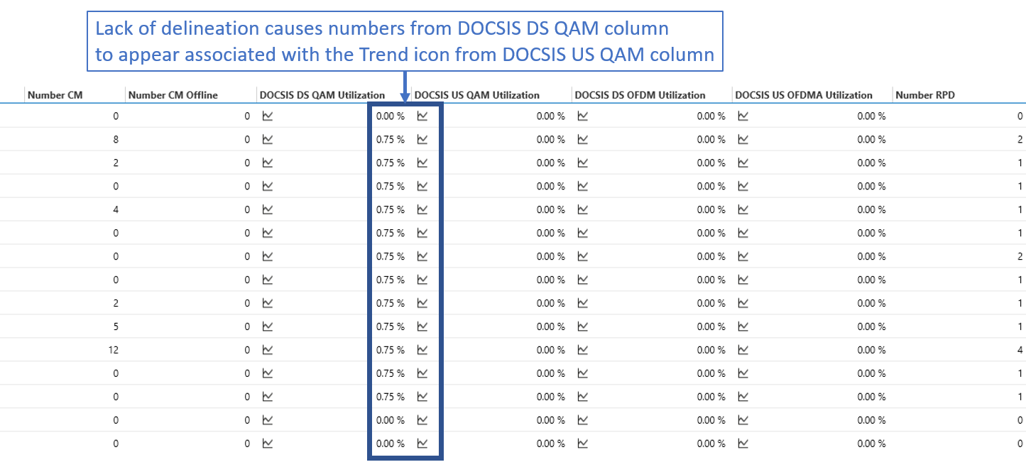
When viewing metrics for devices, the Trend icon is always left justified. Without column delineation, it is common for users to mistake the Trend icon's association due to how the numbers appear grouped with the icon. Are there any options available to allow for adjusting the Trend icon placement or improved user readability for distinguishing columns, such as dividing lines between columns or alternating column background color?
Thanks
Marieke Goethals [SLC] [DevOps Catalyst] Selected answer as best
