Hi Dojo,
I've created a Dashboard with a Graph which shows the Top 30 elements and their alarms. The problem is when I exported it as PDF, the X axis labeling is not showing all element names, as you can see on the screenshot:
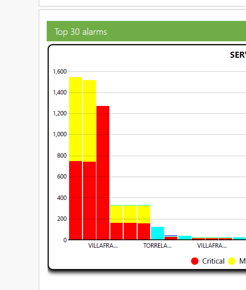
Is it possible to modify how labels are shown? If not, do you have in your road-map this feature? Note that each column is from one element, because columns are stacked.
Thanks!
Hi Daniel,
The amount of labels that are shown are based on the width of the component, which itself is based on the selected paper size. Selecting a larger paper size will show all/more labels. We do have a task on our backlog to improve this behavior and will let you know here once it has been done.
Hi Wout,
Do you have an estimated date to deploy this feature?
Thanks!
Hi Wout,
Thanks for your quick answer. I can confirmed that I tried the largest paper, but I think that 30 names are too much for horizontal labeling. I checked that in old reports legacy, labels are shown in diagonal way. Something like that could be very useful for my case.
I'm looking forward to your comment when you have this task finished.
Thanks a lot!