Hello, I’m trying to see if there’s a better way to make panels on apps a lot more dynamic to different screen resolutions.
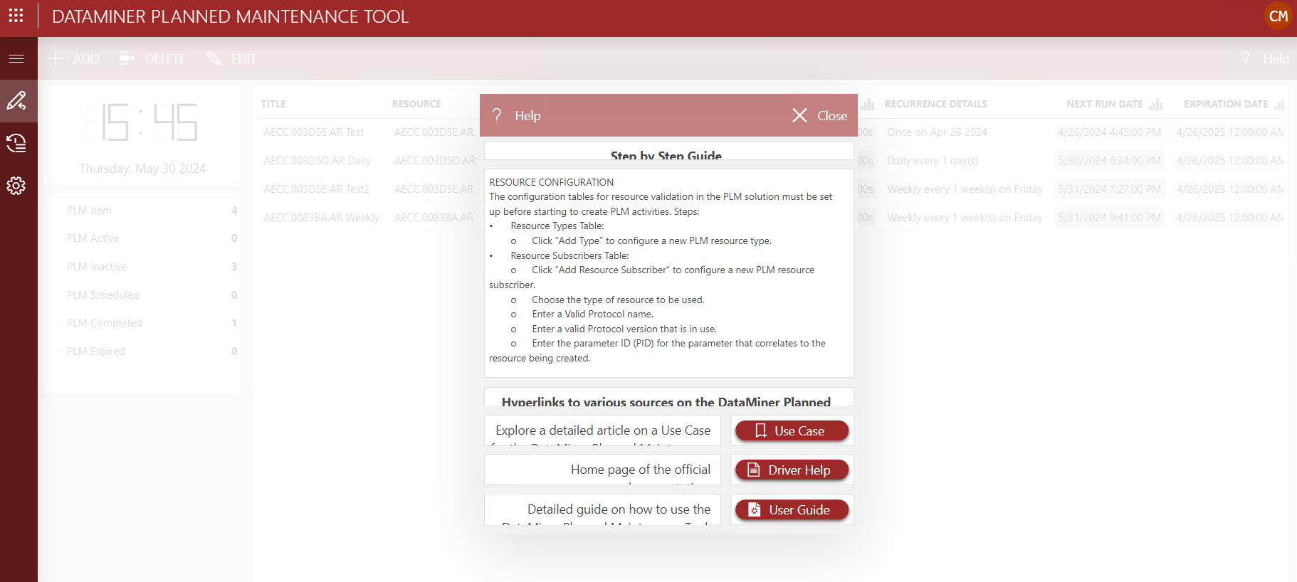
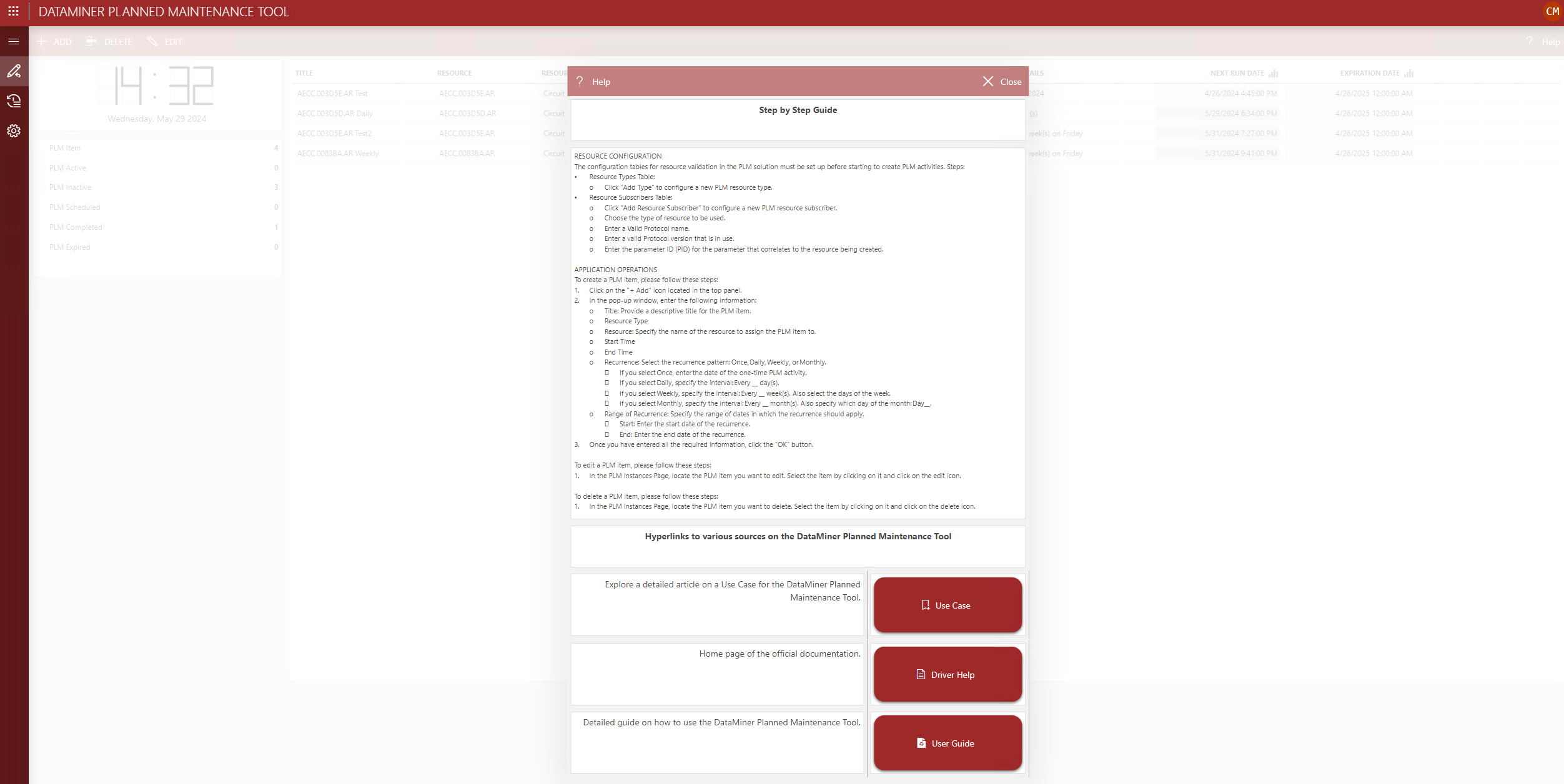
For example, I created this help panel and tried by best by changing the sizing of the modules, changed the number of columns on the panel to 20, and checked the “fit to view” box for the following result on different screen sizes:


But as you can see, the smaller one looks a bit cramped, so I was wondering if there’s a setting to help with this.
The support for different viewports or media sources is currently very limited. The fit to view will ensure everything will fill the panel or Page without introducing scrollbars, with indeed a cramped result on some smaller viewports.
Definetly something that needs to be improved as low-code apps is meant as a solution that can target all devices, big and small.