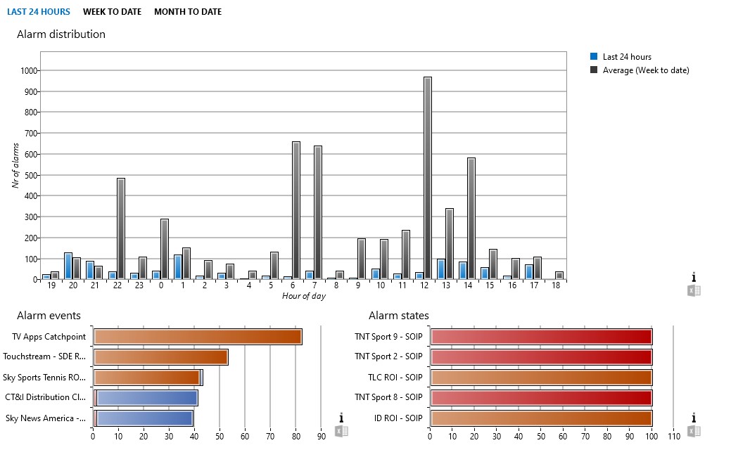
Hi, what is the best way to display an Alarm Distribution graph against a given timespan in the new Dashboards module please? Something like the Alarm distribution graph in the old Reporter module (see image)?

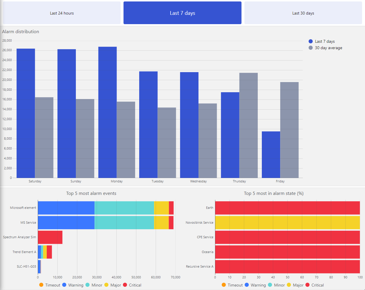
We have added a package on the catalog, compatible from DataMiner 10.4.0 onwards: Alarm Report | Catalog (dataminer.services)
This package contains the following:
- Ad hoc data source to retrieve the alarm distribution
- Ad hoc data source to retrieve the top most alarm events
- Ad hoc data source to retrieve the top most time in alarm state
- An Alarm Report dashboard, using these data source in bar charts
All can be customized further for more specific needs.

As Tobe shows, you can also almost get there using the built-in Alarms data source. But be aware that this approach will require GQI to pull all the alarm event data in memory every time.
In contrast, the ad hoc data sources in the catalog package reuse the existing specialized report messages to get the best performance.
Ideally, in the future, these type of data sources will come available out of the box.
Hi Alex, the best way to achieve this with the new dashboards would be using an Ad Hoc data source in a GQI query. We should have something like this available in the DataMiner Catalog, but at the moment of writing this is not the case yet.
We’ll add something you can use and post it as an answer here when ready.