In this second installment, Visio expert Toon Casteele brings his deep expertise to the forefront, analyzing an impressive Visual Overview submitted by TV2 Denmark.
Visual Overviews are powerful and visually appealing tools for navigating, monitoring, and managing your entire infrastructure. However, since they typically contain a lot of information and different types of data, it can be challenging to strike the right balance between complete and cluttered.
In this video series, Visio expert Toon Casteele provides feedback on real-life Visual Overview submissions, highlighting their strengths and areas of improvement. Our goal is to help you create Visual Overviews that are intuitive, organized, and effective.
Watch the video below for a full breakdown of his feedback, or soak up the key takeaways summarized below.
4 tips to immediately buff up your Visual Overviews
1. Prevent UI freeze
– Use NonElementProtocol on each page or system-wide to halve load times.
– Prefer view paging over property paging for splitting children over multiple pages, as it offers cleaner organization and improved performance.
2. Optimize Visuals with HoverType and scrollable containers:
– Apply HoverType=Geometry at the page level to enhance visual aesthetics and interactivity.
– Use scrollable containers with NoAutoScale and Docking for better scalability.
– Disable unnecessary loading messages with EnableLoading=False.
3. Delete, group, or consolidate shapes to improve efficiency:
– Remove empty transparent group shapes to reduce clutter.
– Group shapes with the same conditions and apply conditions directly to shapes where possible.
– Consolidate shape texts. Instead of using two separate shapes for parameter name (“xxx”) and value (“*”) try combining them like so “xxx *” to streamline the layout and limit the number of shapes needed.
4. Embrace the DataMiner Connectivity Framework (DCF):
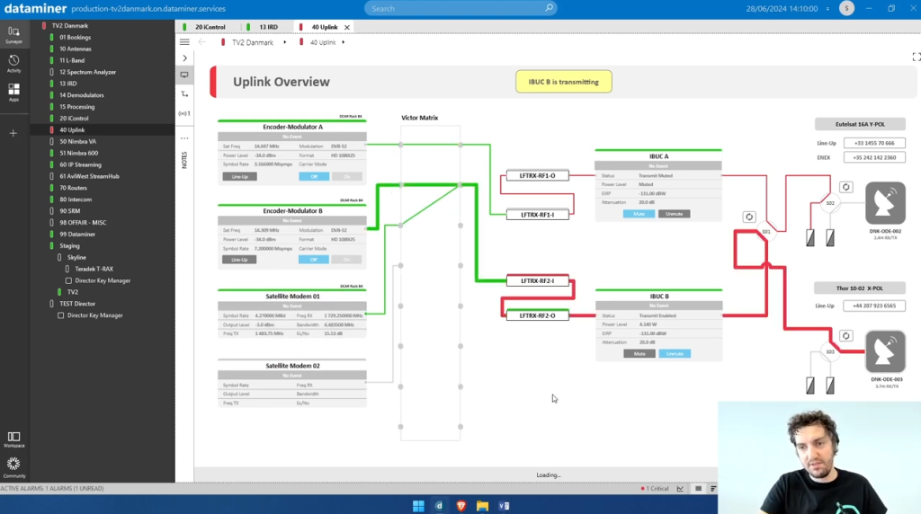
The DataMiner Connectivity Framework (DCF) makes it possible to set up element connectivity, allowing the visualization (and modification) of signal paths throughout an infrastructure.
TV2 Denmark took full advantage of the DCF features like FollowPathColor, HighlightPath, and ConnectivityLines, creating a beautiful and functionally efficient “uplink view”.
Earn DevOps Points AND valuable operational insights from our Visio expert
Get in on the action! Send us your Visual Overview solutions and we will feature them in our video series. Don’t miss this chance to showcase your work, get valuable insights from the experts, and earn some DevOps Points!
More from the Visual Overview feedback series
VIDEO| BLOG
Toon kicks off the series with an amazing Visual Overview submitted by Tommy Hexeberg from Telenor.