I’m looking for information on creating custom themes beyond what I can find in the help pages of: –
In the Edit custom theme dialog box, enter the theme’s XML code (Router Control themes are XAML resource dictionaries), and click OK.
Hi Philip,
The custom themes for the Router Control are using the XAML syntax. You can find more information on this topic here: https://docs.microsoft.com/en-us/dotnet/desktop/wpf/fundamentals/xaml
The basic layout of the XML content is a ResourceDictionary:
<ResourceDictionary
xmlns=”http://schemas.microsoft.com/winfx/2006/xaml/presentation”
xmlns:x=”http://schemas.microsoft.com/winfx/2006/xaml”
xmlns:conv=”clr-namespace:Skyline.DataMiner.Client.Controls.Converters;assembly=SLClientControls”
xmlns:model=”clr-namespace:Skyline.DataMiner.Client.RouterControl.UI.Model;assembly=SLRouterControl”
xmlns:commonconv=”clr-namespace:Skyline.Common.Converters;assembly=SLCommon”
xmlns:commontools=”clr-namespace:Skyline.Common.Tools;assembly=SLCommon”><!– insert styles and templates here –>
</ResourceDictionary>
Depending on what you want to achieve, there are different approaches and possibilities.
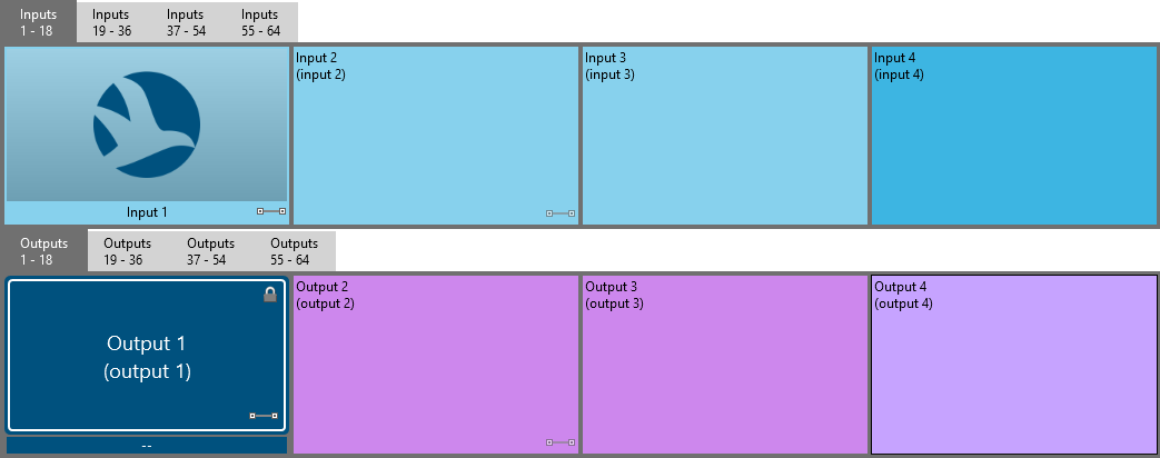
For example, if you only want to change the default colors of all input/output buttons from green/orange to blue/purple:
<Style x:Key=”{x:Static model:IOButtonBlock.InputStyleKey}”
BasedOn=”{StaticResource {x:Static model:IOButtonBlock.InputStyleKey}}”
TargetType=”{x:Type ButtonBase}”>
<Style.Resources>
<SolidColorBrush x:Key=”FlatButtonNormalFill” Color=”#FF87D1ED” />
<SolidColorBrush x:Key=”FlatButtonNormalBorder” Color=”#FF000000″ />
<SolidColorBrush x:Key=”FlatButtonHooverFill” Color=”#FFACE0F3″ />
<SolidColorBrush x:Key=”FlatButtonHooverBorder” Color=”#FF000000″ />
<SolidColorBrush x:Key=”FlatButtonPressedFill” Color=”#FFACE0F3″ />
<SolidColorBrush x:Key=”FlatButtonPressedBorder” Color=”#FF000000″ />
<SolidColorBrush x:Key=”FlatButtonSelectedFill” Color=”#FF3DB5E2″ />
<SolidColorBrush x:Key=”FlatButtonSelectedHooverFill” Color=”#FF62C3E7″ />
<SolidColorBrush x:Key=”FlatButtonSelectedHooverBorder” Color=”#FF000000″ />
<SolidColorBrush x:Key=”FlatButtonHighlightedFill” Color=”#FF4FF2F2″ />
<SolidColorBrush x:Key=”FlatButtonHighlightedHooverFill” Color=”#FF7BF9F9″ />
<SolidColorBrush x:Key=”FlatButtonHighlightedHooverBorder” Color=”#FF000000″ />
<SolidColorBrush x:Key=”FlatButtonSelectedHighlightedFill” Color=”#FFA3FFC6″ />
<SolidColorBrush x:Key=”FlatButtonSelectedHighlightedHooverFill” Color=”#FFBAFFDC” />
<SolidColorBrush x:Key=”FlatButtonSelectedHighlightedHooverBorder” Color=”#FF000000″ />
</Style.Resources>
</Style><Style x:Key=”{x:Static model:IOButtonBlock.OutputStyleKey}”
BasedOn=”{StaticResource {x:Static model:IOButtonBlock.OutputStyleKey}}”
TargetType=”{x:Type ButtonBase}”>
<Style.Resources>
<SolidColorBrush x:Key=”FlatButtonNormalFill” Color=”#FFCD87ED” />
<SolidColorBrush x:Key=”FlatButtonNormalBorder” Color=”#FF000000″ />
<SolidColorBrush x:Key=”FlatButtonHooverFill” Color=”#FFDCACF3″ />
<SolidColorBrush x:Key=”FlatButtonHooverBorder” Color=”#FF000000″ />
<SolidColorBrush x:Key=”FlatButtonPressedFill” Color=”#FFDCACF3″ />
<SolidColorBrush x:Key=”FlatButtonPressedBorder” Color=”#FF000000″ />
<SolidColorBrush x:Key=”FlatButtonSelectedFill” Color=”#FFAE3DE2″ />
<SolidColorBrush x:Key=”FlatButtonSelectedHooverFill” Color=”#FFBE62E7″ />
<SolidColorBrush x:Key=”FlatButtonSelectedHooverBorder” Color=”#FF000000″ />
<SolidColorBrush x:Key=”FlatButtonHighlightedFill” Color=”#FFF24FF2″ />
<SolidColorBrush x:Key=”FlatButtonHighlightedHooverFill” Color=”#FFF97BF9″ />
<SolidColorBrush x:Key=”FlatButtonHighlightedHooverBorder” Color=”#FF000000″ />
<SolidColorBrush x:Key=”FlatButtonSelectedHighlightedFill” Color=”#FFC6A3FF” />
<SolidColorBrush x:Key=”FlatButtonSelectedHighlightedHooverFill” Color=”#FFDCBAFF” />
<SolidColorBrush x:Key=”FlatButtonSelectedHighlightedHooverBorder” Color=”#FF000000″ />
</Style.Resources>
</Style>
A more advanced example is changing the content of the buttons. Instead of displaying the name and label of an input, you maybe want to show a image. Beware that images are embedded as base64 and should be kept small, at most a few kilobytes. Apply it to a specific input button by adding a custom option named ContentTemplate and giving it the value {DynamicResource SkylineLogoTemplate}.

<commontools:Base64Image x:Key=”SkylineLogo”>
iVBORw0KGgoAAAANSUhEUgAAAIAAAACACAMAAAD04JH5AAAABGdBTUEAALGPC/xhBQAAAAFzUkdCAK7OHOkAAAKRUExURUdwTABRfgBRfgBRfgBRfgBQewBR
fgBUeQBeZwBRfgBRfgBRfgBRfgBRfABRfABRfgBQfQBQfQBQfQBRfgBQfQBJfgBRfQBPfgBQfQBQfQBRfgBRfgBQfQBRfgBQfQBRfgBRfgBRfgBRfgBRfgBV
dwBQfQBRfgBRfgBRfgBQfgBQfQBQfQBRfgBRfgBQfQBRfgBQfQBRfQBQfQBQfQBQfQBRfgBRfgBQfgBQfwBRfgBRfgBNfgBRfgBRfgBRfgBRfgBRfgBQfgBR
fgBRfQBRfgBRfgBRfgBQfQBRfgBRfgBQfQBRfgBPfQBRfgBRfgBRfQBRfgBRfgBQfgBRfgBRfgBRfgBRfgBRfgBRfgBRfgBQfgBRfQBRfgBRfgBRfgBQfQBR
fgBQfQBPfQBRfgBRfgBQfQBRfgBPfgBRfQBQfQBRfgBRfgBRfQBQegBRfgBQfQBQfgBRfgBRfgBRfgBRfgBRfgBRfgBQfQBRfgBRfgBQfQBRfgBRfgBRfgBQ
fQBRfgBQfQBQfgBRfgBRfgBPfgBQfgBRfgBQfgBQfQBQfwBRfgBRfgBRfQBRfgBQfQBRfgBRfwBRfgBRfgBQfgBRfQBQfgBRfgBQfgBRfABRfgBQfgBRfgBQ
fgBQfQBQfgBQfgBRfgBRfgBRfgBQfQBRfgBQfQBRfQBRfgBQfQBRfQBQfQBQfgBQfQBQfgBRfgBQfgBRfwBRfgBRfgBQfQBRfgBRfgBRfQBRfgBRfgBQfQBR
fgBQfgBRfgBQfQBQfgBRfgBRfgBQfQBQfQBQfgBRfQBQfQBRfQBRfQBRfQBQfgBQfQBQfgBRfQBQfQBQfgBRfgBRfgBSfgBSfgBRfgBRfgBRfgBQfgBRfgBQ
fQBQfQBRfsTwSBEAAADadFJOUwD8+/r9A+wCAf71haEMCOhxTFj0cAQyDxE49rgr4hDSsYvdnARR0RfzayAYzN5QzQtKHyMa69t2Ce6JBep9qMCYpfch0zDg
WdjhLZcSkvJT8Kth5fm/1z7PlMkN2qydItVDJ3S7TvEUcixdKVYGZUWRoHmueq3HbanfZObt+J9/XFqigAdq1oEuClPEQbQkvhWa2RaD0KZIGZlpfHcvQl7L
lpNg6T0x3MZvOTZPhsKNBuTUp7COX7ajO84Z40dmxXtzh2cqW4ZNQJdvHWpTbw7KGx65kLMcryUmT7/ggwAAByZJREFUeNq9m+dDE0kUwAcIJdQkEBCQXgSl
CQiCICiCCiICSlGxAQqIgtgr9t577569nvXs7XrvN3/NJcSQTbIzu/tm1vcBSPbtvB+zU16ZRQgo80qPfUzO3bRp05LmZENX6QD0+WSIvnBkYhJ2kLlHjvbo
D6luPPuSbyqmSM6ix0PUs97e24ClRZveO18N68dzx2DZEpU7iLP53U2uWJG4NX3Lz7q74SsMkJSx7pwAQk9MxyCpM3jy6oR/26aCEBJn83sQe30CIAgPZ/JD
WNAxBkDg3RzPD8FzZx0AIX0gx/loTM5TThC23IsjwqGRgE6IjlRqpnwv+ZphknKCnO3K7N9KSn1Ovpp1RDlBYJoS+8s1pik8jXw9I1o5gSZIvv2v++7YQ1lJ
3eMAAyFf5lD0bPx0QwxNaQaAoELWyuxV0X/DTtoOBXgK+IAcgj8FbhZtGfUbByC4KG2/UKg/dQRF84wbgGCblP0ae/1emu42yOa0UMLzcfiv3L6gKO8YDwBw
pW7QJR5Obo2Ror4e0gUeg8kN+ou4XjraXJwFIUgfTmzwOxH1uTQ/fwPITaogNZcmqr6OthjEgghuibc2aJj4Gl5KIbgOAhgm3qtLCep/UACmTQQRNIm1lUBU
r6cQFMMc9gSRlTWCqF1EAQiGAdzPcGrJh6J+hUIAixfwYcd2MkdTtJ9QABbCAEY7Lke+1Iib4leHjIYRLLJv5oMLVTuO0gUjYQAuc+xaGSUR3UwgAwyFAeAv
7dxcFwntNjJAfACwC0oEjVRKaW+l+JOVwC6oFAykJEntG5T0ARAgMKS/iWRp7WKKFxsLJNhiG4IaSeW8e2QCHyBAg62JSP2jRAntoWSAgUAAbO/vZdcsDaQo
09yCKCBAvpNL9o0vMfDNo3joS4AAK0Xm1uaE6sni2rvJADOhzyBYPA+uE00F3aU8g2VAgFPEqT3KOeoZRwEIAgK8pqTFDxc4amdSEskuwOU4hPJfZVx/Ya9d
Q1HeB+yCl/S84EK72OspRXUVEOCwRKi6+efLNuXxFMWQMBhAi3kjoCL4+dia/pu/W1JgCkfIc8Eiv6+wanci/m7JEHQW4x6JB9E1XTpnFL8aBtCFTpp+NksQ
+L/rq5fso+kAt8T36J3513KpxEmwORD3oKYWNMD9qM8d1dZIEQzvNqk9p2mEA13TIksI3CmZvWrNw2dp19NAAPuse7nbMUmCmVHvqaWtVFBNB9VaXcQbkgR+
9AIQaEdajfoD/DWs9c4MDwDAXLS2/++ybEYCiGO0Fgk+HJnGBuBXACAQAuBwIxvBSQiAVvipkQ0gvkGxfVfBGLAPVkAS7KoUwBvZD13Xs2wEp5UCrEGx8jO5
cqodSv2CqyhFfiZXjmx+qAxgGfrL8asZjIcN3ihKGu1BJ5y+u8R6yub7GXH5hblBQUGntz3a2LI1jB72v3EemDxrzeakfqa+MJyU0j2NOp2/jPLnfwYmvj5G
NBVrQKWw2hakJ2ZHO3tNZ5C/yNqhfanSSaT5TVqHmtQChMRC4fuqHQ2rt682jjF9tUjs0fiqBYAyfB0Ttq+UpoRY5ZRDFbFdFGC8n3oEzTYzH8zLt3iq9a56
ACjfaiSgL0n0VHyjPqMegGe43VAjFP92ealHYC3QGSyxPSEtNlbFh/DYsgoMoAZVEcPVA/BKsWyFFjlH2Ch6VOwCvdlAh9Wd9hYHmDRPxXF4EOOk/jBgHaEL
YlTsgh6h63OTABCWrR7AHIxDbZ9SCM+gnceU6wrqXnznQU7ZuMQpK2K21FtPlb04L1AaK37W4Sar8cGvjjq7IQfjOvabrkUbBIrGlSL2a8sZoxQfYh1B81p3
vC1eItN5kClCyCyUOAjrYl9AH+HUBUUT4NZHVLVopfzxWIcCiOOBmLgFYPMlsk6/nnNcGNKFVyefBC8w+iey8nXnnU6VPRN0Wlko0PyAtzJriNpnzjfbfLXF
QJd0+wFvuRHZRpHb93/ao5NWgawbq4oUJMlFdxmDZfRnQcxPyC1TEpISXI1qjCf+CPGD2k94KzGPq0lDKGLpb4Bx39qiMCkRQRxjgLUnRKe4du56heOe2piE
FYuOm1MzNFyr3Dw+ysl8pC4HlJ+fysfVHVgRCCvRXOXx+s29zinQcnnAXnbzmT4BUPPYo5zVulEf7YLh9ktZZ93tWswgq9nSbz/ofsVMkpPFYD2r7ZqWzTy+
th+84ITefoCZZSMw+XioY9Qwdut4cjKoBnQspkGLeUgqyMczxmFO4vsL8OknBPAwX5vAsOMUa1jNa4ojmWZ/8C42+3eCmbM5VVvh5mdV8Ui1ua+fBTNft4HX
C5eeaYD9d4qe2/uefVFPpaLX/NZ0lyPe4v9TtUzvP3DFThWKPmbZ0XpA8phE6oXWHUhNKTl3IYVQGQw7f+HjYPQ5xH1+2tvGxcumXw4zuUdugQV1u/7p1qX9
B3rP+X+082OQhsVtbAAAAABJRU5ErkJggg==
</commontools:Base64Image><Style x:Key=”LargeIconStyle” TargetType=”{x:Type Image}”>
<Setter Property=”Width” Value=”96″ />
<Setter Property=”Height” Value=”96″ />
</Style><LinearGradientBrush x:Key=”ImageBackgroundBrush” StartPoint=”0,0″ EndPoint=”0,1″>
<GradientStop Color=”#50CCCCCC” Offset=”0.0″ />
<GradientStop Color=”#50333333″ Offset=”1.0″ />
</LinearGradientBrush><ControlTemplate x:Key=”ImageWithTextIOButtonTemplate” TargetType=”{x:Type ContentControl}”>
<Grid>
<Grid.RowDefinitions>
<RowDefinition />
<RowDefinition Height=”Auto” />
</Grid.RowDefinitions>
<Border Background=”{StaticResource ImageBackgroundBrush}” />
<Image Source=”{TemplateBinding Content}” Style=”{StaticResource LargeIconStyle}” />
<TextBlock Grid.Row=”1″ TextAlignment=”Center” Margin=”2″ Text=”{Binding Label}” />
<Image x:Name=”imgLocked” Grid.Row=”1″ HorizontalAlignment=”Left”
Style=”{DynamicResource UnlockedImageStyle}” />
<Image x:Name=”imgConnected” Grid.Row=”1″ HorizontalAlignment=”Right”
ToolTip=”{Binding ConnectionsInfo}”
Style=”{DynamicResource ConnectedNoneImageStyle}” />
</Grid>
<ControlTemplate.Triggers>
<DataTrigger Binding=”{Binding IsLocked}” Value=”True”>
<Setter TargetName=”imgLocked” Property=”Style” Value=”{DynamicResource LockedImageStyle}” />
<Setter TargetName=”imgLocked” Property=”ToolTip” Value=”Locked” />
</DataTrigger>
<DataTrigger Binding=”{Binding IsConnected}” Value=”True”>
<Setter TargetName=”imgConnected” Property=”Style” Value=”{DynamicResource ConnectedSingleImageStyle}” />
</DataTrigger>
<DataTrigger Binding=”{Binding IsMultiConnected}” Value=”True”>
<Setter TargetName=”imgConnected” Property=”Style” Value=”{DynamicResource ConnectedMultipleImageStyle}” />
</DataTrigger>
</ControlTemplate.Triggers>
</ControlTemplate><DataTemplate x:Key=”SkylineLogoTemplate”>
<ContentControl Content=”{StaticResource SkylineLogo}” Template=”{StaticResource ImageWithTextIOButtonTemplate}” />
</DataTemplate>
A step further would be to create an entire new look for a button. When using a table-based matrix, this also allows binding to information in extra columns. In the example below, the value of the 6th column will be displayed, and if the value of the 8th colum equals “abc” custom colors will be applied. Apply it to a specific output button by adding a custom option named Style and giving it the value {DynamicResource CustomOutputButtonStyle}.

<SolidColorBrush x:Key=”CustomOutputButtonBackgroundNormal” Color=”#00517E” />
<SolidColorBrush x:Key=”CustomOutputButtonBackgroundSelected” Color=”#0051D5″ />
<SolidColorBrush x:Key=”CustomOutputButtonBackgroundHighlighted” Color=”#007E7E” />
<SolidColorBrush x:Key=”CustomOutputButtonForegroundNormal” Color=”#FFFFFF” />
<SolidColorBrush x:Key=”CustomOutputButtonForegroundSelected” Color=”#FFFFFF” />
<SolidColorBrush x:Key=”CustomOutputButtonForegroundHighlighted” Color=”#FFFFFF” />
<SolidColorBrush x:Key=”CustomOutputButtonBorderNormal” Color=”#FFFFFF” />
<SolidColorBrush x:Key=”CustomOutputButtonBorderSelected” Color=”#FFFFFF” />
<SolidColorBrush x:Key=”CustomOutputButtonBorderHighlighted” Color=”#FFFFFF” /><SolidColorBrush x:Key=”CustomCondition1Background” Color=”#FF0000″ />
<SolidColorBrush x:Key=”CustomCondition1Foreground” Color=”#FFFFFF” /><Style x:Key=”CenterTrimmingTextBlockStyle” TargetType=”{x:Type TextBlock}”>
<Setter Property=”VerticalAlignment” Value=”Center” />
<Setter Property=”TextAlignment” Value=”Center” />
<Setter Property=”TextTrimming” Value=”CharacterEllipsis” />
</Style><ControlTemplate x:Key=”CustomOutputButtonTemplate” TargetType=”{x:Type Button}”>
<Grid>
<Grid.RowDefinitions>
<RowDefinition />
<RowDefinition Height=”Auto” />
</Grid.RowDefinitions>
<Border Background=”{TemplateBinding Background}” CornerRadius=”5″ Padding=”3″>
<Border BorderBrush=”{TemplateBinding BorderBrush}”
BorderThickness=”{TemplateBinding BorderThickness}”
CornerRadius=”3″ Padding=”4″>
<Grid>
<Image x:Name=”imgLocked” Style=”{DynamicResource UnlockedImageStyle}”
HorizontalAlignment=”Right”
VerticalAlignment=”Top” />
<Image x:Name=”imgConnected” Style=”{DynamicResource ConnectedNoneImageStyle}”
ToolTip=”{Binding ConnectionsInfo}”
HorizontalAlignment=”Right”
VerticalAlignment=”Bottom” />
<TextBlock Text=”{Binding Description}” FontSize=”18″
Style=”{StaticResource CenterTrimmingTextBlockStyle}” />
</Grid>
</Border>
</Border>
<Border Grid.Row=”1″ Margin=”2 2 2 0″
Background=”{TemplateBinding Background}”>
<TextBlock x:Name=”txtFirstInput”
Text=”{Binding Model.Row.Cells[6].DisplayValue}”
Style=”{StaticResource CenterTrimmingTextBlockStyle}” />
</Border>
</Grid>
<ControlTemplate.Triggers>
<DataTrigger Binding=”{Binding Model.Row.Cells[6].HasValue, FallbackValue=False}” Value=”False”>
<Setter TargetName=”txtFirstInput” Property=”Text” Value=”–” />
</DataTrigger>
<DataTrigger Binding=”{Binding IsLocked}” Value=”True”>
<Setter TargetName=”imgLocked” Property=”Style” Value=”{DynamicResource LockedImageStyle}” />
<Setter TargetName=”imgLocked” Property=”ToolTip” Value=”Locked” />
</DataTrigger>
<DataTrigger Binding=”{Binding IsConnected}” Value=”True”>
<Setter TargetName=”imgConnected” Property=”Style” Value=”{DynamicResource ConnectedSingleImageStyle}” />
</DataTrigger>
<DataTrigger Binding=”{Binding IsMultiConnected}” Value=”True”>
<Setter TargetName=”imgConnected” Property=”Style” Value=”{DynamicResource ConnectedMultipleImageStyle}” />
</DataTrigger>
</ControlTemplate.Triggers>
</ControlTemplate>
<Style x:Key=”CustomOutputButtonStyle” TargetType=”{x:Type Button}” BasedOn=”{StaticResource {x:Static model:IOButtonBlock.OutputStyleKey}}”>
<Setter Property=”Template” Value=”{StaticResource CustomOutputButtonTemplate}” />
<Setter Property=”Background” Value=”{StaticResource CustomOutputButtonBackgroundNormal}” />
<Setter Property=”Foreground” Value=”{StaticResource CustomOutputButtonForegroundNormal}” />
<Setter Property=”BorderBrush” Value=”{StaticResource CustomOutputButtonBorderNormal}” />
<Setter Property=”BorderThickness” Value=”2″ />
<Setter Property=”Margin” Value=”2″ />
<Style.Triggers>
<DataTrigger Binding=”{Binding Model.Row.Cells[8].DisplayValue}” Value=”abc”>
<Setter Property=”Background” Value=”{StaticResource CustomCondition1Background}” />
<Setter Property=”Foreground” Value=”{StaticResource CustomCondition1Foreground}” />
</DataTrigger>
<DataTrigger Binding=”{Binding IsSelected}” Value=”True”>
<Setter Property=”Background” Value=”{StaticResource CustomOutputButtonBackgroundSelected}” />
<Setter Property=”Foreground” Value=”{StaticResource CustomOutputButtonForegroundSelected}” />
<Setter Property=”BorderBrush” Value=”{StaticResource CustomOutputButtonBorderSelected}” />
</DataTrigger>
<DataTrigger Binding=”{Binding IsHighlighted}” Value=”True”>
<Setter Property=”Background” Value=”{StaticResource CustomOutputButtonBackgroundHighlighted}” />
<Setter Property=”Foreground” Value=”{StaticResource CustomOutputButtonForegroundHighlighted}” />
<Setter Property=”BorderBrush” Value=”{StaticResource CustomOutputButtonBorderHighlighted}” />
<Setter Property=”Margin” Value=”2″ /> <!– to undo effect from base style –>
<Setter Property=”BorderThickness” Value=”2″ /> <!– to undo effect from base style –>
</DataTrigger>
<Trigger Property=”IsPressed” Value=”True”>
<Setter Property=”Margin” Value=”2″ /> <!– to undo effect from base style –>
</Trigger>
</Style.Triggers>
</Style>
The possibilities are endless but it can be overwhelming if you have no prior experience with WPF/XAML. Feel free to contact us, maybe with some example mockups you had in mind and we can help you get started.
Thank you Bert. I’m just going for a basic input/output button colour change for now, but will have a look trough all the examples you have given for inspiration.